We’ve got quite a few hockey fans here at PKG and we’re still reeling from the second Blackhawk’s Stanley Cup victory in four years. Whether you’re a ‘Hawks fan or not, you have to acknowledge that having the Cup paraded around your city is pretty awesome. We’re celebrating, PKG-style, by declaring our own winners and losers of this year’s hockey season based on logo design.
WINNERS
Tampa Bay Lightning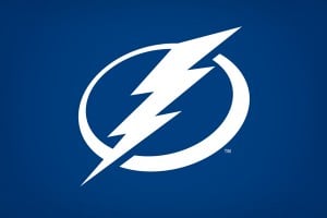
The NHL has a particularly colorful history of team names and logos. Hockey fans still mourn the clever whale tail monogram of the Hartford Whalers, while just as many try to forget the terror that was the early ‘80s Canucks’ uniform. To me, the 90’s Tampa Bay Lightning logo was the worst of the worst. Cheesy brush script, drop shadows and disjointed layout made it impossible to tell what was going on, even with a mascot as iconic as a lightning bolt. After a recent re-design, the Bolts have finally grown up. By getting rid of all the distracting elements, Tampa Bay finally looks like a professional hockey team.
Montreal Canadiens
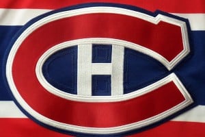 No reason to ever change this classic. Montreal hasn’t taken home the cup for a while, but when your club is one of the most successful sports teams of all time, brand equity means a whole lot.
Buffalo Sabres
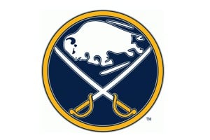 Sometimes you have to go back to go forward. The return to the original emblem plays off fans’ nostalgia and works worlds better than the angry "Buffaslug" from the late 2000s or the "Demonic Goat Head" of the 90s. Trends come and go, and maybe the flat emblem won’t look so attractive in a few years, but hockey fans are superstitious sticklers for tradition. Plus, who can argue with a buffalo AND swords?
LOSERS
Nashville Predators
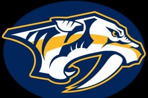 Nashville suffers from what I like to call “Millennium Mountain Dew Syndrome." Angular, pointy and fussy with details, Nashville’s prehistoric predator is a visual assault. They’ve recently simplified, but this big cat still looks like a work in progress.
Chicago Blackhawks
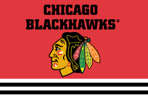 Treading lightly here as ‘Hawks fan. In terms of execution, the Blackhawks have a great look. The bold color scheme of the feathers as well as the recent incorporation of cream into the alternate sweaters is sharp, dignified and classic. The main issue here is the use of a crude Native American image as a sports mascot. There’s been much debate on this topic as to whether this type of logo is a slight to native peoples. It’s 2013. Just because that’s how it’s "always been done," doesn’t make it right. I’d challenge the Blackhawks to find an impactful identity that doesn’t caricature the Sauk leader.
Carolina Hurricanes
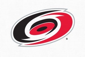 Yep. Still looks like a checkerboard in a blender.