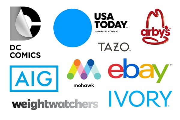
Is it just us, or has every major logo update this year been eerily similar? A brand looking for a slick, simple update for the 21st century decides to drop the "extra nonsense" and go with an all caps or all lowercase sans-serf font. Usually it's Helvetica, Futura, Gotham or something similar. (There's even a Tumblr blog dedicated to every new Gotham-based logo out there) Don't get me wrong, simplicity can do a brand wonders. By simplifying the logo, the focus is placed back on the quality of the product or service itself. Apple and American Apparel come to mind. But when brands with an over-the-top graphic history like DC Comics, or a rich sensory experience like Tazo Tea go slick and clean, does something get lost in translation? In any case, the best branding should tell a story that's unique to the brand and stand out rather than fit in.


