Let's get a few things out of the way right here at the top: The first: If you're someone who's easily offended for yourself or on behalf of others, then this post may not be your cup of Sanka with two Sweet'N Lows. Also, it might contain some jokey "inside baseball," so here's a link to Wikipedia. And, yes, your author is Jewish, was raised in a conservative Jewish household, and sort of kept a little bit of kosher sometimes, but for sure during Passover. I didn't have to consult Wikipedia for this post. Not once. (Maybe I should have? I'm sure you'll tell me.)
Here's a (fifth) question, just in time for the upcoming Holiday of Spring: Why does Passover food packaging look like it's been wandering the desert for forty years? How did this become the 11th plague? (Fine. Two questions. Guilty.)
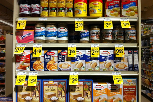
I was in the grocery store last night, and the annual Passover end caps are on display (if you want to check them out for yourself, they're usually located at the end of the looooooong Easter aisle). And as I gazed across the blues and oranges and browns, I had the overwhelming thought: "Great. Not only do they beat us with Christmas, but they beat us with the colorful pastels of Easter, too. What's keeping us from making our food look appetizing?" I made an exodus without buying anything.
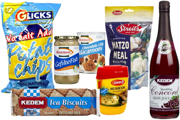
While I've resolved that until there's a Discovery Channel special on The Search for the Gefilte Fish, you'll never get me near this mythical non-fish. Sure, some may argue the tradition or even (gross) the deliciousness of gefilte fish, but we can all agree that the packaging—seemingly unchanged for decades, pickling like the whitefish within—leaves a bad taste in our mouths, no?
I'll give some nominal credit to Manishewitz. The master brand of all things Jewish appears to have updated its packaging.
To 1980.
It's an important eight days for Jews—the Holiday of Freedom! One of the pilgrimage holidays! We gather! We recline! We race through, or spend six or more hours (I've had the pleasure of both), eating a sumptuous meal in a particular order ("seder"), full of symbolism and importance, reiterating faith and tradition, and—if we're lucky—we find the afikomen (and line our pockets with $5 and these).
So why can't the food packaging measure up to the thrill of a Cecil B. Demille joint (or even a Mel Brooks joint)? Why, on these nights, must we suffer with boring packaging that tells a completely different story from a fairly exciting Biblical one—bland brand stories that suggest, nay predict, food that's equally bland.
"Feh!" my Bobie would have said, as she made her matzah balls, adding her secret ingredient (love, obviously). She had time to make things from scratch. And, sure, there are plenty of cooks out there making their family recipes year-in and year-out, passing them from one generation to the next. But the reality is this: Not everyone makes something from scratch.
It's 5773. We have the ability to make packaging that looks delicious. In every other category, the packaging has kept up with the times. Every. Other. Category. Appetite appeal photography. Smart communication hierarchy. Good-looking design.
I mean, who wants bring home mediocre packaging just because it "has a nice personality"?
We can do better.
Next year, packaging for the new millennium. Please?