image credit: ludovic bertron/flickr cc
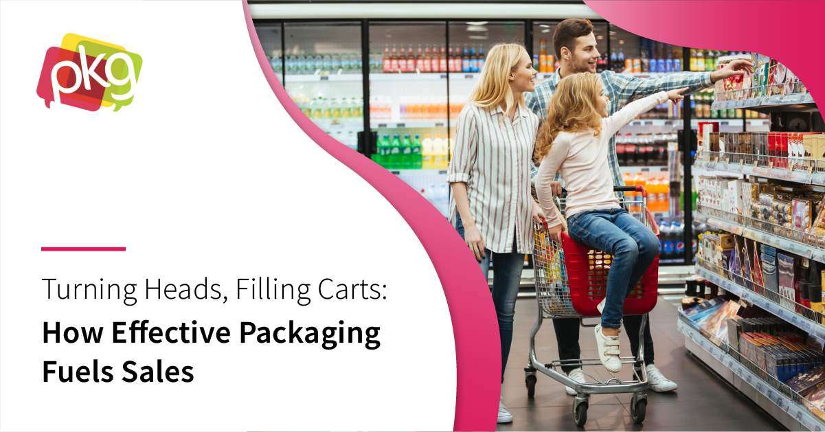
Truly iconic brands achieve near-universal recognition and positive brand associations, even among individuals who don’t frequently consume consumer packaged goods (CPG). Coca-Cola, McDonald’s, and Campbell’s soup are just three of many companies with instant recognition and associations among consumers worldwide.
Research by Millward Brown indicates that “iconic brands” enjoy a unique status of super familiarity. They appreciate higher “top of mind awareness” and the benefit of instant association, which can be immensely beneficial in a retail setting. While product quality certainly plays a role in achieving this extreme familiarity, packaging is immensely important to developing an iconic CPG brand.
In this blog, you’ll learn a basic overview of eight times when a brand’s identity was expressed in truly iconic CPG packaging. We’ll review organizations who got it way right the first time, and other companies who’ve managed to achieve greatness through smart rebranding efforts.
-
Coca-Cola
Coca-Cola’s branding is so incredibly iconic, that individuals within certain regions of the U.S. refer to any carbonated beverage as a “coke.” Business Insider reports that individuals in 200 countries worldwide drink some 1.9 servings of this beverage each day.
Unlike Coke’s biggest competitor, Pepsi, Coke’s iconic swirling font against a solid red background has survived through time without any need for significant branding or revision. The instant recognition potential of the brand’s original logo has only solidified its ability to stand out. While the bold color choices of the logo are certainly partially responsible for Coke’s success, BI believes the fact the brand originally chose a “timeless” font certainly doesn’t hurt.
-
Subway
Despite recent media scandals with spokesman Jared Fogel, Subway remains top-of-mind for consumers who want fast, convenient food choices with healthy options. Surveys of consumers indicate that Subway consistently scores at the top of their competition for “advertising I can relate to” and “advertising that makes me hungry,” among other factors.
Subway’s minimalist, green-and-yellow branding and directional logo certainly have played a role in their consumer acceptance. There’s no question that the visual elements of Subway’s packaging indicate speed and health to consumers, which also summarizes their unique position in the fast food market.
-
Toblerone
There’s no question that Toblerone stands out. While other chocolatiers offer rich milk chocolate with toffee and nuts, Toblerone was certainly the first to offer the distinct triangular packaging shape that directly mirrors the pyramid in the brand’s logo.
Marketing Magazine writes that the shape of Toblerone’s packaging allowed the product to stand out in the crowded Swiss chocolate market, which also aided its success in international distribution.
-
Kraft
Kraft Heinz is now the fifth-largest food and beverage company in the world; representing some 13 distinct brands. While there’s certainly been notable branding achievements among many different brands within both the Kraft and Heinz families, Kraft has especially earned a mention.
While Kraft products have undergone some notable and controversial rebranding efforts, the effect on consumers remains the same. Their CPG products are associated with convenience, comfort, and a high appeal to the youngest consumers. The brand’s iconic image is achieved through bold, block lettering and deep hues.
-
Lunchables
The iconic status of Lunchable’s is clear in their positioning among consumers, who refer to pre-packaged lunch boxes as “lunchables” regardless of the specific brand name attached. Lunchable’s branding and packaging are nearly one-and-the-same, and consumers expect the convenience of pre-sectioned lunch boxes from this child-centric CPG brand.
The asymmetric, tilted lettering and red-and-white color combinations of Lunchables spell convenience for adult consumers, and an enjoyable meal experience for their children. As Lunchables expands into various related offerings, including “upgraded” and snack-focused offerings, their recognition remains instantaneous.
-
Oreo
Following a massive rebranding effort in 2012, Oreos were lauded by the Harvard Business Review (HBR) as “respiratory.” In a world where many well-established CPG brands hold the reputation of being immovable, respiratory is an undoubtedly good thing.
As HBR points out, Oreo has demonstrated the ability to “breathe in” consumer feedback and “breathe out” packaging that’s aligned with modern values and consumer demands. This ability to continually innovate and integrate customer feedback is aspirational for their competitors.
-
KitKat
Even regardless of KitKat’s earworm commercials of the 1990s, the packaging of this candy brand is certainly worth mention. KitKat in a way was an early venture into minimalism, launching a product whose logo played the most prominent role on their food packages.
In the 1990s and today, KitKat isn’t the most adventurous option in the candy aisles. It lacks Acai berries or healthy elements. However, the brand’s position isn’t edgy. It’s reliable and familiar. And their brand-centric packaging communicates this message perfectly.
-
Tropicana
Tropicana is fresh. When the brand launched among many other from-concentrate or otherwise diluted orange juice offerings, it immediately achieved brand recognition as the freshest and purest option on the juice shelves.
Innovative packaging design and a bold green logo have facilitated Tropicana’s reputation as one of the freshest juice options. Their iconic branding is further aided by their bold venture into see-through plastic bottles, which initially aided their ability to stand out against store brands packaged in paper cartons.
There are few visual elements in common with Tropicana’s transparent orange juice bottles and KitKat’s bold, simple candy packages. However, the single common factor among iconic packaging case studies is the ability to be different. Organizations who manage to differentiate their CPG products from competitors through bold packaging choices may achieve the best chances of near global recognition and positive consumer association.