
Putting a visual identity onto your brand in the form of a logo is a task that must not be taken lightly.

A logo identifies your brand and differentiates it from the competition, so the work that goes into its design has to account for multiple branding attributes such as who the target audience is, the industry as a whole, and new design trends.
And sometimes the most successful logo needs a bit of an update. Even major brands like Coca-Cola and Apple do this, despite the fact that no one is likely to forget they exist. If you are designing a new logo for your brand in 2019, or are updating an existing one, consider the following six trends that are dominating logo design this year.
1. Gradients
Gradients allow brands to expand their color palette and freshen up the look of their logo, and gradients are also easily adaptable into GIFs and video formats. This can be a key consideration with digital marketing. Gradients are usually created from colors that are close together on the color wheel rather than random, so that in dynamic formats like GIFs, they give a seamless, flowing appearance.
2. 80s Retro Styling
Minimalism isn’t right for every brand, and in some cases, “maximalist” designs that were popular in the original MTV era are making a comeback. These logos use bright colors, bold patterns, and strong, non-subtle lines. It isn’t right for every company, but the style has been out of the spotlight long enough that it can look fresh and new when attached to the right brand.
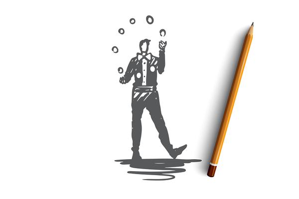
3. Hand Drawn, Artistic Illustrations
In a digitized world, the simple hand-drawn artistic logo can really stand out despite its subtlety. This type of logo is popular with small businesses and creative services companies, because it conveys a sense of authenticity and “humanizes” the business. Additionally, the simplicity of a line drawing with plenty of white space allows the logo to work well when placed over photos and other graphics.
4. Minimalism
Maximalism may be re-emerging, but don’t count minimalism out! The style is still going strong, and there are some clear advantages, such as how well minimalist logos do when placed atop photography and other imagery. Their very simplicity allows easy updates such as slight shifts in colors, and the simple lines and backgrounds make it easier to combine multiple fonts in a single logo.
5. Shapes or Illustrations Substituting for Letters
A geometric shape or simple illustration that substitutes for a letter in a brand name gives an extra element of fun to a logo design. An infinity symbol (∞) in the place of “oo” would be an example of this, but there are countless other ways to do this. The idea is to both remind the reader of the letters themselves, while simultaneously recalling the brand.
6. Bubble Fonts
Like 80s “maximalist” designs, bubble fonts are seeing a resurgence. They convey personality and have a retro feel, and they’re still uncommon enough to stand out from the crowd. Mixed with modern elements, bubble fonts give a sense of movement and energy, especially when rendered in bright colors. Be aware, however, that not all bubble fonts are easy to read, so test designs thoroughly first.
Logo design is based on numerous decisions and influencing factors, and it should never be an afterthought for any brand. Whether you’re announcing your new brand or striving to differentiate it from competitors, your logo must state your brand identity and support your brand’s story. And over the years it will almost certainly need to evolve to stay fresh in consumers’ minds.
Understanding current logo design trends can help in the creation of a logo that resonates with your target audience. PKG Brand Design is always on the forefront of new CPG branding and packaging initiatives; please subscribe to our blog for the latest package design industry news!
.jpg)

-min%20(2).png)

