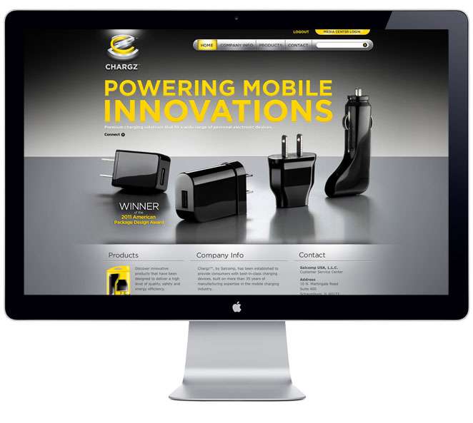
When Salcomp—an international manufacturer of digital and mobile chargers—approached us to create an integrated brand—from logo to packaging to marketing materials—for a retail-facing product group in North America, we totally plugged in. We had the opportunity to bring all of our expertise to bear—including extensive research like qualitative surveys, store audits, category and competitive analysis, along with packaging, promotion and digital capabilities—to create a brand that spoke in one attention-grabbing, integrated voice..
Strategy
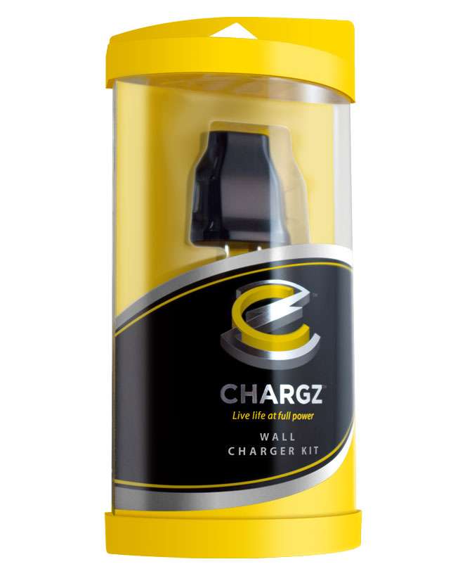
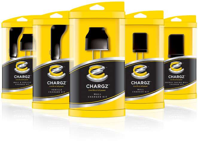
Differentiate the Chargz brand from generic and premium brands within a very competitive—and very cluttered—marketplace at launch by giving retailers and consumers a reason to choose the higher-end Chargz brand.
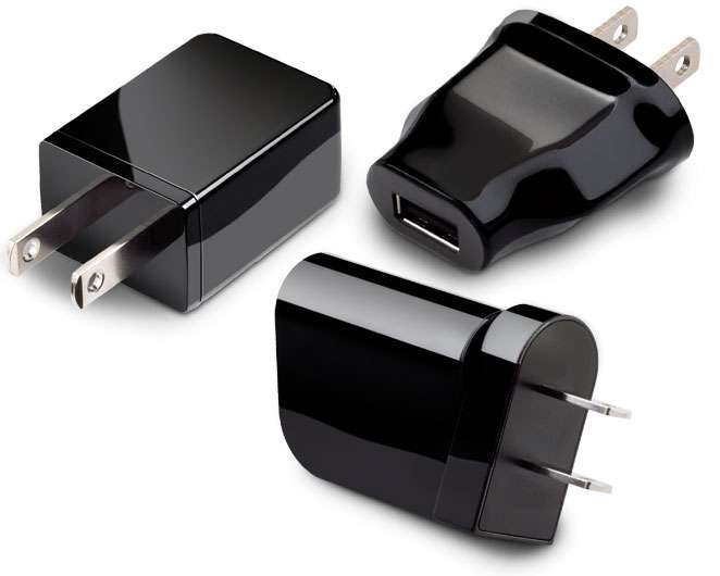
Develop something that feels premium in a consumer’s hand
Use premium materials that reflect a premium brand and showcase the product
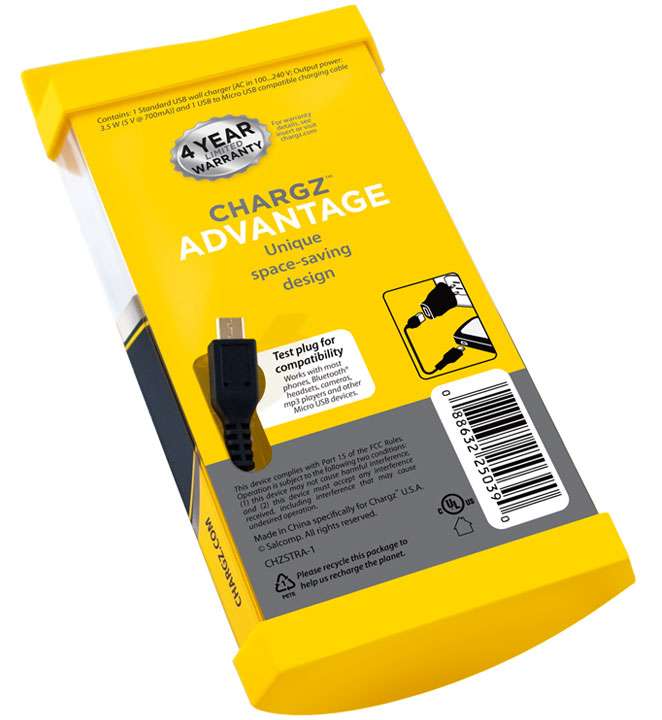
Ensure that one packaging form is suitable across five SKUs to create production efficiencies and keep costs low
Build loss-prevention into the structural design
Consumer First
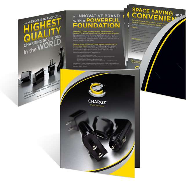
We built the brand from scratch, using our Consumer First model to leverage extensive audits—including retail shelf sets and packaging to get us started and our audit data led us to a structural engineering solution that accomplished many of our goals. Once we had a structure and substrate that felt right, we turned to heat mapping research to see what colors and designs resonated with consumers, including packaging structural engineering, package design the logo and the brand color palette. Thanks to our audit process, we knew many generic competitors used blue as a primary color, and some of the premium competitors used orange. Wanting to bring clarity and awareness to a crowded retail space, we believed yellow would resonate.