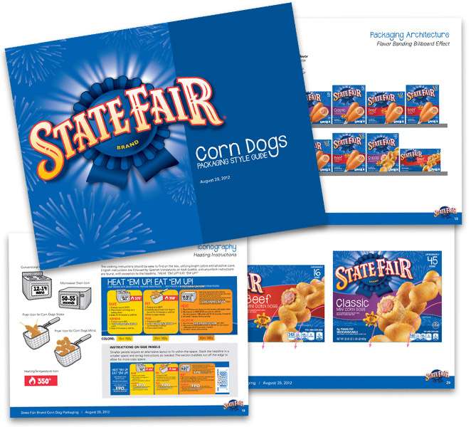
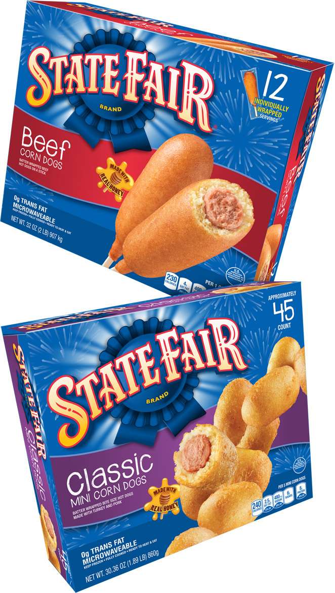
State Fair Brand Corn Dogs
OPPORTUNITY
The State Fair® Brand is the #1 corn dog in the U.S., so when this fun brand asked us to redesign its packaging, we warmed to the task and took a huge bite.
STRATEGY
Evolve the packaging to showcase the brand’s playfulness, while creating more differentiation between flavors and forms. For retailers, our new design must work horizontally and vertically.
CONSUMER FIRST
We developed three initial concepts for consumers, asking them to identify what they liked and how new compared with current. Shoppers noticed packaging improvements immediately.
SOLUTION
Our “Fireworks” concept evokes fond memories of fun at the state fair. Brand blue and a modified brand mark dominate the box. New product photography provides more appetite appeal and shows real texture. We’ve clarified the flavor, giving it more prominence in a re-imagined and re-structured ribbon.