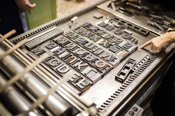
The human race has explored new ways to communicate since the development of language, through sound, pictures, and writing. Punches and dies were used in ancient Mesopotamia to regularize text, and highly trained scribes perfected handwritten typefaces up through the invention of movable type in the 15th century.
The characteristics that make up a typeface include the presence or absence of serifs, and the ratio of thicknesses of various parts of each letter. With the invention of mass media, and later on, the expansion of the internet, typeface choices became nearly unlimited, even for the smallest business.
Typefaces make a statement about your brand, and you have to make sure it is a positive statement. While some typefaces become iconic in their association with brands (like the script used in Disney products), the world of typefaces is ever-evolving. This is great news because it gives you almost unlimited scope in pairing the best possible typeface with your brand.
What Various Typeface Categories Convey
First, it’s important to note the difference between “typefaces” and “fonts.” Typeface denotes the presence or absence of serifs and the relative thickness of the components of each letter, while font denotes the size, weight, and orientation of the typeface. You’ll see the terms used almost interchangeably, but there are subtle distinctions between the two.
Serif and sans serif typefaces are both classics, with serif fonts being perceived as more traditional and professional, while sans serif fonts convey a more crisp modernity. Serifs lend themselves more to print, while sans serif fonts are likelier to be chosen for large headlines, banners, or signs.
Script fonts are both elegant and decorative, with each letter neatly connected to the next within a word. They tend to be considered more “feminine” than non-script fonts.
“Handwriting” fonts are more casual and personal, and they work well for brands that want to come across as non-threatening, friendly, and approachable.
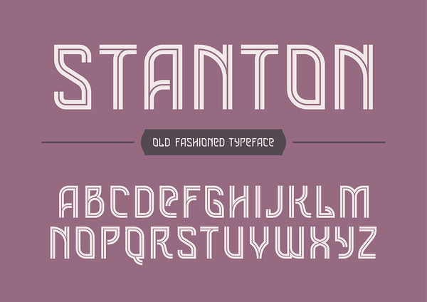
Decorative or “Display” fonts are made to call attention to themselves. Great for logos, they’re not so great for print, because in large quantities, these fonts can be overwhelming to look at.
Slab fonts are blocky and carry an “old school” charm. They’re easy to read, yet they’re better for logos and headers than they are for long paragraphs of text.
Practical Tips When Choosing Typefaces
First and foremost, typefaces need to be clear and legible in their assigned context. While a highly-stylized, single-word banner that is clearly associated with your brand can pack just the right visual punch, the more text there is, the more important its legibility. Imagine if Coca-Cola used their iconic script font in their ingredient lists and ad copy, for example.
The typeface you choose should, of course, mesh with the image you want your brand to convey. Additionally, you have to account for where the font will be seen. Some fonts look great on a screen, but terrible on a billboard, or vice versa.
If your brand uses multiple typefaces, they should look good together, and the transitions from one to the other shouldn’t be jarring to the eyes. In general, you should use no more than three typefaces in branding to prevent a cluttered, haphazard look.
Finally, when using multiple typefaces, your branding should demonstrate a clear hierarchy of typefaces. For example, if you use a decorative or display font, it should be used for headers, while putting more traditional, readable fonts in body text and sub-headers. Endnotes, attributions, and clarifying notes at the bottom are often done in an italic font to set them apart from the main body text.
Test and Preview Your Choices Extensively
Choosing and mixing typefaces is both a science and an art, and in the end, there is no substitute for previewing and testing your typeface choices in the sizes, environments, and media in which they will be seen. What looks good on a standard sheet of paper may look terrible on a huge banner, and the reverse is often true as well.
Ultimately, typeface selection should never be an afterthought, because it can become so closely intertwined with your overall branding message. PKG Brand Design is always on the forefront of new CPG branding and packaging initiatives; please subscribe to our blog for the latest package design industry news!