With experience in a wide range of packaged goods, we work with some of the world’s most well-known companies earning us the reputation as one of the best packaging design firms.


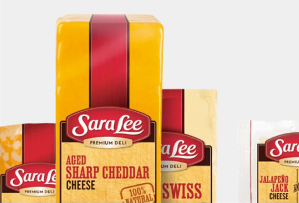
To combat the challenges of this unique category, Sara Lee had a plan: A reformulated product line offering the same great taste, but with a more premium and nutritious profile. Could PKG use this news to create a new deli brand perception?