It's common knowledge among marketers that the human brain reacts in different ways to different colors. Packaging design teams are well aware that one color may make the human brain retreat while another draws them in. How can you use color to change consumer behavior? Here is why your choice of colors in CPG packaging matters.
Color and Packaging Design
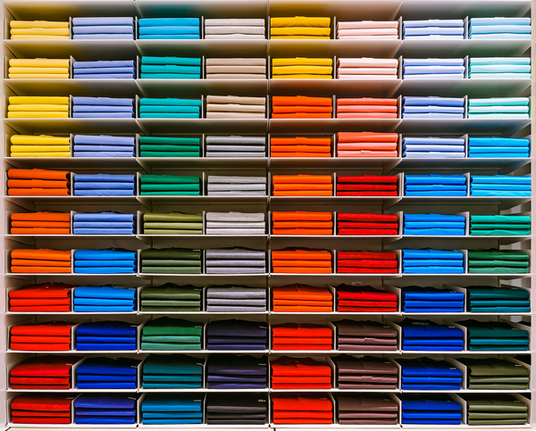
Humans see a full spectrum of color, and the psychology of the color wheel has been put to use to influence human behaviors for decades. Whether you’re on a packaging design team or just the average consumer, many of us have an inkling that color affects our mood. For example, blue and greens are calming, but red is the color of danger.
But those examples just touch the surface of the sophisticated nature of our manipulation of color to influence human behavior. Did you know red makes people hungry and orange makes them eat faster? Note the popularity of red in fast food chains, and you’ll realize that the psychology of color manipulation is alive and well in most industries, but particularly in CPG marketing.
Ironically, much of what we know about color is anecdotal; Supplier Community says, “The interesting thing about all these ideas is that there is little to no evidence that color has any psychological effects.” The goal for packaging design is to capitalize on our unconscious attractions to color, as our eyes seek out the attractant, much like a bee to a lovely flower.
Color can trigger an emotion that, in turn, triggers a behavior. There are cultural differences that CPG marketers must take into consideration, but generally, colors fall into certain assumptive categories:
- White is perceived as pure, simple, and innocent.
- Black is about power, mystery, and control.
- Red is the attention grabber color that signals excitement.
- Green is about sustainability, the earth, and emotion.
- Yellow is optimistic, cheerful, and also an attention grabber.
- Orange signifies creativity and is also an attention grabber (but less so than red).
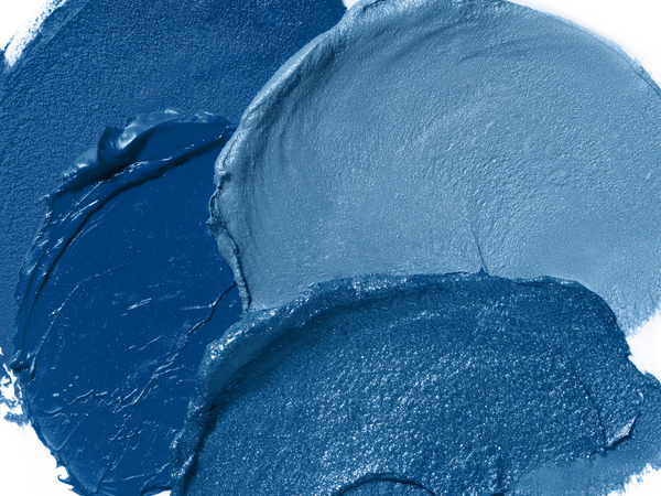
But there are also differences in packaging design depending upon the shade of the color. For example, a professional, darker blue cues a different reaction from a light sky blue. Blue is often perceived as the color of intelligence, but according to Repsly, younger audiences prefer neon or light blues and older audiences the darker blues.
Choose Your CPG Packaging Color Carefully
Packaging design typically makes use of color to influence consumer behaviors. This is nothing new. Color psychology has been studied for decades as tools to manipulate when conducting marketing and branding of products.
Color influences our emotions, and can be used to create trust in a brand, or even get our hearts beating a little faster. But choose carefully! How your brand uses color has a direct impact on sales volume. Creating the right mix of color and design is a critical component of CPG marketing, ultimately affecting the success or failure of your brand.
PKG Brand Design is always on the forefront of new CPG branding and packaging initiatives; please subscribe to our blog for the latest package design industry news!