 image credit: Scott Ogle via Flickr CC
It’s virtually impossible to separate the concepts of typography and visual design.
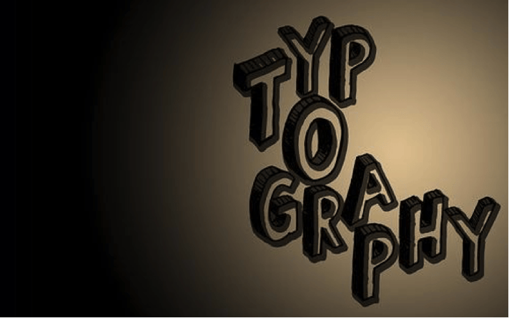
While typography is traditionally the simple act of arranging letters, in modern design it has grown into the concept of digital font selection and placement. The Creative Bloq blog writes that a designer’s typography selections can determine the difference between “good, bad, and great design.”
An organization’s choice of fonts for logo and subtext placement on consumer packaged goods (CPG) packaging can play a significant role in determining a product’s perceived values, audience, and benefits. While the human brain processes images faster than text, it’s important to think of font as an element which straddles the barriers between visuals and words. While your target audience in a retail environment might not immediately understand the intent of your text, they’ll certainly perceive the tone of your typography.
In the realm of CPG packaging design, typography selection may be perceived by viewers in a matter of milliseconds. Your font selection can represent the difference between positive and negative distraction in a retail environment. In this post, you’ll discover a few of the most basic principles of typography and their connection to consumer behavioral psychology within the realm of graphic packaging design.
-
Know the Gestalt Principle
In the Gestalt Principle of Behavioral Psychology, the human brain was discovered to have a strong affinity for creating relationships in blank space. In the realm of typography, this concept plays a powerful role when it comes to the ideas of proximity and alignment.
As the staff of design blog HOW highlight, the human brain looks for similarity on packaging typography. While similarity communicates a strong relationship, a lack of similarity can communicate a difference. Using a single typography style can communicate continuity of an idea. Relying on visibly different styles may highlight your subtext as a separate, but related, concept.
-
Avoid Aggressively Decorative Faces
It’s crucial for designers to understand the difference between decorative typography that’s designed for logos and headlines, and typography that’s tailored for readability. In general, heavily stylized typefaces are not designed for the purpose of communicating long or complex messages.
While it may be tempting to heavily utilize a very stylized typeface throughout your brand packaging, this concept can alienate readers who may grow tired of “deciphering” your typography selection. In virtually all cases, it’s best for designers to rely on very simple typefaces as a medium for communicating longer or complex concepts.
-
Consider Size
The size of typography may play just as great of a role as color or surrounding imagery in communicating the general concept of your CPG product. As PhotoShop Cafe highlights, excessively large font is often perceived as “cheap” by buyers, who are accustomed to small and minimalist font as a design trademark of pricer products.
While there’s certainly a time and place for large typography placement, it probably isn't throughout the entirety of your packaging design. By limiting large typography to your brand logo or certain lines of subtext, you can avoid devaluing your brand with a limited amount of ill-planned visuals.
-
Readability
For the vast majority of brands, the reliability of typography should be a key consideration. Unless your brand’s image is entirely communicated by visuals, the readability of your product selection is absolutely crucial to your brand’s image.
By putting a light font color against a dark background or selecting typography that contains heavy seraphs, you may sacrifice the instant readability of your packaging’s content. For optimal results, most brands must opt for a strong contrast between the font and the packaging background, and letters that aren’t obscured by stylization.
-
Spacing
As a consumer, you’ve probably been blind to typography grouping and spacing during your entire time selecting and purchasing CPG products. When CPG packaging or other forms of graphic design is optimally executed, typography spacing is not apparent to the end consumer.
When selecting fonts, graphic designers must be conscious of the interaction between letters. If multiple fonts are used within a single visual element, the spacing should be adjusted so that some degree of symmetry is achieved between lettering. Without symmetry, you may lose any sense of balance.
----
While typography isn’t the only component of graphic design, it’s certainly an important one. By understanding the role typography plays in CPG packaging, product designers can select fonts and placement that enhance a product’s potential for recognition and visibility. Avoiding typography mistakes will improve the appeal of your product.


