Creating a logo can seem simple on the surface, but a logo must be designed for customers to easily understand and withstand the test of time.
What the most popular brand logos have in common. Illustration: Yuliya Kim
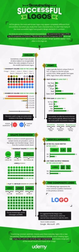
When it comes to creating a successful logo for your brand, it seems simplicity is key.
Udemy, an education marketplace, examined logos from 50 brands on Fortune's 2015 World's Most Admired Companies list to figure out what their beloved insignias have in common.
The infographic below, Deconstructing Successful Logos, breaks the designs down by color, typeface, shape and a few other criteria. And here are some key findings: Of the 50 logos analyzed—for brands including Starbucks, Coca-Cola, Facebook and Walt Disney—red and blue were the most popular colors. Also, 43 of the top companies use no more than two colors in their designs.
Read more from the source: AdWeek