Colors that are mixed with significant amounts of white pigment are pastels, and they are often designated by the adjective “pale” or “light” before the name of the base color, as in “light blue.”

Pastels have never been absent from modern packaging design and in some cases have become iconic, as is the case with the “Tiffany Blue” associated with high-end jeweler Tiffany and Co. You’ll frequently see pastels in packaging for cosmetic brands, perfumes, and baby care items, and they convey a sense of softness, quietness, and invitation.
Indeed, the Pantone 2018 palette contained several pastels, including Little Boy Blue (a light azure shade), Pink Lavender, and Blooming Dahlia. Pastels in packaging design are becoming more popular as brands attempt to reach their target audiences more effectively. There are several reasons for this subtle shift.
Primary Colors Shout; Pastels Whisper
Packaging design on retail shelves serves as a form of advertisement, beckoning consumers to pick up the product, look it over, and hopefully choose it over others. Bright primary colors, plus black and white grab attention and create a feeling of energy.
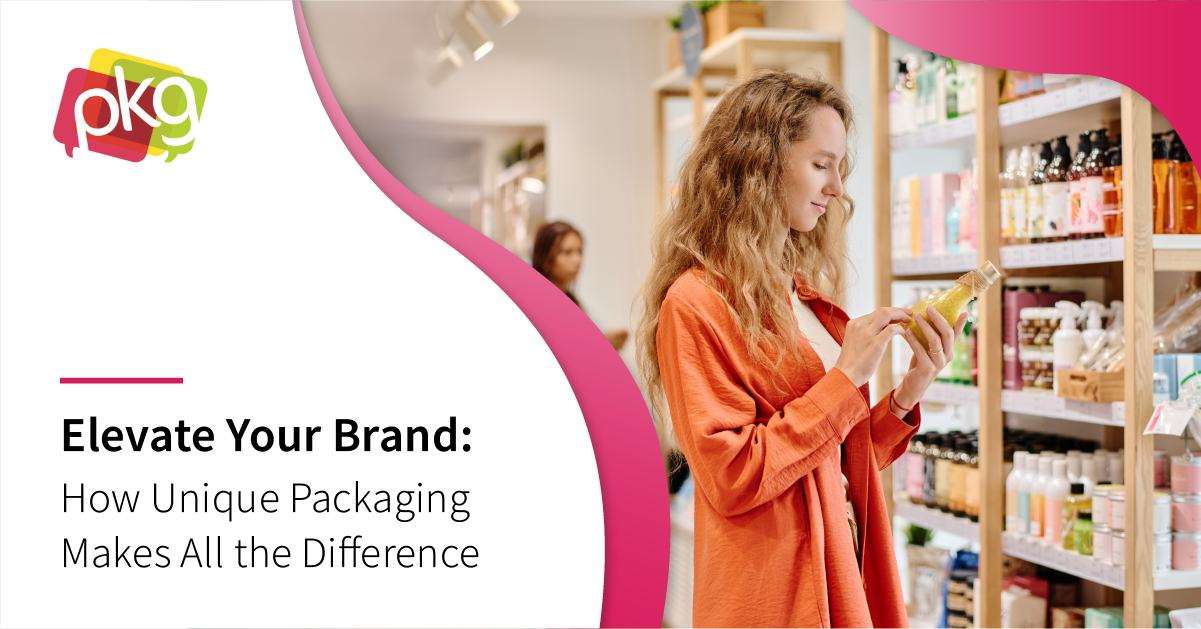
Pastels, on the other hand, don’t shout from the retail shelf, and this can actually benefit brands. The human eye and human brain can become overloaded with bright stimuli, to where all the primary-colored packaging eventually blends together into a cacophony of color. In these instances, a soft pastel can offer the eye (and the mind) a soothing oasis of sorts, drawing in the consumer who is overloaded with visual stimulus.
Associations with Spring and Newness

Pastel tones are often associated with newness. We tend to associate pastels with baby clothing and with products for babies, but we also associate them with springtime. The green shoots pushing up through the ground are usually soft, pale green, and many springtime flowers are pale (like peonies and jonquils) or white. Easter is a holiday associated with the pale pastels of fluffy baby chicks and Easter eggs dyed in pastel colors. Some brands occasionally give their products “spring makeovers,” like the M&M candies dressed up in pastels for springtime.
Standing Out May Require Going Against the Status Quo
Pastels don’t have to only be associated with cosmetics, babies, and springtime, however. They can be used by brands that want to differentiate themselves on retailer shelves by having their products stand more elegantly among a sea of “shouting” packaging designs.
Can it work for every product? Probably not. But products like tea, candy, limited edition sodas, and even laundry detergents can use pastels to their advantage. R&B Brewing, a maker of ales and lagers from Vancouver, won awards for its pastel label designs for a limited-release series of flavors in 2017. The particular pastels chosen were designed to reflect flavors used in the ales, such as a pale green for the pale ale infused with pear juice, and a pale yellow for a flavor infused with subtle banana notes.
Brands that don’t traditionally use pastel colors in their packaging designs may consider using pastels as a way to “zig when the others zag,” so that their products stand out on the shelves and product pages online. Pastel packaging may not “shout” the way bright primary colors do, but that is often just the thing to draw the eye of the consumer seeking an oasis of calm in a bustling world. PKG Brand Design is always on the forefront of new CPG branding and packaging initiatives; please subscribe to our blog for the latest package design industry news!


