Like a kid in a candy store. That's what it's like to be a hungry packaging designer in a truck stop. Aisles and aisles of packaging competing in an all-out melee for the impulse purchases of hungry drivers: Jerky, corn nuts, candy, chips, soda, energy drinks, relaxation drinks, snack mix, snack bars, power bars, new flavors, bold flavors, king size, fun size, big brands and local favorites. It's a beautiful little ecosystem where shoppers aren't thinking about family groceries, or coupons or price - only about what looks good right now. Because of this unique environment, you end up finding some great packaging treasures. Ranging from beautiful, to quirky, to downright bizarre, there's as many different strategies to break through the clutter as there are bugs on the windshield after a day's drive on I-80. Recently, I spent two weeks on the road and every time we stopped for gas, I let my impulses be my guide to find something that caught my eye from a consumer and a design perspective. Here's a few that I managed to snap pictures of:
Uncle Al's Stage Planks Classic Feeling
 One of the most fun things about traveling is finding the local flavor you can't get anywhere else. You'd be surprised how much that applies to convenience stores and truck stops across the country. Regional candy, drinks and snacks can hold a candle to the big guys by sticking to their guns when it comes to branding. Take this packaging for Uncle Al's "Stage Planks" that I spotted somewhere in the Carolinas. Being from up north I had no idea what in the world this was. (A taste test and some Internet research revealed that it's basically a big iced gingerbread cookie originating in New Orleans). Its bare-bones classic packaging really caught my eye and immediately seemed like something local and authentic. Definitely worth a try when stacked up against the in-your-face circus-colored candy rack.
Herr's Potato Chips "Extreme" Appeal?
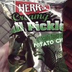 In Pennsylvania, I found some more examples of local snack brands taking different strategies. First, check out this insane packaging for Herr's potato chips. 10-year old artwork of a DJ spinning a potato chip like a record? Metallic and neon green with a ton of fonts? Hilarious and not very appetizing. You can tell they're trying to be "extreme" to go up against Doritos and some of the other big guys and I'm not sure how well it's working.
Utz Potato Chips Retro Appeal
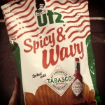 On the other hand, Pennsylvania snack brand Utz is sticking to their guns with this awesomely retro bag of Tobasco potato chips. It might be ugly, but at least it's authentic. Utz is staying relevant by partnering with Tobasco to appeal to today's spice lovers, but isn't getting caught up with a style it can't pull off. New exciting flavor, same classic potato chips. (authors note: these are addictive and taste amazing.)
Red Bull Billboarding Attracts Tired Eyes
 The truckstop beverage cooler is another compelling place to look at packaging in the wild. Not only are there more brands side-by-side than your standard convenience store, each brand has the space to showcase a huge set of all their different flavors. There's juice, water, sports drinks, energy drinks, soda and tea. Each category has sub-categories and different sizes and a range of brands and sub-brands in a range of flavors. Navigating the glass labyrinth of the cooler case is difficult, but in this instance I kept going back to the gold standard of energy: Red Bull. They have carved out a chunk of the cooler with their iconic can and iconic brand. While most other caffeine-laden drinks look like they came out of the wrestling wring, Red Bull almost seems clean and healthy and magical. Never under-estimate the power of the billboard effect.
Cracker Jack'd Grabs Attention
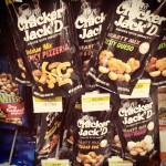 There was one package I found that was by far my favorite. This one has it all: classic brand, contemporary appeal, and a handsome packaging with crystal-clear communication. Cracker Jack'd blew me away. The black wall obliterates the competitive snack mix set which is mostly blues and yellows and reds. And look at those flavor colors! By pairing rich jewel tones up against black, you can almost taste the flavor is before you even read what it actually is. Finally, the photography is a straightforward showcase of what's inside. A great introduction to a new product. No DJ necessary. (authors note: apologies for blurry image. Photo was taken at 4am after sleeping in the back of a van)
So next time you're starving and bored after hours of driving, take a moment to relish in the the bazaar of curiosities that is the great American truck stop. Look at the colors, flavors and brands and realize that these snacks are going all-out for your attention. Take pride in your choice of junk food and let impulse rule the day.