Successful packaging design is a balance of visual and text content. These elements grab the attention of consumers by telling a story about the product.
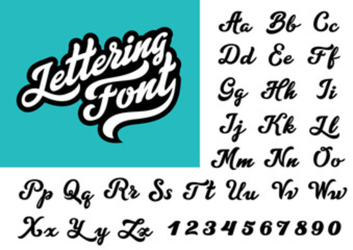
Typography communicates your marketing message and important information consumers need to know. Using the right fonts and colors are critical to ensure your message is clear and stands out on store shelves.
Typography improves the appearance of CPG packaging. Per Zillion Designs, 95% of what attracts consumers to a product is its packaging design. Here are some fonts and colors to consider when creating unique packaging.
Why Typography Matters
Typography is important for packaging designs because it helps communicate the product’s message to the consumer. It can be used to draw attention to key aspects of the product, such as its benefit or ingredients. Typography also helps to create an overall aesthetic for the packaging, which can help it stand out from other products on the shelf. Lastly, good typography can make a product more memorable and create an emotional connection with potential customers.
What Fonts Should Be Used
The font used on packaging design should be chosen based on the product’s target audience, brand message, and overall aesthetic. Fonts that are easy to read, such as sans-serif fonts, are often the best choice for packaging design. For a more modern look, geometric sans-serif fonts, slab serif fonts, and script fonts can be used. For a more traditional look, serif fonts can be used. It is important to ensure the font chosen is legible and conveys the desired message or feeling.
Fancy scripts are elegant, but they may require more focus and take more time to read. Simpler fonts, by contrast, are easy to read. This means consumers can take in lots of information about your product from the CPG packaging in less time. This often helps them make informed buying decisions faster.
Hand script fonts are more playful. Consider using them when you want an informal look. Also, custom lettering gives your brand a unique and own-able image that can even be trademarked.
Ensure all information on your CPG packaging is easy to read. This is important for product details, but it's especially crucial for specifics like ingredients and any possible allergens it may contain.
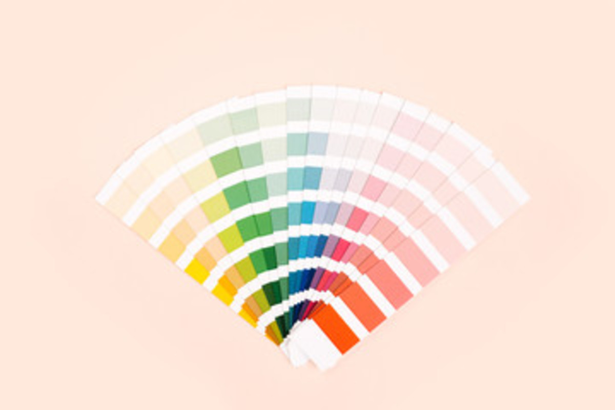
Why Color Is Important
Color is important for packaging design because it can be used to draw attention to the product, create a sense of brand identity, and make the product stand out from other products on the shelf. It can also be used to evoke an emotional response from the consumer. Color is a powerful tool that can be used to communicate the product’s message, create a sense of trust, and make the product more memorable.
Use specific colors in your logos to represent your brand. These will become the colors that make it recognizable, so choose those that signify your brand.
Color Ideas for Your Logo and Text
Colors can have a strong influence on how shoppers feel and can affect their emotions and behaviors. Different colors can evoke different emotions, and this can influence how consumers feel about a product or brand.
For example, red is often associated with strong emotions such as passion and love. Blue is often associated with calmness and reliability, while yellow is associated with happiness and optimism. Green is often associated with nature and tranquility.
The use of certain colors can also be culturally specific, so it's important to consider the cultural context in which a product or brand will be marketed. In general, it's a good idea to carefully consider the colors used in CPG packaging, as they can have a significant impact on how consumers perceive a brand.
When determining packaging design, think about how the colors you choose will be associated with your product. Consumers often judge a product by its CPG packaging within seconds of seeing it. The right colors can result in a quick purchasing decision in your favor.
Conclusion
Fonts and colors are important aspects of packaging design. Your content and graphics will tell a story about your product and brand, so choose carefully.
Select fonts that are easy to see and read. Consumers should be able to easily locate important information about your product.
Pay attention to CPG packaging trends to learn about industry growth. For example, Global Monitor reports the cosmetic packaging industry is predicted to register a compound annual growth rate (CAGR) of 3.64% by 2025. If you sell cosmetics, you should be aware of these details, the trends surrounding them, and materials brands are using.
Knowing which segments dominate a specific market can help you make packaging design decisions. This also helps you gain more insight about what consumers want so you can stay ahead of the competition.
PKG Brand Design is always at the forefront of new CPG branding and packaging initiatives. Subscribe to our blog for the latest package design industry news!