
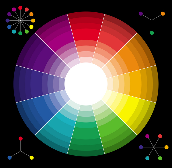
Every CPG package designer understands the distinctive interplay between color and consumer attraction. Design 101 covers the basic correlations between color and the customer, such as whether red is an attractant or the universal symbol of “stop” or if yellow washes out on the shelves and gets missed by a roving consumer eye.
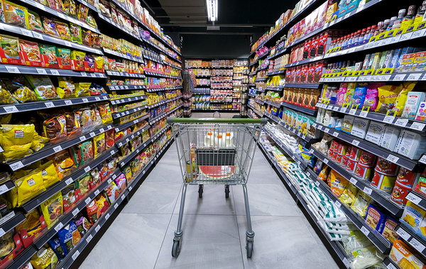
While there is plenty of data, there is still debate about the best colors for CPG packaging. A recent analysis of more than 2,500 grocery store products across 10 categories now reveals popular color hues for CPG packaging. What does this new data tell us?
Color and CPG Packaging—A New Study
The psychology of color in CPG packaging remains both an art and science. We know that color can invoke emotion, but what color and what emotion? Does the impact of color change with consumer trends or cultural shifts? We know color’s impact can change by culture.
A new study sought to look at hundreds of products in 10 different food and beverage categories to determine how color made an impact. Some of the results were a big surprise.
For example, do you know the most used packaging color for everything from ice cream to soda, cookies, and chocolate was light gray? About 20% of all products marketed to consumers in the CPG category use light gray on their packaging materials.
Other less-than vibrant packaging colors used frequently include black, which is used about 11% of the time. On the opposite side of the color wheel, you’ll find red, which is used about 8% of the time. Some of the colors that CPG packaging gurus use less often are light purple, blue, or lime for everyday items.
The study does not elaborate on why this is the case or why CPG packaging designers move and gravitate toward one side of the color wheel or the other.
According to the research, the majority of CPG packaging uses two or more colors:
- Candy 79.4%
- Canned foods 80.2%
- Cereal 69.6%
- Chocolate 74.1%
- Coffee 78.8%
- Cookies 78.8%
- Ice cream 80.7%
- Potato chips 75.1%
- Soda 72.9%
- Tea 79.2%
The most prominent colors by these categories include:
- Candy gold and orange
- Canned food dark blue and light gray
- Cereal dark red and light gray
- Chocolate ivory and dark gold
- Coffee red and light gray
- Cookies dark blue and light gray
- Ice cream light blue and light gray
- Potato chips dark red and light gray
- Soda dark gold and green
- Tea dark gold and black
Only 22% of CPG packaging leaned toward only one color. Cereal was the most consistent in this area. While we understand the identity of a brand’s first impression is most often tied to the color on the CPG packaging, this research shows that light greys, thick black, and dark red are the colors most dominant currently.
Although this study reveals popular color hues, it doesn't answer questions like will the color your use put off customers or bring them closer? Click here to see our deeper analysis of the psychology of color in packaging.
PKG Brand Design is always on the forefront of new CPG branding and packaging initiatives; please subscribe to our blog for the latest package design industry news!

-min-2.png)

