Color impacts how consumers perceive your product before they even touch it. Research shows that 90% of first impressions are based on color, and 93% of purchase decisions are influenced by visual elements. Packaging colors communicate emotions, quality, and brand identity, shaping how customers feel about your product.
Here’s what you need to know:
- Color Psychology: Warm tones like red and orange evoke appetite and energy, while cool tones like blue and green suggest health or trust.
- Brand Identity: Colors like black or gold convey luxury, while bright hues like yellow or red suggest affordability and approachability.
- Target Audience: Match colors to your demographic - children prefer bright shades, while adults lean towards muted tones.
- Cultural Context: Color meanings vary globally (e.g., red signals luck in China but urgency in Western markets).
- Industry Trends: Food brands use warm tones; eco-friendly brands favor greens and browns; tech companies rely on blues and silvers.
To make your product stand out, define your brand’s personality, align colors with your audience, and test palettes for effectiveness. Use tools like Adobe Color or Coolors to create harmonious designs and ensure consistency across all materials. Testing with focus groups and A/B campaigns can fine-tune your choices for maximum impact.
As Kevin Keating, President of PKG Brand Design, summarizes:
"The right colors can influence emotions, boost sales, and make your brand unforgettable."
- Kevin Keating
Color Psychology in Packaging
How Colors Affect Emotions and Buying Decisions
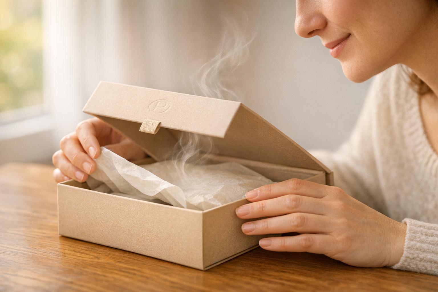
Color acts as a silent salesperson, influencing emotions and decisions in mere milliseconds - long before a consumer even reads a word. Our brains process color faster than text, which makes it a key player in driving quick purchase decisions.
Psychologist Louis Cheskin's concept of "sensation transference" explains why packaging color holds so much sway. Essentially, people unconsciously transfer their feelings about a product's packaging to the product itself. Studies reveal that identical products can evoke entirely different reactions based solely on packaging. One might feel "richer" or "more indulgent", while another might seem "healthier" or "softer". As Jay Daggar, Sales Manager at GWP Packaging, explains:
"Selecting packaging color shapes consumer perceptions, expectations, and buying behavior."
- Jay Daggar
Colors evoke specific emotions that directly influence purchasing behavior. For example, warm colors like red and orange are linked to indulgence and flavor, making them especially effective for food items. On the other hand, cool colors such as blue and green create perceptions of health and sustainability. These aren't just abstract ideas - 85% of shoppers say color is the main reason they choose a product, and most make that choice within just 20 seconds of spotting it. This instant connection between color and cognition highlights how crucial strategic color choices are in packaging design.
Subconscious Color Associations
Beyond their immediate emotional impact, colors also tap into deeper subconscious cues that shape consumer perceptions. These snap judgments happen so quickly that they set the tone for the entire relationship between the buyer and the product. For example, neon colors often evoke energy and excitement, while muted tones suggest authenticity and eco-consciousness.
However, color associations aren't universal - they vary depending on demographics and cultural context. Men often prefer bold, saturated colors like blue and black, while women tend to lean toward softer shades such as teal or rose. Culturally, red might symbolize luck and prosperity in China, but in Western markets, it can evoke urgency or danger. To make the most of color psychology, brands must align their color choices with their message and audience. For instance, using green to represent eco-friendliness only works if the brand's practices genuinely support sustainability. Otherwise, the color risks creating distrust rather than connection. Thoughtful color selection ensures your packaging reflects your brand's promise and resonates with your target audience.
sbb-itb-0c3a5ed
Choosing Colors for Your Brand and Audience
Define Your Brand's Character
Start by identifying your brand’s core values and mission - this will help shape your brand's personality and visual style. Think about the mood you want to evoke. Are you aiming for bold and energetic? Earthy and natural? Elegant and refined? Or perhaps youthful and rebellious? The colors you choose for your packaging should reflect this emotional tone.
For brands targeting premium markets, darker tones like black, navy, deep burgundy, or metallic gold and silver can convey sophistication. Budget-friendly brands, on the other hand, often use bright primary colors like red and yellow to grab attention. Eco-conscious brands should lean into greens, earthy browns, and muted shades to emphasize sustainability. If your brand prioritizes innovation and trust, colors like blue, white, or metallic silver work well. Meanwhile, brands that exude energy and passion might opt for vibrant hues like red or orange.
"The visual appeal of your product often plays a critical role in attracting consumers... color choice is perhaps the most significant."
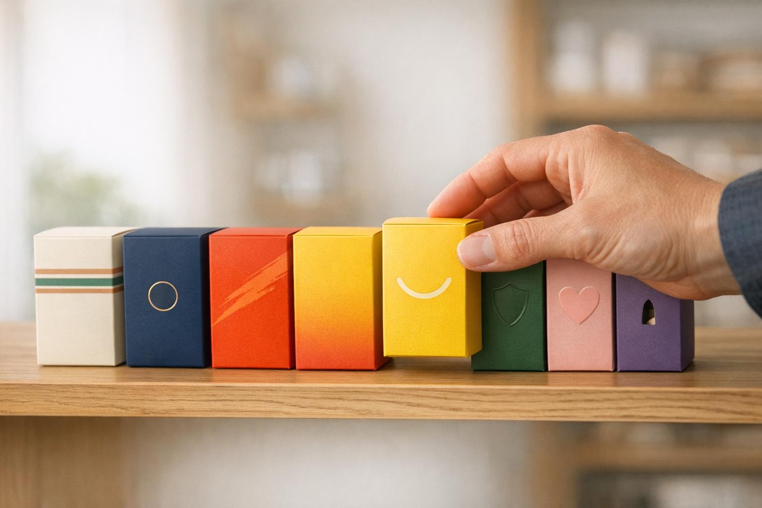
Take a close look at what your competitors are doing. Then, choose colors that make your brand stand out rather than blend into the crowd. A helpful design rule is the 60-30-10 principle: use your primary color for 60% of the design, a secondary color for 30%, and an accent color for the remaining 10%. Stick to two or three main colors to keep things visually clean and avoid overwhelming your audience. Once your brand identity is clear, refine your palette to align with your audience’s preferences.
Match Colors to Your Target Customers
After defining your brand’s personality, it’s crucial to ensure your color choices resonate with your target audience. For example, children are drawn to bright, playful colors, while older consumers often prefer softer, more muted tones. Gender preferences also come into play - men typically favor bold, saturated colors like blue and black, while women often gravitate toward softer shades like teal, lavender, or rose.
Cultural significance is another factor you can’t ignore. Different cultures associate colors with varying meanings, so research thoroughly to avoid unintended negative associations. Before finalizing your design, test your color choices through focus groups, A/B testing, surveys, or polls to ensure they resonate with your audience.
Consistency is key when it comes to building trust and recognition. Use exact hex codes (e.g., #151A7B) to maintain uniformity across all brand materials. Formalize your color choices in brand guidelines, detailing primary, secondary, and neutral palettes for designers and printers to follow. This consistency reinforces your brand identity, making it easier for customers to recognize your products and fostering long-term loyalty. For product variations, like different flavors, consider using complementary hues or slight tints of your core colors while keeping the overall design style intact.
Color Strategies by Industry
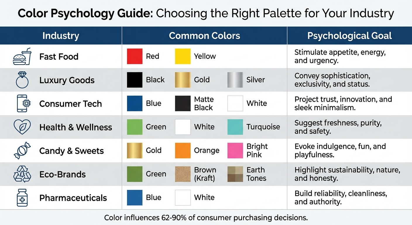
Color Psychology Guide for Product Packaging by Industry
Common Color Choices by Industry
Different industries lean on specific color schemes to influence consumer behavior. For instance, food and beverage brands often use warm tones like red, orange, and yellow to spark appetite and create a sense of urgency, while green is associated with organic or natural ingredients. Beauty and skincare products favor soft pastels and muted pinks to evoke femininity, while white and cream suggest purity, and gold or purple hint at luxury. Technology companies tend to use cool colors like blue, silver, and matte black to project innovation and reliability, while white conveys simplicity and sleek design.
When it comes to luxury brands, black, gold, and deep purple are popular choices to communicate sophistication and exclusivity. Eco-friendly brands often stick to earth tones, muted greens, and Kraft brown to emphasize natural and sustainable values. Meanwhile, pharmaceutical products rely on blue and white to foster trust and signal cleanliness. Research even suggests that color influences between 62% and 90% of consumer purchasing decisions, making it a critical factor in branding.
| Industry | Common Colors | Psychological Goal |
|---|---|---|
| Fast Food | Red, Yellow | Stimulate appetite, energy, and urgency |
| Luxury Goods | Black, Gold, Silver | Convey sophistication, exclusivity, and status |
| Consumer Tech | Blue, Matte Black, White | Project trust, innovation, and sleek minimalism |
| Health & Wellness | Green, White, Turquoise | Suggest freshness, purity, and safety |
| Candy & Sweets | Gold, Orange, Bright Pink | Evoke indulgence, fun, and playfulness |
| Eco-Brands | Green, Brown (Kraft), Earth Tones | Highlight sustainability, nature, and honesty |
| Pharmaceuticals | Blue, White | Build reliability, cleanliness, and authority |
Examples of Successful Packaging Designs
Effective packaging design hinges on balancing industry norms with a touch of originality. While sticking to familiar color schemes helps with recognition, introducing unexpected hues can make a product more memorable. For example, warm tones are ideal for indulgent "vice" foods, while cooler shades are often linked to healthier options. Seasonal packaging, like using pumpkin orange in the fall, has been shown to boost sales by as much as 25%. The trick is to stand out just enough to catch attention without confusing shoppers about the product's category.
"Color is arguably the single most important cue in product packaging."
- Charles Spence, Professor of Experimental Psychology
Looking ahead to 2025–2026, trends include bold hues like "Digital Lavender" and "Solar Yellow", AI-generated gradients, and retro 70s-inspired palettes. Futuristic finishes like holographic foils and color-shifting effects are gaining traction, while sustainable brands are opting for natural dyes and biodegradable inks to achieve muted, matte finishes. These trends offer a roadmap for crafting a color palette that resonates with your audience and aligns with emerging preferences.
Building and Testing Color Palettes
Design Tools for Creating Color Palettes
When it comes to crafting color palettes, tools like Adobe Color and Coolors are invaluable. Adobe Color allows you to explore different schemes - complementary, analogous, or triadic - while Coolors provides a Palette Visualizer to see how colors look in real-world designs. Coolors also offers a Contrast Checker to ensure text readability and an Image Picker that extracts palettes directly from photos. This is especially useful if you're inspired by nature or existing products.
For more advanced needs, AI-powered tools such as Colormind and Khroma analyze millions of designs to suggest on-trend color combinations. These tools can improve design efficiency by up to 30% and increase client satisfaction by 80%. By using these resources, you can create color palettes that maintain visual harmony and align with your packaging goals.
Incorporating PKG Brand Design's Consumer First® approach adds another layer of precision. By integrating consumer insights, you can ensure your palette reflects both brand objectives and shopper preferences. Once your palette is ready, the next step is testing its effectiveness in real-world scenarios.
Testing and Improving Your Color Selections
Creating a color palette is just the beginning - testing its effectiveness is where the real work begins. A/B testing on social media platforms is a practical way to compare two color schemes and measure engagement before committing to full-scale production. Eye-tracking studies, on the other hand, provide detailed insights into where shoppers' eyes naturally gravitate on a shelf.
Take Miller Genuine Draft as an example. In 2021, they transitioned from gold-dominant packaging to a bold black design with red accents. The result? Increased visual engagement and a stronger perception of product quality. On the flip side, the 2019 Drumstick x Messina collaboration in Australia leaned on bright pastel blocks. While the colors grabbed attention, they confused shoppers about the product, ultimately hurting purchase intent. These cases highlight how careful testing can make or break a design's success.
Qualitative methods like focus groups and purchase intent surveys can add depth by uncovering emotional and cultural connections to your colors. It's also crucial to test colors on the actual packaging materials. Finishes like matte or soft-touch, as well as different lighting conditions, can dramatically change how colors appear. Tools like PKG Brand Design’s consumer eye-tracking tests and package research studies transform design instincts into data-backed decisions, helping ensure your packaging stands out and drives sales.
Conclusion
Selecting the right colors for your product packaging isn’t just about aesthetics - it’s a deliberate choice that can directly influence sales and strengthen brand recognition. As we’ve explored, color plays a significant role in shaping purchasing decisions and improving brand recall, making it an essential tool in your design arsenal.
From leveraging the urgency of red to the trustworthiness of blue, and applying the 60-30-10 rule for balanced visuals, these strategies give you a solid foundation for smart color choices. Whether you stick to industry norms for quick recognition or opt for bold, unexpected shades to stand out, the right color strategy can make all the difference.
FAQs
How can I choose packaging colors that reflect my brand and attract customers?
Choosing the right packaging colors for your brand involves more than just picking shades that look good - it’s about aligning with your brand’s personality and values while resonating with your audience. Start by reflecting on the message you want your packaging to send. For instance, luxury brands often favor rich, deep tones to exude sophistication, while brands with a focus on sustainability might opt for greens and earthy hues. Maintaining consistency across all branding elements, including your packaging, helps build trust and strengthens recognition.
Color psychology can play a powerful role in shaping perceptions. Colors like blue can communicate trust and dependability, whereas green often evokes a sense of health and environmental awareness. It’s equally important to consider your audience’s preferences, factoring in aspects like age, gender, and cultural influences. To create visually appealing and cohesive designs, tools like a color wheel can help you craft combinations that are both striking and true to your brand’s essence. In the end, your packaging colors should do more than grab attention - they should genuinely reflect your brand’s identity.
What are the best tools to evaluate the colors used in my product packaging?
To see how well your packaging colors work, try mixing digital tools with practical testing. Tools like color palette generators can help you come up with balanced and visually appealing color schemes, while contrast checkers ensure your colors are easy to see and accessible to everyone.
If you want to dig deeper, go for consumer testing or A/B testing. These methods let you gauge how your audience reacts emotionally to your packaging and how well they recognize your brand. This feedback can guide you in making sure your color choices align with your brand’s goals. By combining these strategies, you’ll have a solid approach to perfecting your packaging design.
How do cultural differences influence color choices in packaging?
When it comes to product packaging, colors do more than catch the eye - they carry meaning. That meaning, however, can vary wildly depending on cultural context. Take red, for instance: in the United States, it often conveys passion or energy, but in other parts of the world, it’s linked to luck or prosperity. On the flip side, white might symbolize purity in one culture, while in another, it’s tied to mourning and loss.
In the U.S., with its rich cultural diversity, brands face the challenge - and opportunity - of navigating these nuances. While colors like blue and red tend to have broad appeal, often associated with trust or vitality, the key to truly effective packaging lies in understanding your specific audience. By aligning your color choices with the values and expectations of different cultural groups, you can create designs that don’t just stand out but also connect on an emotional level. This thoughtful approach can help build trust and broaden your brand’s reach.