A great brand identity sets your product apart and builds trust with customers before they even engage. From your logo to packaging, every design element communicates your values and influences purchasing decisions. Here's what matters most:
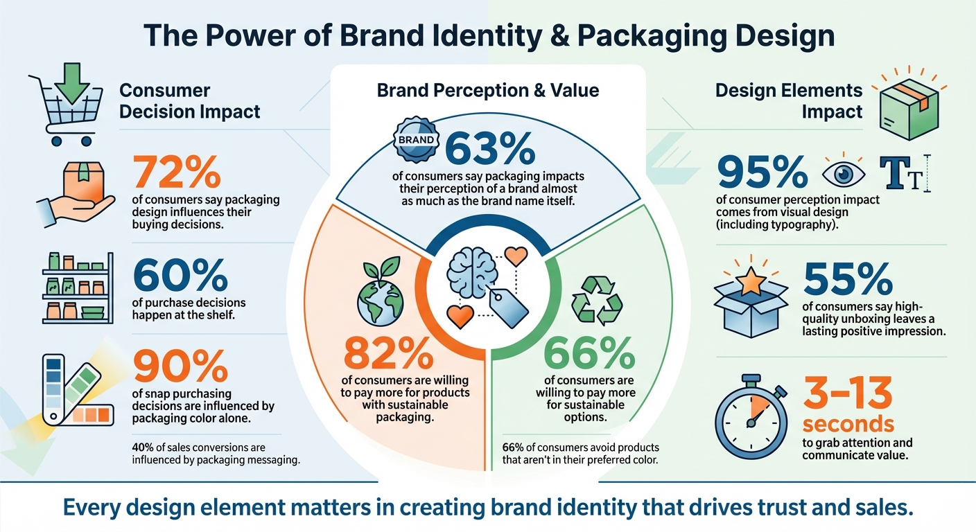
- Packaging is crucial: 72% of consumers say packaging impacts their buying choices.
- Start with strategy: Define your brand's mission, vision, and target audience.
- Color and typography matter: Colors evoke emotions, and fonts convey personality.
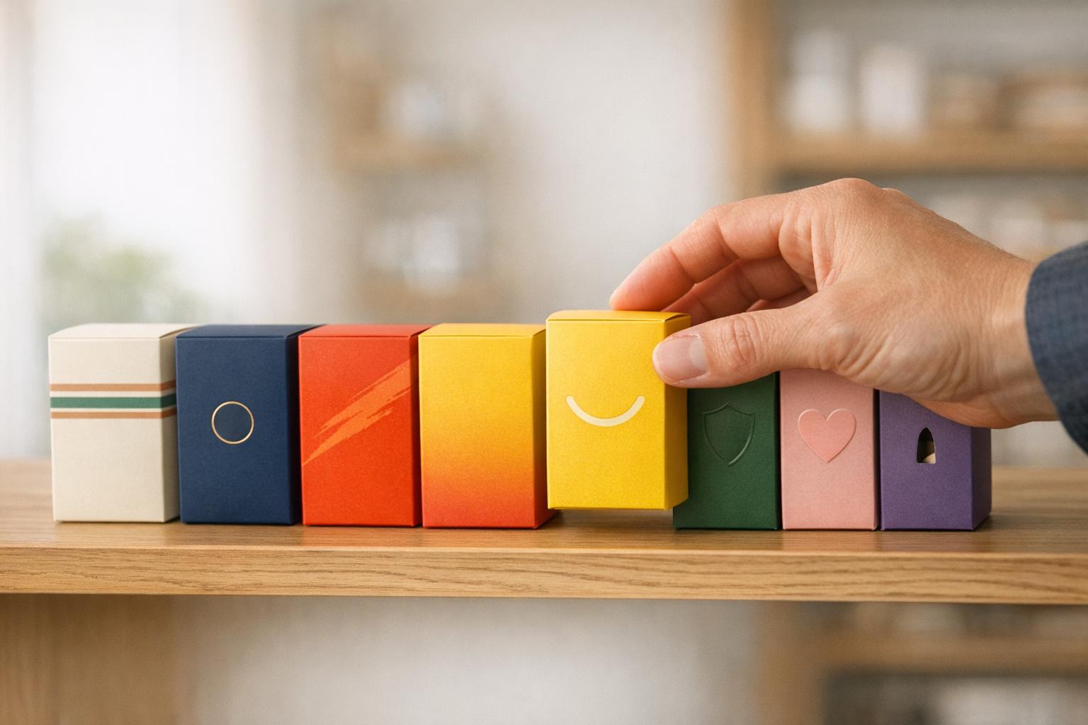
- Tell a story: Use visuals and materials that reflect your brand's values.
- Test and refine: Use consumer insights to ensure your design resonates.
A strong brand identity isn't just about aesthetics - it's about creating a connection that drives trust and sales.
Key Brand Identity Statistics: Packaging Impact on Consumer Decisions
1. Define Your Brand Strategy and Values
Before diving into logo designs or deciding on colors, you need to answer a core question: what does your brand stand for? Your brand strategy is the backbone of everything that follows. It transforms your product from just another item on the shelf into something consumers recognize, trust, and choose time after time. Without a clear strategy, your packaging risks looking generic and forgettable.
Here’s a compelling fact: packaging messaging influences about 40% of sales conversions, and 63% of consumers say packaging impacts their perception of a brand almost as much as the brand name itself. Take G Fuel, for instance. By undergoing a strategic repositioning, the brand evolved from a niche supplement to a dominant energy drink for gamers, achieving $350 million in annual sales.
Your strategy needs to answer three key questions: Why does your brand exist? Who is your audience? What sets you apart? These aren’t just theoretical exercises - they’re the framework that keeps your packaging focused and impactful.
Before you start designing, take a step back and evaluate your brand using tools like the Brand Development Index (BDI) to measure your market performance. Set SMART goals - specific, measurable, achievable, relevant, and time-bound - like increasing market share or building consumer trust. Also, finalize your actual copy early, as legal requirements and product claims will shape your design choices. By tackling these steps upfront, you’ll ensure every design element reflects your brand’s essence and connects with your ideal customer.
Create Your Brand Mission and Vision
Your mission statement defines why your brand exists today, while your vision outlines where you’re headed in the future. Together, they act as a compass for your packaging design. For example, if sustainability is at the heart of your mission, that should influence every decision - from using biodegradable materials to incorporating earthy tones and eco-friendly messaging.
Your packaging should bring your values to life through materials, colors, and tone. A great example is Divine Chocolate, which uses Ghanaian "adrinka" symbols in raised metallic ink on its wrappers. This design choice not only looks stunning but also highlights the company’s commitment to the 85,000 family farmers in the Kuapa Kokoo cooperative who co-own the brand. It’s packaging with a purpose - something consumers can feel and connect with.
Start by crafting a clear mission statement that answers: What problem does your product solve? What values guide your business? Your vision should then outline your long-term goals. Once these are defined, create a brand style guide that establishes rules for logo usage, color codes (HEX/CMYK), and typography. This ensures consistency across all platforms - whether it’s your website, social media, or retail displays. Consistency builds trust and makes your brand instantly recognizable.
Identify Your Target Audience
Effective packaging starts with knowing who you’re designing for. Understanding your audience - their preferences, concerns, and shopping habits - is essential to creating a brand identity that resonates. This goes beyond simple demographics like age or income. You need to develop a detailed buyer persona that captures their mindset, values, and what drives their purchasing decisions.
Here’s a striking statistic: 90% of snap purchasing decisions are influenced by packaging color alone. For instance, environmentally conscious millennials will respond differently to color schemes and messaging than Gen Z shoppers seeking personalized, lifestyle-driven products. When Yucatan revamped its packaging to appeal to younger consumers, it saw a 34% jump in purchase preference - proof that tailoring design to your audience pays off.
To understand your ideal customer, conduct research into their shopping behaviors, pain points, and product expectations. Use these insights to guide choices around packaging materials, colors, and messaging tone. Before finalizing your design, test it with at least 500 target consumers through "gut check" testing to ensure it resonates. Keep in mind, your packaging has just 3 to 13 seconds to grab attention and communicate your value. By deeply understanding your audience, you can craft a design that stands out and connects in a crowded market.
Develop Your Unique Selling Proposition (USP)
Your packaging is your first chance to show consumers what makes you different, which is why your Unique Selling Proposition (USP) is so important. It’s not enough to have a great product - you need to clearly communicate why it’s better and why that difference matters to your audience. This means translating product features into benefits that speak directly to your buyer persona.
Lee Fredericksen, Managing Partner at Hinge Marketing, explains it well:
"A brand promise is an extension of a company's positioning... it's the tangible benefit that makes a product or service desirable."
Your USP should be front and center - both visually and verbally. For example, Tailwind redesigned its packaging to emphasize flavor-forward cues and reposition its brand. The result? A 29-point increase in purchase intent compared to the category leader, Liquid I.V.. That’s the power of a clear and compelling USP.
To develop your USP, start by analyzing competitors to identify opportunities where your brand can stand out with distinct colors, imagery, or messaging. Align your design choices with your brand’s personality - serif fonts can convey tradition and trust, while bold sans-serif fonts suggest energy and modernity. Also, consider how your product is displayed on the shelf. If it’s on the bottom, make sure key messaging is placed on the top of the packaging where it’s most visible. Above all, ensure your visuals match the product experience to build trust and encourage repeat purchases. A well-defined USP, paired with thoughtful design, can double sales in just a few months.
sbb-itb-0c3a5ed
2. Use Color Psychology in Packaging Design
Your brand strategy sets the foundation, but color choices are what truly bring your visual identity to life. Colors aren’t just decorative; they’re powerful tools that influence emotions and drive buying decisions. In fact, about 90% of snap purchasing decisions are based on color alone. That’s why selecting the right colors isn’t just about creativity - it’s a deliberate move that can directly impact your sales.
Ferenc Andahazy, Creative Director at Smartpress, highlights this perfectly:
"Colors can have huge emotional connotations, and therefore can directly impact our decisions."
Take RIPT Apparel as an example. They swapped their black "buy" button for a green one and saw a 6.3% increase in conversions. Similarly, Minor Figures Coffee shifted to a minimalist design between 2018 and 2021, which played a part in a 400% revenue jump over three years. These examples prove that color isn’t just a design element - it’s a business strategy.
Let’s break down how specific colors influence consumer emotions and behaviors.
How Colors Influence Emotions
Colors evoke distinct emotional responses, shaping how consumers perceive your product. Red, for instance, is known to stimulate the nervous system, creating urgency. This makes it a go-to for impulse buys and food products that trigger appetite. In one A/B test by HubSpot, a red call-to-action button outperformed a green one by 21%.
Blue, on the other hand, signals trust and reliability. It’s the most universally liked color and is widely used in industries like finance, healthcare, and premium tech to inspire confidence. Products like bottled water or health supplements often lean on blue to reassure consumers.
Green is synonymous with nature and wellness, making it a staple for organic and eco-friendly brands. A great example is Bare Snacks, which uses earthy tones to highlight its commitment to natural ingredients, fostering consumer trust. Yellow, with its cheerful and affordable vibe, is often used for children’s products and budget-friendly lines. Meanwhile, black exudes luxury and sophistication, frequently seen in high-end fashion and premium spirits. Purple is associated with creativity and premium quality, making it a favorite for skincare and wellness products.
Here’s a quick guide to matching colors with product categories:
| Color | Psychological Meaning | Ideal Product Categories |
|---|---|---|
| Red | Energy, urgency, appetite | Snacks, energy drinks, sauces |
| Blue | Trust, reliability, calmness | Bottled water, health tech |
| Green | Nature, health, sustainability | Organic foods, plant-based products |
| Black | Luxury, sophistication | Premium chocolates, high-end spirits |
| Yellow | Optimism, warmth, friendliness | Cereals, children’s products |
| Orange | Cheerfulness, affordability | Juices, budget-friendly snacks |
| Purple | Creativity, indulgence | Gourmet foods, skincare |
| White | Simplicity, purity, modernity | Dairy, health-focused items |
With this understanding, you can craft a color palette that aligns with your brand’s identity and resonates with your audience.
Build a Consistent Color Palette
Once you grasp the emotional power of colors, the next step is to create a cohesive palette. Start with a dominant color that reflects your brand’s core message, then add one or two secondary colors for flexibility. Use accent colors to highlight key elements like call-to-action buttons or product features.
To maintain consistency, include exact HEX, RGB, and CMYK codes in your brand style guide. This ensures your colors look the same across print, digital, and packaging materials. Research shows that 66% of consumers avoid products that aren’t in their preferred color. Before finalizing your palette, test it under different lighting and shelf conditions to see how it performs against competitors. ISO-certified hardcopy proofs can help ensure accuracy during production.
Leverage consumer data to validate your color choices. Behavioral insights can reveal which hues resonate most with your audience and drive purchase decisions. For example, if you’re targeting Gen Z, bold and vibrant colors that enhance personalization and unboxing experiences might be ideal. For eco-conscious shoppers, earthy tones like muted greens and browns convey environmental responsibility. The goal is to balance aesthetics with data, creating a palette that not only looks appealing but also drives results.
3. Choose Typography That Matches Your Brand Personality
After defining your color palette, the next step in shaping your brand’s identity is selecting the right typography. Fonts do more than just make text readable - they convey your brand’s essence. In fact, visual design, including typography, plays a massive role in attracting buyers, accounting for 95% of the impact on consumer perception. For instance, an elegant script font can immediately suggest luxury, while a clean sans-serif feels modern and accessible.
Each font style carries its own psychological message. Serif fonts, for example, evoke tradition, trust, and timeless sophistication. These are often used by banks or premium brands like Rolex. On the other hand, sans-serif fonts lean toward simplicity and innovation, making them a go-to for tech companies and contemporary brands. Script fonts bring warmth and a personal touch - Coca-Cola’s iconic script is a perfect example of creating a friendly, fun vibe. Meanwhile, bold or display fonts pack a punch, projecting strength and grabbing attention, which is ideal for standing out on crowded shelves.
Jessica Laracy, Senior Designer at Ethos, sums it up beautifully:
"Typography really is an art in and of itself. You can express so much with just a font and nothing else."
Choosing fonts that align with your brand’s values and appeal to your target audience is key. For instance, a premium chocolate brand might benefit from a sophisticated serif to highlight quality and heritage. Conversely, a tech-focused energy drink aimed at Gen Z could use a bold sans-serif to emphasize modernity and energy. Like a well-chosen color palette, typography becomes a silent but powerful advocate for your brand.
Balance Style and Readability
Expressive fonts can grab attention, but they must also be functional. Packaging needs to work in various contexts - whether viewed from a distance on a store shelf or closely examined by a consumer. Research shows that 72% of shoppers say packaging design influences their buying decisions, and they often make those decisions in just a few seconds.
To ensure clarity, establish a visual hierarchy. For example:
- Brand name: Large and prominent (e.g., 192+ points)
- Secondary details: Medium size (24–55 points)
- Tertiary text: Legible but smaller (8–10 points)
Avoid text smaller than 5 points, as it becomes unreadable. Also, think about shelf placement. If your product is on a lower shelf, make sure critical information is displayed on the top or upper face of the packaging. Test your typography at actual size and from typical viewing distances to confirm readability. While decorative fonts can add flair to brand names, keep functional text like ingredient lists simple by using clear serif or sans-serif fonts with adequate spacing.
These practical choices not only enhance the design but also ensure your packaging communicates effectively in retail environments.
Pair Fonts for Visual Consistency
Keep your font selection streamlined - limit your design to two or three fonts to avoid visual clutter. Too many typefaces can confuse your message. A common and effective strategy is to pair a bold display font for headings with a clean, minimal sans-serif for body text.
Thoughtful font pairing reinforces your brand’s visual identity. A good rule of thumb: if your primary font is a serif, use a sans-serif as the secondary font, and vice versa. This contrast creates a clear distinction between text elements without causing visual strain. For example, pairing a bold slab serif for your product name with a simple sans-serif for nutritional information can be both functional and visually appealing. Avoid combinations where fonts are too similar in style or weight, as this can create an awkward or cluttered look.
Document your typography choices in a brand style guide. Include details like font sizes, capitalization rules, and spacing adjustments to maintain consistency across all packaging, SKUs, and marketing materials. Fine-tune kerning (spacing between letters) and leading (line spacing) to ensure clarity and readability. Lastly, make sure you have the proper commercial license for any font used in your packaging. Individual fonts typically cost $10–$30, while full font families can range up to $100.
4. Use Imagery and Storytelling
Visuals are more than just decoration - they're a direct line to your customers' emotions. Did you know that 72% of consumers say packaging design influences their buying decisions?. That means every visual element on your packaging needs to pull its weight, telling your brand's story in an instant.
Think of your packaging as your hardest-working salesperson. As designer Valo Bonilla puts it:
"Your packaging is your best-paid salesperson: It works 24/7, sits at the point of sale, and reinforces your positioning every time it's seen".
The imagery you choose should reflect your brand's story - its roots, purpose, and the values your customers hold dear. For instance, a wellness brand might lean into nature-inspired visuals and handwritten fonts to evoke warmth and authenticity. Meanwhile, a tech-forward energy drink could use bold, dynamic illustrations to scream innovation and energy.
Your brand's history and core values should anchor every visual choice. For example, a packaging refresh for a leading bloody mary mix led to a 7-point lift in purchase intent. Another strategic design effort boosted purchase intent among millennials by 32%. These results prove that thoughtful visual storytelling isn't just about aesthetics - it directly impacts sales.
Adding tactile elements like soft-touch finishes, embossed textures, or uniquely shaped bottles can create a deeper connection with customers. Iconic designs - like Pringles' tube or Absolut's bottle - become instantly recognizable, acting as a "secret handshake" with your audience. Even the unboxing experience matters. Use the inside of your packaging to share thank-you notes, brand stories, or eye-catching patterns to leave a lasting impression. These details naturally lead into creating a visual hierarchy that guides your customer’s eye.
Tell Your Brand Story Through Imagery
Your brand's visuals should weave a clear, memorable story. As Valo Bonilla says:
"A logo might be recognized. A story is remembered".
Great packaging doesn’t just label a product - it communicates your brand’s identity, mission, and values. Start by creating a visual hierarchy that directs the consumer's attention. Arrange elements so their eye naturally moves from the logo to the product name and then to the key benefit. This ensures your message is clear, even on a crowded shelf.
Stay true to your brand. Use imagery that accurately represents what’s inside the package - this builds trust. For example, if sustainability is a core value, use eco-conscious visuals and materials. If you’re going for a vintage vibe, nostalgic imagery can create an emotional connection. But be careful with trends: jumping on the wrong ones can confuse your audience and dilute your brand’s identity.
Maintain Consistency Across All Channels
Consistency is key to building trust. A familiar visual identity reassures customers and makes your brand instantly recognizable, whether on a store shelf or online.
To achieve this, create a style guide that outlines specific rules for imagery, like brand-specific filters, editing styles, and icon themes (e.g., rounded vs. sharp-edged). This ensures your visuals align seamlessly across all platforms - social media, packaging, and your website - while sticking to your brand's typography and color standards [7][10].
For brands with multiple product lines, a design system can balance variety with cohesion. Take Coca-Cola as an example: its Red, Diet (silver), and Zero (black) cans each have distinct colors to differentiate the products, but the typography and logo remain consistent. This approach ensures instant recognition while allowing for variety within the brand [7].
5. Select Packaging Materials and Functionality
Just like color and typography define your brand's personality, the materials you choose for packaging tell a story about your commitment to quality and responsibility. In fact, 82% of consumers are willing to pay more for products with sustainable packaging. This means your material choices don't just affect costs - they shape how customers perceive your brand before they even open the box. But sustainability isn't the only factor to weigh. Your materials also need to protect the product, fit your budget, and create a memorable experience.
Finding the right material means balancing environmental impact, durability, and cost. For example:
- Paper and cardboard are affordable and recyclable but lack natural water resistance.
- Glass offers a premium feel and is fully recyclable, though it’s heavy and fragile.
- Metal delivers a sleek, durable look but can dent during transit.
- Plastic is lightweight and sturdy but raises environmental concerns unless recycled or made from bio-based alternatives.
This balance is crucial - not just for your brand image but for keeping operations efficient.
Choose Eco-Friendly Packaging Materials
Certifications like FSC, RCS, or How2Recycle can verify your eco-friendly efforts. These certifications not only build trust with environmentally conscious shoppers but also help you stay compliant with evolving regulations.
If you want to go a step further, explore innovative materials like seaweed-based films, mushroom packaging (mycelium), or algae-based inks. For instance, Algae Ink absorbs more carbon during production than it emits. If you’re using sustainable materials, make sure to highlight this on your packaging - it’s a selling point for the 66% of consumers willing to pay more for sustainable options. Plus, lighter materials can help you reduce both your carbon footprint and shipping costs. Pair these eco-friendly choices with practical designs to ensure your packaging is as functional as it is appealing.
Balance Appearance and Practicality
Packaging that doesn’t protect the product or is hard to use can damage customer loyalty. That’s why prototyping is essential - test your materials for performance during shipping, unboxing, and everyday use. As Kyle Welker, Structural & Graphic Designer at York Container Company, explains:
"Packaging should be seen as an integral part of the product, not an afterthought at the end of the design phase".
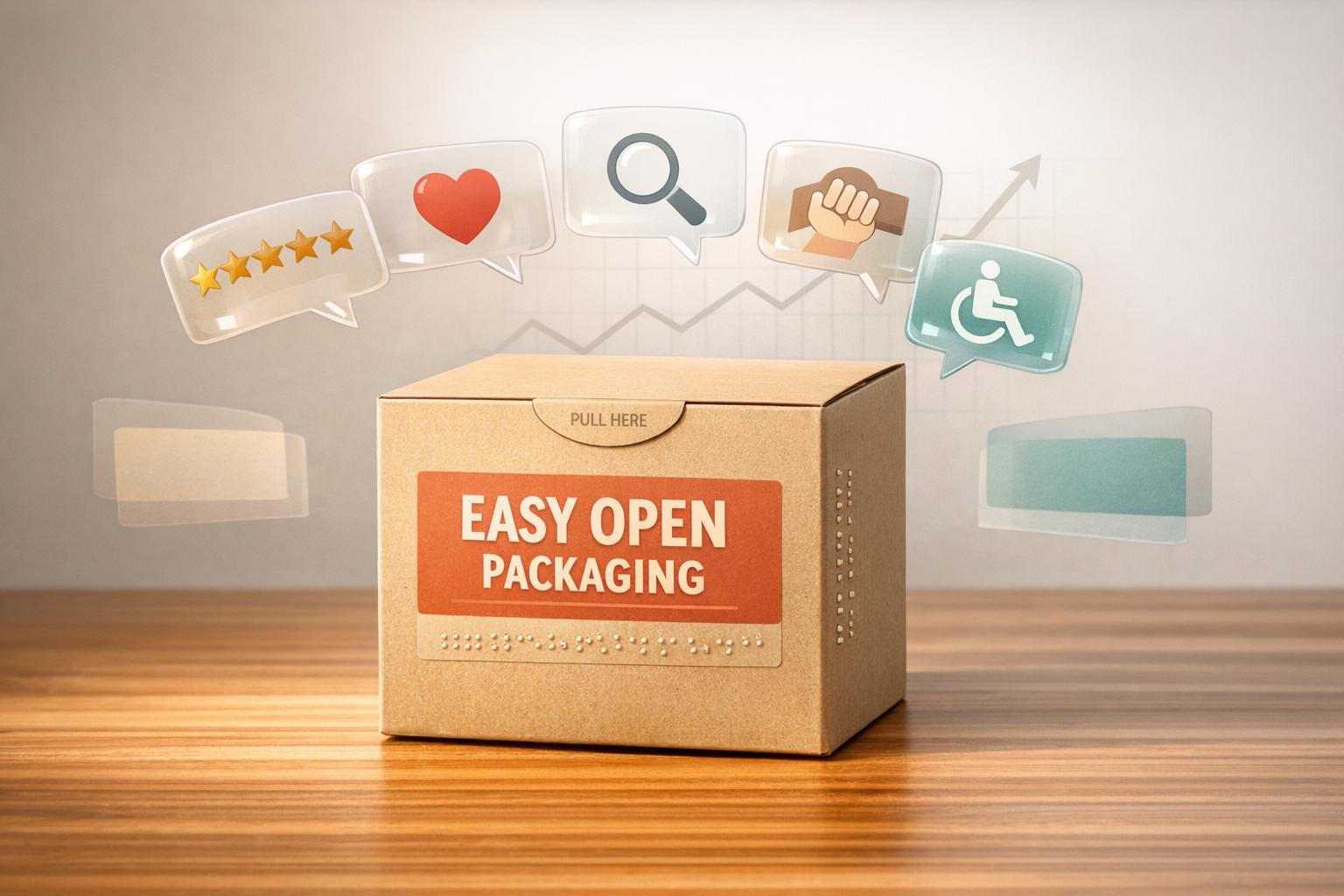
To elevate the user experience, consider incorporating tactile elements like soft-touch finishes, embossing, or die-cut windows. Functional features such as easy-open mechanisms, resealable closures, and ergonomic handles can also make a big difference without compromising protection. And don’t underestimate the power of a thoughtful unboxing experience - 55% of consumers say high-quality unboxing leaves a lasting positive impression. Add finishing touches like custom tissue paper, thank-you notes, or bold interior patterns to make your packaging unforgettable.
How Consumer Insights Improve Brand Identity
A strong brand strategy and design are essential, but consumer insights take them to the next level by testing how they hold up in the real world. Packaging that looks great on paper must also deliver in retail settings. Consumer research bridges the gap between what your brand aims to communicate and how shoppers actually perceive it.
Research ensures that your brand story resonates with your audience and remains focused. A competitive audit, for example, can uncover areas where your competitors fall short and reveal opportunities to make your brand stand out. Instead of relying on guesswork, consumer insights help you identify the exact factors that influence purchasing decisions. These findings lay the groundwork for deeper research.
Collect Data Through Consumer Research
Effective consumer research starts with retail immersion. This involves capturing over 50 shelf photos across various retail channels - grocery stores, mass retailers, and specialty shops. Observing how your packaging stacks up against competitors in real-life settings provides insights far beyond what a studio evaluation can offer. Combine this with one-on-one consumer interviews and on-demand surveys to gather honest feedback on what grabs attention and what might confuse shoppers.
Consumer chatter platforms also offer a unique way to collect feedback. These social interfaces allow shoppers to share unbiased opinions in a conversational setting. A/B testing different packaging designs provides hard data on which version has the most market potential. In-store intercepts, where researchers engage with shoppers directly, offer real-time insights into consumer behavior at the point of purchase.
Adjust Design Based on Consumer Preferences
Once you've gathered the data, the next step is to refine your design based on what consumers want. Taking an agile approach - quickly iterating designs in response to feedback - helps reduce risk and ensures your packaging appeals to your target audience. Focus on the three key factors from Nielsen's BASES model: Catch Attention (stand out on the shelf), Connect the Message (deliver your brand story effectively), and Communicate Clearly (keep the focus sharp).
Fine-tune details like font styles and sizes to ensure they match the message you're trying to convey. After launch, track metrics such as website traffic, search trends, and social media engagement to see if your packaging continues to perform.
As Kevin Keating, President of PKG Brand Design, explains:
"The ultimate goal? Packaging that not only looks great but also drives real results."
PKG Brand Design's Consumer First® Approach
 PKG Brand Design operates with a clear philosophy: "Everything starts with the consumer. That's our only rule." Unlike traditional design methods, this approach prioritizes consumer insights from the very beginning, ensuring that every packaging design speaks directly to its intended audience. This consumer-focused mindset is the foundation of everything PKG offers.
PKG Brand Design Services Overview
PKG Brand Design delivers services aimed at crafting a strong and memorable brand identity. Their Brand Strategy services include market positioning, competitive analysis, and developing a brand personality that tells a compelling story. For Brand Identity, they focus on creating and testing names and logos that resonate with consumers. When it comes to Packaging Design, the goal is to blend visual appeal with functional design. This includes graphics, photography, copywriting, and print-ready files, all working together to communicate your brand's story effectively.
Every service is guided by PKG's proprietary methodology, ensuring designs that not only look great but also deliver tangible results, staying true to the principles of consistency and consumer connection outlined in this guide.
How the Consumer First® Approach Works
The Consumer First® process is structured around a methodology inspired by Nielsen's BASES framework. It focuses on three essential elements: Catch Attention (stand out on the shelf), Connect the Message (tell your brand story effectively), and Communicate Clearly (keep the message focused). The process begins with a targeted retail immersion to evaluate competitors and identify opportunities, followed by a brand audit to assess the strengths and weaknesses of your brand and its competitors.
Consumer engagement plays a central role in this approach. PKG gathers insights through one-on-one interviews with carefully selected consumers, on-demand surveys with shopper panels, and their proprietary Consumer Chatter Tool. This tool, designed like a Facebook interface, encourages open and stress-free conversations. These insights are quickly turned into design concepts, tested, refined, and optimized for final production.
A Design/Packaging Director at Hillshire Brands shared their experience working with PKG:
> "The final design had great success in the marketplace really moving the needle on our brand's modernity and helping maintain its leadership in the category. But what really sets PKG apart are the people. A true partnership - consider them an extension of our team."
PKG Brand Design Pricing Plans
Our Consumer First® philosophy shapes these pricing plans, ensuring they cater to your need for packaging design that’s both research-driven and impactful. Each tier is designed to deliver measurable results that connect with your audience.
PKG Brand Design offers three clear pricing options to suit projects of varying scopes. While all plans focus on consumer-centric packaging, they differ in the level of research, design iterations, and deliverables provided.
Pricing Plan Breakdown
| Plan Name | Price | What's Included | Revisions | What's Not Included |
|---|---|---|---|---|
| Starter | $5,000 | Package Design for 1 Product, 2 Packaging Concepts | 2 Rounds | Final production art, photography, stock images |
| Basic | $12,000 | Logo & Package Design for 1 Product, 2 Logo Concepts, 3 Packaging Concepts, Consumer Eye Tracking Test | 2 Rounds | Final production art, photography, stock images |
| Premium | $20,000 | Logo, Packaging & Research for 1 Product, 4 Logo Concepts, 4 Packaging Concepts, Consumer Eye Tracking Test, Package Research Study | 3 Rounds | Final production art, photography, stock images |
The Starter plan is ideal for businesses with established branding that need focused packaging design for a single product. The Basic plan takes it a step further, including logo creation and consumer eye tracking to understand how shoppers engage with your packaging on the shelf. For the most comprehensive solution, the Premium plan offers additional design concepts, an extra revision round, and a full package research study to validate your design with real consumer insights before production.
Please note: Final production artwork, stock images, and photography are not included in any plan and will involve additional costs.
When planning your packaging strategy, remember that design fees are just one part of the equation. Material costs, printing options, and overall packaging budgets must also be factored in. Allocating these costs early can help you avoid unexpected redesign expenses. Connect with PKG early to choose the plan that best fits your needs and budget.
Conclusion: Building a Strong Brand Identity
Creating a strong brand identity starts with defining your core values and truly understanding your audience. At its heart lies your brand strategy - your mission, vision, and unique selling proposition - which serves as the blueprint for everything else. From there, design elements like colors, typography, and imagery breathe life into your brand, forging emotional connections with consumers.
Did you know that 60% of purchase decisions happen right at the shelf? This makes your packaging a critical player in the buying process. The right design choices - like an eye-catching color palette, easy-to-read typography, and imagery that resonates - can inspire trust and create an emotional bond. Even the materials you choose matter: 82% of shoppers prefer brands that align with their values, which can heavily influence their decisions.
But it doesn’t stop at design. A successful brand identity evolves with insights. Instead of relying on guesswork, using consumer data helps refine your strategy. Testing designs with real shoppers before launching ensures your packaging grabs attention and communicates effectively. This approach marries the creativity of design with the science of consumer behavior, saving you from costly redesigns later.
PKG Brand Design’s Consumer First® approach puts your audience at the center of the design process. Whether you choose the Starter plan or the Premium package, which includes full consumer research, the focus remains the same: creating packaging that connects with people before it even hits the shelves. As a Design/Packaging Director from Hillshire Brands shared:
"The final design significantly moved the needle on our brand's modernity and maintained our category leadership. But what really sets PKG apart are the people. A true partnership... I always consider them an extension of our team."
FAQs
How can I make sure my brand identity connects with my target audience?
To make sure your brand identity strikes a chord with your audience, focus on designing **packaging that embodies your brand’s values and personality**. Use visual elements like **color schemes, typography, and materials** to craft a story that connects on an emotional level and meets consumer expectations.
Consistency matters - keep a unified look and feel across all your packaging. This not only strengthens recognition but also builds trust with your audience. Take the time to learn what your audience values and expects. By aligning your design with their preferences, you can create a memorable experience that fosters loyalty.
Blending storytelling, smart design, and audience insights will help your packaging stand out and make a lasting impression.
How does color influence consumer behavior in branding and packaging?
Color has a strong influence on consumer behavior, sparking emotional reactions and forming connections with a brand's identity. For instance, green is often linked to ideas of health and sustainability, while blue is associated with trust and reliability - qualities that make it a favorite in sectors like finance and healthcare.
Thoughtful color choices in packaging design can do more than just look appealing. They can grab attention, emphasize important details, and stir emotions that align with your brand's message. By selecting colors that truly connect with your audience, you can make your packaging visually engaging, boost brand recognition, and even sway buying decisions.
How can understanding consumers improve packaging design?
Understanding your audience is crucial when designing packaging that resonates. It’s about uncovering what drives their choices - preferences, habits, and emotions - and using that knowledge to create packaging that feels relatable and trustworthy. By tailoring elements like **colors**, **fonts**, and **materials** to match what consumers find appealing, brands can build a stronger connection with their target market.
Studying how consumers make decisions, whether browsing online or shopping in-store, helps brands design packaging that grabs attention, communicates their message effectively, and leaves a lasting impression. This not only strengthens **brand recognition** and **trust**, but also inspires loyalty, giving businesses an edge in crowded markets.