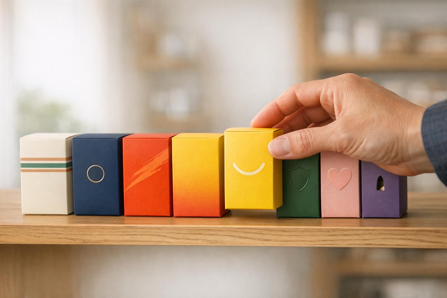
Packaging can make or break a product. With 76% of purchase decisions happening in-store within seconds, clear, functional, and visually appealing packaging is essential. However, many brands fall into these five common mistakes:
- Unreadable Labels: Overcrowded designs and small fonts confuse shoppers.
- Poor Color Choices: Misaligned colors make products blend into shelves.
- Wasteful Packaging: Excess materials frustrate eco-conscious buyers and increase costs.
- Hard-to-Open Designs: Frustrating packaging can ruin the customer experience.
- Inconsistent Branding: Typos and mismatched designs erode trust and recognition.
Fixing these issues involves prioritizing clarity, testing designs in real settings, and aligning packaging with customer needs and brand identity. Simple improvements, like better fonts, thoughtful color schemes, and functional designs, can boost sales and customer satisfaction.
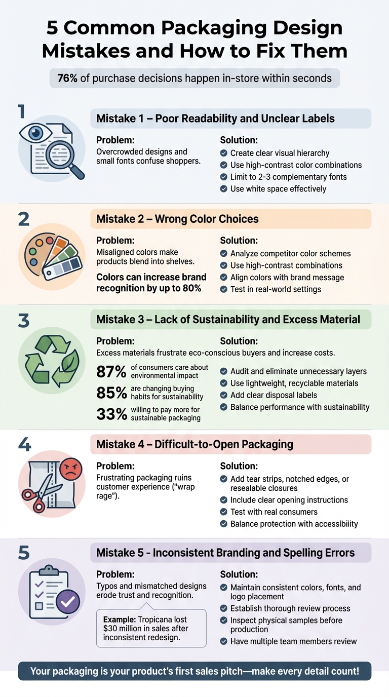
5 Common Packaging Design Mistakes and How to Fix Them
Mistake 1: Poor Readability and Unclear Labels
When shoppers glance at a shelf, they make split-second decisions. Your label needs to communicate instantly. But many brands miss the mark by cramming in too much text, using fonts that are too small, or designing layouts so cluttered that shoppers just move on. And the worst part? It’s not your product quality they’re rejecting - it’s the lack of clarity on your label.
Why Readability Matters
Cluttered designs create negative feelings. When a label overwhelms shoppers with too many fonts or low-contrast colors, it doesn’t just look bad - it frustrates them. Studies show that poorly designed packaging can activate parts of the brain tied to negative emotions. If people have to squint or work hard to figure out what your product is, they’ll assume it’s not worth their time and choose a competitor instead.
A clear label should answer three key questions at a glance: What is this product? Who is it for? Why do I need it?. If these answers aren’t obvious, trust erodes. Worse, hard-to-read labels can obscure crucial details like allergen warnings or nutritional facts - putting you at legal risk and damaging consumer confidence.
When you improve readability, you don’t just make your product easier to understand - you also make it more appealing.
How to Improve Label Clarity
Start by creating a clear visual hierarchy. Make your product name and its main benefit the focal points on the front panel, using bold, large fonts. Secondary details, like ingredients or certifications, should go on the sides or back, where they won’t distract from the main message . Stick to high-contrast color combinations (like black text on a white background) to ensure your label is easy to read both in-store and online.
Use white space effectively. Negative space isn’t wasted - it helps the important elements pop . Limit your design to two or three fonts that complement each other, steering clear of decorative scripts for critical information. Before finalizing, test your design with shelf impact trials in a real retail setting. What looks great on a computer screen might not stand out on a crowded shelf. Always check print proofs to ensure colors and text look sharp on your chosen material .
"Whitespace isn't wasted space - it helps key elements stand out. Use it wisely!" - Sara Lopez, Copywriter
sbb-itb-0c3a5ed
Mistake 2: Wrong Color Choices
Colors do more than just make a product look good - they silently work to grab attention and influence decisions. In fact, 76% of in-store purchase decisions happen within seconds. If your color palette misses the mark, your product risks blending into the background or sending the wrong message entirely. Picking colors that clash with your brand identity or blindly following shelf trends can render your product invisible. This highlights the importance of understanding how color impacts emotions and branding.
The Role of Color in Branding
Colors trigger instant emotional reactions. For example, blue is often associated with trust and dependability, which is why companies like Facebook and PayPal use it. Red, on the other hand, conveys energy and urgency - think Coca-Cola or Netflix. Meanwhile, green is commonly linked to health and eco-consciousness, making it a go-to choice for brands focused on sustainability. Using the right colors can even increase brand recognition by up to 80%.
The problem? Many brands design their packaging without considering the competitive landscape. A sleek, minimalist design might look great online but could fade into the background on a shelf packed with vibrant products. Low-contrast combinations, such as light text on a light background, can also make your labels hard to read.
"If your packaging doesn't disrupt the visual pattern on the shelf, it won't get noticed. No matter how beautiful it is." - Arno Kooijman, Founder, Brandpulse Analytics
Choosing the Right Colors
To make the most of color's emotional pull, choosing the right palette is key. Start by analyzing your competitors’ color schemes. If most products in your category lean toward muted earth tones, a bold, high-contrast palette might make your product pop. That said, your colors should still align with your brand message and your audience's expectations. For instance, while black and red might work for a bold coffee brand, tea drinkers might expect softer, calming shades like pastels or greens.
High-contrast combinations are also essential to ensure your product name and benefits are easy to read - even from a distance. Test your packaging in real-world settings, like crowded store shelves, and on digital platforms, such as mobile thumbnails (e.g., 200x200 pixels). Lastly, develop a consistent color palette for your brand and use it across all products. This consistency builds recognition and trust over time.
Mistake 3: Lack of Sustainability and Excess Material
Using too much packaging not only wastes resources but also drives up production costs. Think about it: when a product shows up wrapped in layers of plastic, stuffed with non-recyclable fillers, or packed in an oversized box, it sends a clear message to environmentally conscious shoppers - and it's not a good one. This matters because 87% of consumers care about the environmental and social impact of the products they purchase, and over 85% are actively changing their buying habits to prioritize sustainability.
Excessive packaging doesn’t just hurt the planet; it hits your bottom line too. Every unnecessary ounce adds to production and shipping costs, while bulky packaging eats up valuable warehouse space and limits truck capacity. By trimming down on materials, you can save money and align with the growing demand for eco-friendly practices.
Why Sustainability Matters
Sustainable packaging isn’t just a trend - it’s a customer expectation. Over 33% of consumers are willing to pay more for products with sustainable packaging, and 88% say they feel more loyal to companies that prioritize environmental issues. When your packaging reflects a commitment to sustainability, it builds trust and creates lasting connections with customers who share these values.
"Packaging design is a top driver for shoppers who value sustainability." - Explorer Research
Yet, achieving sustainability goals isn’t easy. Only 7% of companies successfully implement sustainability transformations - a rate far lower than other types of business changes. One common misstep? Treating sustainability as a simple material swap. For instance, switching to a biodegradable film might sound like a win, but if it compromises the product’s protection and leads to spoilage, it becomes a bigger issue. The real challenge is finding the right balance between environmental responsibility and packaging performance.
Practical Sustainability Solutions
To align with both cost-efficiency and consumer expectations, take actionable steps toward smarter packaging. Start by auditing your current materials - eliminate unnecessary layers, ensure recyclability, and adjust sizing to better fit your product. Then explore strategic upgrades, like using lightweight materials such as advanced corrugated packaging. These materials are thinner yet stronger, reducing both raw material usage and shipping emissions without sacrificing durability. For cushioning, swap out plastic air pillows and bubble wrap for recyclable paper inserts or compostable bio-polymers.
Innovative materials can also make a big difference. Many brands are now turning to bamboo paper, stone paper, and organic woven labels to replace traditional plastic-heavy designs. For example, one company introduced a proprietary HDPE bottle to showcase its eco-friendly commitment while maintaining durability.
Another key consideration: make your sustainable packaging easy for customers to recycle. Avoid combining materials - like wrapping paper around plastic - that are hard to separate, as this can confuse consumers and disrupt recycling efforts. Adding clear disposal labels with simple graphics can also help guide customers on whether the packaging is compostable or recyclable, ensuring eco-friendly materials don’t end up in the trash.
Sustainable packaging doesn’t just reduce waste; it can also drive sales. For instance, a lettuce brand rebranded itself as the "World's Cleanest Lettuce" with optimized sustainable packaging. The result? A 50% increase in sales and expansion into major national retailers.
Mistake 4: Difficult-to-Open Packaging
Ever found yourself wrestling with packaging so stubborn you needed scissors or even a knife to break through? That frustration has a name: "wrap rage".
The Impact of Usability on Consumer Experience
When packaging becomes a barrier, it can ruin the entire product experience. Even the best products can lose their appeal if the packaging is a hassle to open. It's not just a minor annoyance - struggling with packaging can leave customers with a sour impression of the brand.
"Underestimating the importance of user experience in packaging design can lead to frustration, dissatisfaction, and negative brand perception among consumers." - Packaging Gateway
The challenge is finding the right balance. Packaging needs to protect the product during shipping and handling, but it shouldn't frustrate customers when they try to access what's inside. Renee Fleck, Content Manager at Dribbble, puts it perfectly: "The packaging you choose should be strong enough to protect fragile items from getting damaged, but not to the point where customers will have to struggle to access what's inside!"
This highlights the importance of functional design - packaging that’s both protective and easy to open.
Creating Easy-to-Use Packaging
The solution lies in thoughtful design. Adding features like tear strips, notched edges, or resealable closures can turn an irritating experience into a seamless one. If your packaging requires a specific method to open, make sure to include clear instructions or icons in a visible spot. Testing is also crucial: place your packaging mockups alongside competitors' products to see if your design is as intuitive as intended. Additionally, usability tests with real consumers can help identify trouble spots during the opening process.
While visual appeal often takes center stage, combining aesthetics with practical functionality ensures your packaging not only looks good but also works well.
"Making it easy for customers to remove your packaging and access the product inside is an important part of creating a positive user experience." - crowdspring
Mistake 5: Inconsistent Branding and Spelling Errors
Even small typos can send the wrong message about your attention to detail and hurt your credibility. The same goes for inconsistent branding - when your logo, colors, or fonts vary across products, it becomes harder for customers to recognize and trust your brand.
Maintaining Brand Consistency
Consistency is key to building a recognizable brand. When design elements like colors, logos, or fonts differ across products, it confuses customers and weakens your brand image. Take Tropicana, for example. After a major redesign that simplified its packaging, the company saw a $30 million drop in sales because customers couldn’t immediately identify the product on store shelves.
The solution? Clear visual guidelines. Stick to the same colors, fonts, and logo placement across all products. Coca-Cola is a great example of this: its signature red color, iconic contour bottle, and cursive logo are instantly recognizable, even without the brand name. This level of consistency doesn’t just enhance recognition - it reinforces your brand’s promise every time a customer interacts with your product.
Avoiding Spelling and Grammar Errors
Visual consistency is important, but so is error-free copy. Typos and grammar mistakes don’t just look unprofessional - they can lead to expensive recalls and damage consumer trust.
"Spelling and grammar mistakes... take away from your brand's professionalism and attention to detail which ultimately is a negative reflection of your brand." - PakFactory
Establish a thorough review process for every project. Always inspect physical samples or prototypes before full-scale production to catch errors that might not be obvious on a screen. Have multiple team members review everything - from text to design - since fresh eyes often spot overlooked mistakes. For early production runs, digital printing can be a smart choice. It allows for smaller batches and makes fixing errors less costly if they’re discovered after the initial print. Remember, with 76% of purchase decisions happening in-store within seconds, your packaging needs to be flawless from the start.
Conclusion
The design of your packaging plays a crucial role in your product's success. Factors like unclear text, mismatched color schemes, wasteful materials, hard-to-open designs, and inconsistent branding can all push potential buyers away.
"With shoppers often making decisions in mere seconds, every detail of your packaging needs to work in your favor" - Kevin Keating, PKG Brand Design
Creating effective packaging means juggling several priorities. It’s about aligning consumer preferences, brand identity, and practical functionality. Packaging serves as your product’s first sales pitch, shaping how customers perceive its value before they even pick it up. To make the most impact, focus on clarity rather than trying to be overly clever, test your designs in real-world retail environments, and maintain consistent branding across the board.
"Packaging is not just about protecting the product, but above all a key element of brand communication with the consumer, aimed at capturing attention, building an emotional bond, and ultimately convincing to purchase." - Holy Studio
FAQs
What are the best ways to make my product labels easier to read?
To make your product labels easier to read, start with a simple and clean design. Choose fonts that are easy to read, with sizes and spacing that make key details - like the product name, features, and instructions - stand out. Stay away from overly decorative or complex typefaces that might confuse or overwhelm.
Maintain a balanced layout by organizing text and visuals with clear priorities. Highlight the most important information, such as usage instructions or benefits, so it’s easy to spot at a glance. Avoid clutter by skipping unnecessary graphics or excessive details that could distract from your message.
Lastly, test your labels in real-life settings. Check how they look under common store lighting or when viewed from a typical distance to make sure they’re clear and easy for consumers to read.
How does color impact packaging design?
Color plays a crucial role in packaging design. It catches the eye, reflects your brand's personality, and even influences purchasing decisions. The right color palette can stir emotions, build associations, and make your product pop on a crowded shelf. For example, bold and vibrant hues grab attention in a busy store, while softer, muted shades can convey sophistication or an eco-friendly vibe.
Maintaining consistency in your color choices is essential. A unified color scheme across all your products reinforces your brand’s identity, while strategically placed accent colors can draw focus to key features or special promotions. It’s also worth noting that colors can have different meanings depending on cultural and regional contexts, especially in the U.S. Thoughtfully chosen colors not only make your packaging visually appealing but also boost brand recognition and leave a lasting impression on customers.
Why does sustainable packaging matter for my brand?
Sustainable packaging has become a priority for many brands because today’s consumers are paying closer attention to how products impact the planet. More and more shoppers are choosing companies that actively address environmental concerns. By using eco-friendly packaging, your brand can not only meet these expectations but also earn trust and strengthen its reputation.
But it’s not just about appealing to environmentally conscious buyers. Sustainable packaging can lead to practical benefits for your business too. It can lower material costs, reduce waste, and streamline operations. Making sustainability a focus isn’t just good for the environment - it’s a smart way to set your brand apart in a crowded market while showing your dedication to creating a better future.