Not all packaging designs have done well for the products or brands they represent. Here are a few examples of designs that have not led to positive results and what we can learn from them.
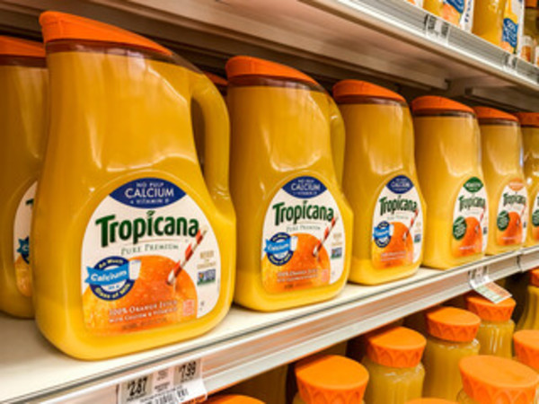
Tropicana
Tropicana is one of the most famous examples of what can go wrong with new packaging design. In 2009, this iconic juice brand introduced a more modern look, which only lasted two months on the market. During this time, sales dropped 20%, prompting executives to drop the new look fast.
This packaging design is notable because of its brief time on store shelves. The original CPG packaging was comprised of rich colors and had a premium feel. The new design used clean lines and lacked the visual appeal of the previous packaging.
The Tropicana logo was displayed on the side of the packaging in a different font than before, making it difficult to read. The product became less distinguishable, resulting in a switch back to the previous packaging.
Monopoly
Hasbro’s Monopoly is one of the most popular board games of all time. In 2008, the brand implemented new packaging design that made the product almost unrecognizable. It catered to an urban, young-adult audience, and used a more modern look.
The traditional houses became condos, all with a faux vintage looks and feels. This version of the game didn’t sell nearly as well and is rarely seen on store shelves.
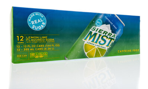
Sierra Mist
The Sierra Mist lemon-lime soda brand drastically changed its packaging design in 2009-2010. The decision was made by Arnell, the same firm that created the failed Tropicana design.
The new can featured a “misty” looking product title that was difficult, if not impossible, to read. The background consisted of lines that were meant to resemble vines that would give the product a “natural” vibe. This, however, did not depict a refreshing beverage that is caffeine-free and naturally sourced. It didn’t take PepsiCo long to eliminate this packaging design.
Lipton Tea
In 2015, Lipton Tea rolled out new packaging design. Rather than wrapping each tea bag in paper, the iconic brand used foil for its 100-count box of tea bags.
Instead of individually wrapping each bag, they placed four groups of 25 tea bags in four paperboard trays. A gold foil sleeve encased each tray. While this was visually appealing, it missed its mark with consumers, some of whom were concerned about the freshness of the tea. “Once the foil sleeve is opened, tea bags [lose] their potency and begin to go stale.”
Others missed the cleanliness the individually wrapped bags provided. Others suggested wrapping each bag in the foil.
Lipton continues to offer its products using different packaging designs depending on the bag count in each box.
Conclusion
There are many reasons why a CPG packaging design fails. Changing the look can make the product difficult to locate. A visually appealing, functional design doesn’t work well if the package is hard to open. Creating packaging design that isn’t recyclable or doesn’t keep products fresh may put consumers off.
Regardless of the reason, it’s important to remember not every packaging design will be a winner. Conducting proper research and listening to consumers will help you find the right balance between what to keep and what to change.
PKG Brand Design is always on the forefront of new CPG branding and packaging initiatives. Subscribe to our blog for the latest package design industry news!