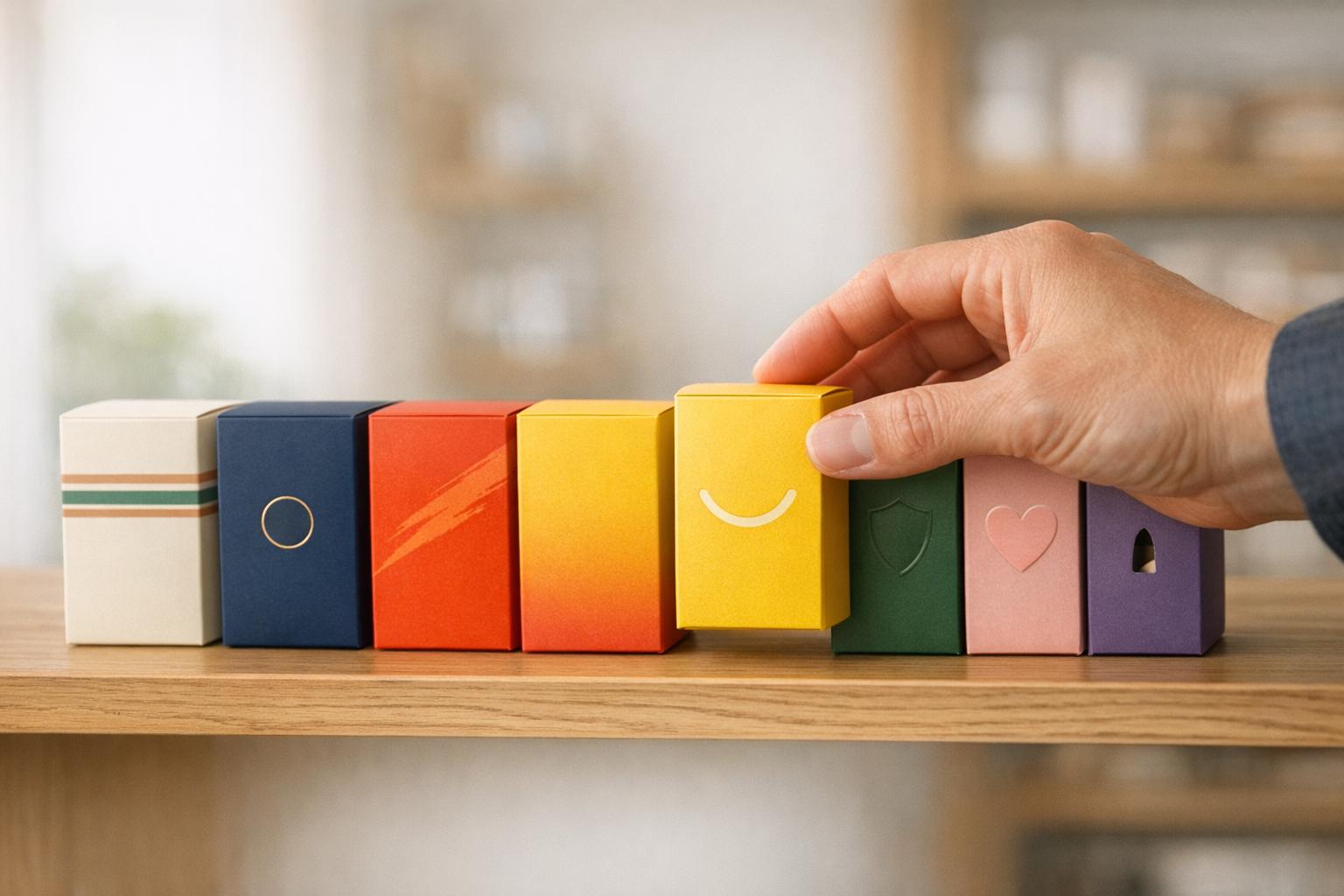
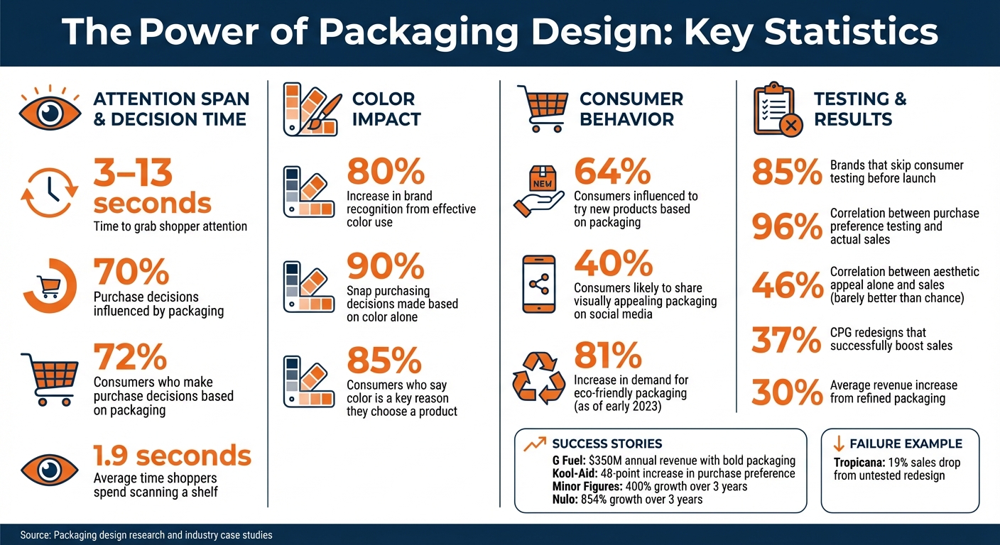
Packaging design is your product's silent salesperson. With only 3 to 13 seconds to grab attention, it influences up to 70% of purchase decisions. Effective packaging combines four principles: clarity, consistency, creativity, and consumer focus. Here's what matters most:
- Clarity: Make product value instantly obvious. Use visuals over text and organize information for quick scanning.
- Consistency: Reinforce brand identity with unified colors, fonts, and logos. This builds recognition and trust.
- Creativity: Stand out on crowded shelves with bold designs that drive purchase intent, not just aesthetic appeal.
- Consumer Focus: Design for your audience's preferences, whether that's eco-friendly materials or ease of use.
Testing is critical. Brands that test packaging before launch see higher sales and avoid costly mistakes. For example, G Fuel's redesign helped them reach $350 million in annual revenue, while Tropicana's untested update caused a 19% sales drop.
In short, packaging isn't just a container - it's your most powerful marketing tool.
Packaging Design Statistics: Impact on Purchase Decisions and Brand Recognition
The 4 Core Principles of Effective Packaging Design
When it comes to creating packaging that grabs attention and drives sales, four principles stand out: clarity, consistency, creativity, and consumer focus. These aren't just trendy ideas - they're the backbone of designs that succeed on crowded shelves. Here's a closer look at how each principle works.
Clarity: Helping Shoppers Instantly Understand
Shoppers don’t have time to figure out complicated packaging. With only 3 to 13 seconds to make an impression, your design needs to communicate the product and its value immediately. The trick? Visuals over text. As NielsenIQ explains:
"If you want to convey the freshness of an orange or the satisfaction of a chip, don't talk about it - show it".
Clarity also means organizing information in a way that’s easy to scan. For instance, pairing flavor visuals with their matching text can eliminate confusion. Arrange key details in the order shoppers naturally read, based on how the product sits on the shelf. The goal is simple: make it quick and easy for customers to identify the product and feel confident about their choice. And don’t overpromise - misleading visuals can damage trust and hurt your brand in the long run.
Consistency: Building Strong Brand Recognition
Your product should be instantly recognizable. Studies show that color alone can increase brand recognition by up to 80% and influence 90% of snap purchasing decisions. This is why maintaining consistent logos, colors, and fonts across your entire product range is critical.
Take Minor Figures, a plant-based brand, as an example. Since 2018, they’ve used a cohesive aesthetic across everything from oat milk cartons to branded merchandise. This approach helped them grow by 400% over three years, backed by a $9.8 billion investment to expand in the U.S.. Similarly, Kenvue saw a 5% sales boost when they unified the branding for Zarbee's Naturals.
Stick to one or two font families for all your packaging. Work with color experts to ensure consistency across different materials - small variations can weaken your branding. And before going into production, use physical mockups to confirm that your design looks consistent and recognizable from every angle.
Creativity: Standing Out in the Aisle
To grab attention, your packaging needs to do more than just look different - it has to break through the shopper's autopilot mode. G Fuel is a great example. By using bold and innovative packaging, they turned a niche supplement into a top gaming beverage, now generating $350 million in annual sales. Kool-Aid also saw success by tweaking their pouches and refreshing their branding, which led to a 48-point increase in purchase preference.
But creativity should always serve a purpose: driving purchase intent. Research shows that designs created just for "likability" only resulted in sales increases 46% of the time - barely better than chance. On the other hand, designs that enhanced purchase preference were 96% predictive of actual sales. Avoid clutter that distracts from your message. Use imagery that evokes emotion - like showing a handful of chips instead of just one, which can increase cravings. And always test your creative ideas to ensure they deliver measurable results.
Consumer Focus: Designing for Your Audience
Packaging can influence 64% of consumers to try new products, and 40% are likely to share visually appealing designs on social media.
"Effective packaging isn’t about what looks good to you - it’s about what matters to your customers." - Kevin Keating, President, PKG Brand Design
Earth Breeze offers a great example. Their redesign balanced messaging about product effectiveness with eco-friendly values, leading to a 13-point increase in purchase intent and above-average sales at Walmart. The lesson? Understand what your audience values most and let that guide your design. If sustainability is a priority, use materials and messaging that reflect it. If convenience is key, make that clear through the structure and layout of the packaging. Every design choice should feel like it was made specifically for your audience - because it was. Aligning with their needs is what drives results.
sbb-itb-0c3a5ed
How to Organize Information on Packaging
Good packaging design isn't just about looking great; it’s about making sure the most important details grab attention right away. Organizing information effectively ensures customers notice what matters most.
What Information to Include
Packaging needs to deliver the right details, but not all information deserves equal emphasis. Studies reveal that 72% of consumers make purchase decisions based on packaging. This means prioritizing and displaying key details in a way that resonates.
Here’s what to include:
- Brand identity: Your logo, colors, and tagline should be front and center.
- Purchase drivers: Highlight features like "gluten-free" or "organic" that influence buying decisions.
- Regulatory details: Include ingredients, nutritional facts, and barcodes.
- Usage information: Instructions, warnings, and expiration dates belong here.
The front of the package should focus on your brand and purchase drivers, while legal and usage information can go on the back or sides. For temporary details like expiration dates or batch numbers, leave space for updates.
A critical tip: Limit the front panel to three visual cues. Ron Romanik from Packaging World explains:
"Less is often more - communication-wise. Be succinct, both verbally and visually. Three main visual cues are all that the typical eye will tolerate." - Ron Romanik, Packaging World
Trying to cram too much information on the front can overwhelm shoppers, making your core message less effective. Keep it simple and impactful.
Arranging Information by Importance
Once you’ve identified the essential details, the next challenge is arranging them in a way that draws attention. A proven hierarchy to follow is: 1) Brand, 2) Product, 3) Variety, 4) Benefit. This mirrors how consumers naturally scan packaging and helps them quickly understand what they’re looking at.
Placement is equally important. Eye-tracking studies show that shoppers often start scanning 20%–30% below the top of the package - the ideal spot for your brand logo. From there, position the product name and key benefits in a way that guides the eye naturally. For products on higher shelves, ensure branding is visible from below; for lower shelves, make key messaging easy to spot.
Visual hierarchy plays a big role too. Use larger fonts, bold colors, or striking images to make your most important element - whether it’s your brand or a standout benefit - the focal point. Supporting details should appear smaller and less prominent. This approach ensures that in the 5–15 seconds a shopper spends glancing at your product, your key message stands out.
Using Color, Typography, and Images to Stand Out
When it comes to grabbing attention in a retail setting, visual elements like color and typography play a crucial role. On average, shoppers spend just 1.9 seconds scanning a shelf before deciding whether to pick up a product or move on. That means your packaging has to make an immediate impact. By leveraging color, typography, and imagery, you can evoke emotions, communicate brand values, and differentiate your product in a crowded marketplace - all in those fleeting moments. Let’s break down how these elements, starting with color, influence consumer behavior.
How Color Affects Consumer Perception
Color is the first thing shoppers notice, and it has a direct effect on their purchasing decisions. In fact, about 85% of consumers say color is a key reason they choose a product. Additionally, using color effectively can boost brand recognition by up to 80%. Eye-catching packaging doesn’t just look good - it can trigger reward responses in the brain, which may encourage impulsive buying while reducing reflective thought.
Colors also communicate specific product attributes. For example, green often signals organic or eco-friendly qualities, blue suggests cooling effects, and different shades can hint at flavor profiles without the need for text. Certain colors like red, yellow, green, and pink are particularly effective because their wavelengths naturally draw the eye. If you want your product to stand out, consider using a contrasting color compared to your competitors - this creates the Isolation Effect, making your item more noticeable on the shelf. For example, orange packaging in a sea of blue can make a lasting impression. Earth tones and natural visuals are especially popular for brands emphasizing environmental responsibility, while seasonal or limited-edition colors appeal to collectors and create a sense of urgency.
Choosing Fonts That Work
Typography is another key element that influences how consumers perceive your brand. It’s not just about readability - it’s about personality.
"A well-chosen font can instantly communicate whether your product is premium or affordable, modern or classic." - Kevin Keating, President, PKG Brand Design
For example, Minor Figures Coffee revamped its packaging with a sleek, minimalist design and clean typography, leading to 400% growth over three years and $4 million in revenue.
The type of font you use sends subtle psychological signals. Ornate script fonts suggest luxury and elegance, perfect for high-end products, while bold sans-serif fonts feel modern and straightforward, making them ideal for tech or health-related brands.
| Font Type | Psychological Association | Best Use Case |
|---|---|---|
| Fancy Script | Prestige, Elegance, Maturity | Luxury goods, high-end spirits |
| Hand Script | Casual, Playful, Youthful | Children’s products, artisanal snacks |
| Serif Print | Stability, Class, Tradition | Heritage brands, print-heavy labels |
| Sans-Serif | Modernity, Simplicity | Tech products, modern health brands |
| Decorative | Unique, Whimsical, Fun | Novelty items, limited editions |
Readability is just as important as style. Sans-serif fonts are better for quick glances and digital screens, while serif fonts work well for longer text in print. Always test your typography on physical packaging - what looks great on a screen might not translate well to a bottle or box. Another tip? Use font families with multiple weights (like bold, semi-bold, and light) to create a clear hierarchy. This ensures that product names stand out while ingredient lists remain easy to read.
Packaging Structure and Material Choices
Effective packaging is more than just a container - it’s a key part of the overall brand experience. The structure and materials of packaging influence durability, shelf appeal, and even how satisfying it feels to the touch. Three main factors shape structural design: the physical form (like shape, size, and ergonomics), functionality (ease of use, resealability), and material choices (strength and environmental considerations). When these elements work together, they create a cohesive experience. But if they fall short, customers may look elsewhere.
Packaging plays a major role in purchasing decisions. In fact, it influences 70% of buying choices and impacts 72% of consumers. Brands that refine their packaging often see real results - revenue increases of 30% are not uncommon.
Structural Design and Practical Benefits
The design of your packaging has a big impact on everything from how it looks on a shelf to how well it performs during shipping. A well-thought-out structure ensures products survive the journey from warehouse to store, stack neatly to maximize shelf space, and arrive intact when shipped via e-commerce. Take stand-up pouches, for example. They’re a favorite for snacks and detergents because they save space, use less material, and are resealable for convenience. On the other hand, rigid designs like the Pringles tube excel at protecting the product and maintaining a consistent shelf presence, though they may not be as eco-friendly as flexible alternatives.
The way a package feels also matters. Textures, raised lettering, and other tactile elements can sway a consumer’s decision during that critical moment when they hold the product. Packaging that’s difficult to use - like hard-to-open seals or awkward shapes - can frustrate buyers and push them toward competitors. Features like ergonomic grips help prevent spills and enhance perceived quality, while resealable closures keep products fresh for repeated use. Even small adjustments, like custom folds, can strengthen packaging without adding bulk.
But structure is only part of the equation. Material choices also play a major role in meeting consumer expectations.
Choosing Eco-Friendly Materials
Today’s consumers increasingly expect brands to prioritize sustainability. As of early 2023, demand for eco-friendly packaging had risen by 81%. Ignoring this trend means risking a loss of market share. The challenge lies in finding materials that are both environmentally responsible and practical. Packaging must be durable enough to protect products during shipping, as damaged goods lead to waste and harm a brand’s reputation. At the same time, materials need to be cost-effective to maintain profitability.
Corrugated cardboard is a popular choice because it’s biodegradable and made from 90% recycled fibers. It’s also versatile, though it may need added fluting for extra strength. For snacks and produce, plant-based plastics offer compostable options that reduce reliance on petroleum. Beverage packaging like Tetra Pak has made strides, with solutions that are 82% plant-based. Glass and aluminum are infinitely recyclable but not biodegradable, while plant-based materials break down naturally but may have limitations in printing and shaping.
Design choices, like earthy tones or kraft textures, signal eco-conscious values. Clear labeling for recyclability, ethical sourcing, or vegan-friendly status builds trust with environmentally aware consumers. Before committing to a material, it’s crucial to test prototypes in real-world scenarios to ensure they can handle pressure, movement, and varying lighting conditions. Also, think about the end of the material’s lifecycle - can consumers easily recycle or dispose of it?. Compact, efficient designs that reduce wasted space during shipping not only save costs but also reinforce a brand’s commitment to sustainability.
Testing Packaging Before Launch
Skipping packaging tests can lead to expensive mistakes and wasted resources. Unlike digital ads, which can be adjusted quickly, physical packaging is permanent once it hits store shelves. Errors in packaging can result in product recalls, wasted inventory, and confusion among shoppers who might struggle to identify your product. With 72% of Americans saying that packaging design impacts their buying decisions, it’s surprising that 85% of brands skip consumer testing before launching. Testing is as important as having a clear and consistent design - it ensures your packaging delivers the right impression where it matters most: on the shelf.
Kevin Keating, President of PKG Brand Design, explains:
"Testing takes the guesswork out of design by relying on real consumer feedback rather than internal opinions." - Kevin Keating, President of PKG Brand Design
Brands that prioritize testing often see impressive results. For example, Nulo’s commitment to thorough concept testing helped it become the fastest-growing premium pet food brand in the U.S., achieving an incredible 854% growth over three years. Similarly, Yucatan saw a 30% boost in purchase intent in the U.S. and a 40% increase in Canada after testing their brand refresh. On the flip side, Tropicana learned the hard way when they updated their bottle shape and label without sufficient testing. The result? Confused customers and a sharp decline in sales, forcing the company to reverse the changes at great expense.
Creating Prototypes and Mockups
Physical prototypes can reveal flaws that digital mockups simply can’t. For instance, they let you check how the packaging feels in your hand, whether it’s easy to open, and if it can handle shipping. Using detailed 3D mockups that show multiple angles and include clear text can help replicate the real product. Structural elements like resealable closures, ergonomic grips, and material durability should be tested in the same environment where the product will be used - whether that’s a pantry, fridge, or bathroom cabinet.
When conducting A/B testing, focus on changing one element at a time - like color, font, or imagery - to pinpoint what works best. Early testing of concepts allows you to identify winning ideas before making a major creative investment. By combining the best-performing elements from different designs, you can refine your packaging into a final version that resonates with consumers. Once prototypes are polished, gathering consumer insights will help ensure your choices hit the mark.
Getting Consumer Feedback
After confirming that prototypes are functional, it’s time to test their appeal with real consumers. For reliable data, aim for sample sizes of at least a few hundred participants. Shelf simulations - whether physical or virtual - can mimic real shopping environments, showing how your packaging performs alongside competitors. Eye-tracking heatmaps, for example, can highlight which design elements grab attention first and how long shoppers focus on them. TreeTop used head-to-head testing against Capri Sun and Honest Kids, leading to an 18% improvement in purchase intent compared to the market leader.
Mock retail displays are another effective tool. They help ensure that your key messaging remains visible no matter where your product is placed on the shelf. Asking participants to choose their favorite design can reveal what truly drives their decisions - whether it’s uniqueness, visual appeal, or perceived quality. Purchase intent tests, which simulate real shopping conditions, can even predict in-market performance with 94% accuracy. Armed with this data, you’ll have a strong case to persuade stakeholders and align your team before committing to large-scale production.
Conclusion
Good packaging design does more than just hold a product - it acts as a silent salesperson, catching the shopper's eye and influencing their decisions right there on the shelf. When elements like clarity, creativity, consistency, and a strong focus on the consumer come together, packaging becomes a tool that shapes perception, encourages purchases, and solidifies brand identity. With decisions often made in just seconds, every detail matters.
Applying these principles isn't just theoretical - it delivers real results. Time and again, successful packaging redesigns have shown measurable increases in sales and consumer preference.
Testing plays a critical role in avoiding costly errors. Consider this: only 37% of CPG redesigns manage to boost sales. However, purchase preference testing boasts a 96% correlation with actual sales outcomes. Compare that to relying on aesthetic appeal alone, which shows just a 46% correlation - barely better than flipping a coin. Brands that skip consumer testing risk expensive missteps, but those that embrace data-driven methods can confidently predict shelf performance and gain retailer trust before production even begins. This process ensures the clarity, consistency, creativity, and consumer focus necessary for a winning design.
FAQs
What’s the best way to test packaging design before launching it?
Before rolling out your packaging design, it's important to test it with your target audience to ensure it hits the mark. One effective method is A/B testing. This involves presenting different design options to consumers and gathering their feedback on preferences, purchase intent, and how well the design communicates your brand message. You can collect this feedback through surveys, focus groups, or even in-person interviews.
Another approach is creating a simulated shopping experience - either online or in-store. This allows you to observe how consumers interact with your packaging in a setting that mirrors real-life conditions. It’s a great way to see which design grabs attention, communicates clearly, and ultimately influences buying decisions.
These testing methods can uncover insights that help you tweak your design to better connect with your audience, reducing risks and increasing the chances of success when your product hits the shelves.
What are the main advantages of choosing eco-friendly packaging materials?
Switching to eco-friendly packaging materials comes with some clear advantages. First, it helps you connect with a growing group of environmentally aware consumers. These shoppers actively seek out brands that align with their values, and using sustainable packaging can be a great way to show you're on the same page.
But it's not just about winning over customers - it’s also about reducing waste and making smarter use of renewable or recyclable materials. This means your brand can actively lower its environmental impact, which is a win for both your business and the planet.
On top of that, adopting eco-friendly packaging can give your brand a boost in reputation. It shows you're committed to responsible practices, which builds trust and loyalty among your customers. Plus, in a crowded market, standing out as a company that values sustainability can make all the difference. By embracing this approach, you're not just keeping up with trends - you’re showing a forward-thinking mindset that resonates with today’s consumers.
How does the choice of color in packaging influence consumer behavior and purchasing decisions?
Color has a strong influence on how people view products and decide what to buy. Each color sparks unique emotions and ideas - blue and green often suggest trust and relaxation, while red can evoke urgency or energy, potentially prompting quick purchases. These emotional cues let brands connect with consumers on a deeper, subconscious level.
Using color thoughtfully can also make products pop on busy shelves, reinforce a brand's identity, and shape how customers perceive quality and value. By understanding what resonates with shoppers, brands can use color to create packaging that grabs attention, aligns with customer preferences, and ultimately boosts sales.