Color in packaging significantly impacts consumer behavior. In 2026, brands are using color to stand out, build trust, and connect emotionally with buyers. Key trends this year include:
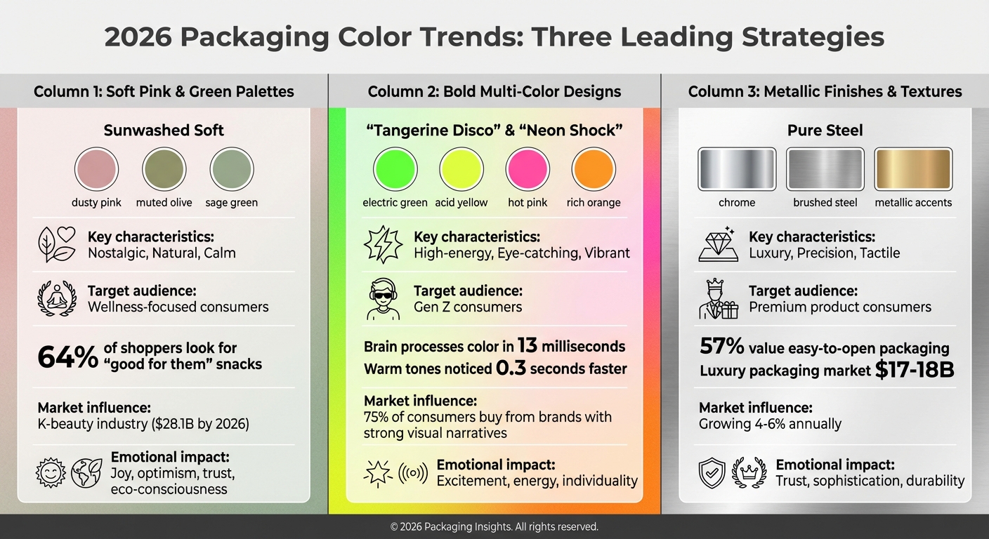
- Soft Pink and Green Palettes: Nostalgic yet natural tones like dusty pinks and sage greens are popular for wellness products, evoking calmness and eco-consciousness.
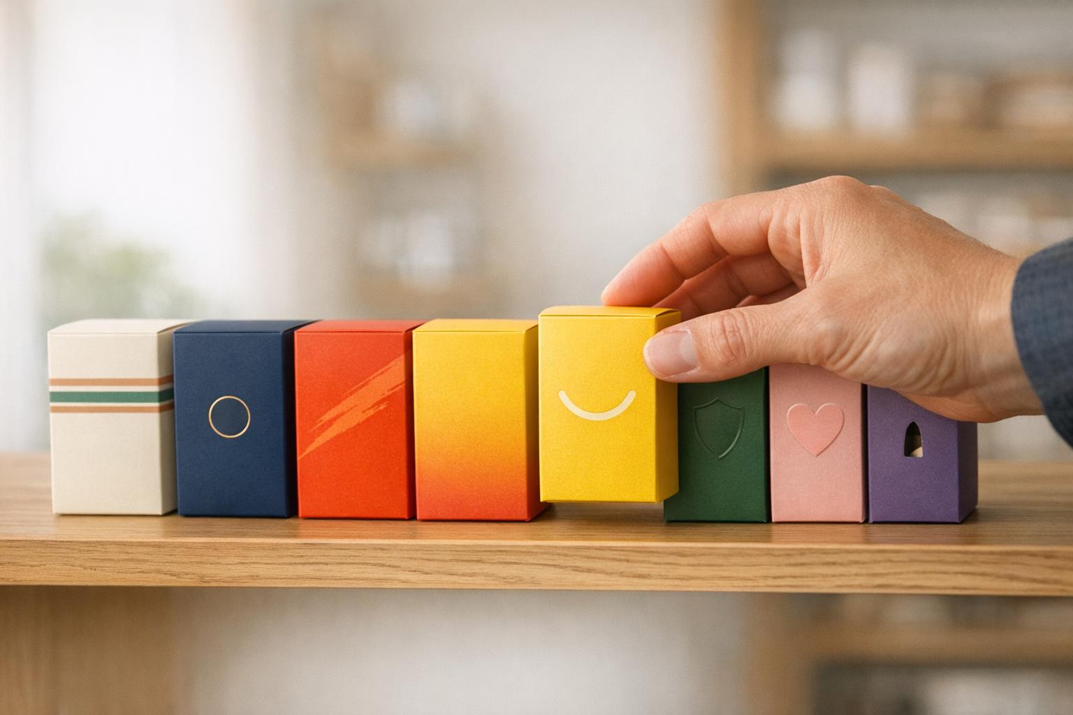
- Bold Multi-Color Designs: High-energy palettes with electric greens, acid yellows, and hot pinks dominate Gen Z-focused products, creating eye-catching moments.
- Metallic Finishes and Textures: Chrome and brushed steel convey luxury and durability, while tactile packaging builds trust and elevates the consumer experience.
With 85% of purchase decisions influenced by color, brands are blending timeless hues with trend-driven accents to stay relevant. Regulatory changes, like the FDA's upcoming Red No. 3 ban, are also driving shifts toward natural palettes. Whether targeting digital or physical markets, the right colors can make or break a product's success.
Leading Color Trends for 2026 Packaging
2026 Packaging Color Trends: Three Leading Color Strategies Compared
Soft Pink and Green Color Schemes
The "Sunwashed Soft" palette is reshaping how brands connect with consumers, blending dusty pinks, muted olives, and sage greens to create a nostalgic yet natural aesthetic. These colors strike a balance between warmth and authenticity, making them perfect for wellness-focused branding.
"This trend taps into nostalgia to spark emotion in your brand. Remember leaving toys out in the sun until they faded? Now that washed-out, sun-soaked vibe is exactly what makes designs feel warm, retro, and full of character." – Justin Hamra, Creative Director, VistaPrint
This palette aligns with consumer preferences, as 64% of shoppers look for snacks marketed as "good for them". Soft pinks evoke joy and optimism, while greens like matcha and sage suggest trust and eco-consciousness. The influence of the K-beauty industry, which embraces this "Clinical with Soul" aesthetic, cannot be overlooked - it’s projected to surpass $28.1 billion by 2026. While these gentle tones bring a sense of calm, they also contrast beautifully with bolder, more dynamic color schemes.
Bold Multi-Color Designs
For brands aiming to stand out, high-energy palettes like "Tangerine Disco" and "Neon Shock" are grabbing attention, especially among Gen Z. Vibrant shades such as rich oranges, electric greens, acid yellows, and hot pinks create a sense of excitement and energy. These colors aren’t just visually striking - they’re scientifically effective. Your brain processes color in about 13 milliseconds, faster than shapes or text. Additionally, warm tones like red and orange are noticed 0.3 seconds faster than cooler shades in busy retail environments.
A standout example is Graza, which disrupted the olive oil market by pairing bold colors with quirky characters on its packaging. This approach created "Double Take" moments that captured consumer attention on both store shelves and social media. For brands targeting younger audiences, this type of visual storytelling is essential, especially when 75% of consumers are more likely to buy from brands with strong visual narratives.
Metallic Finishes and Textured Surfaces
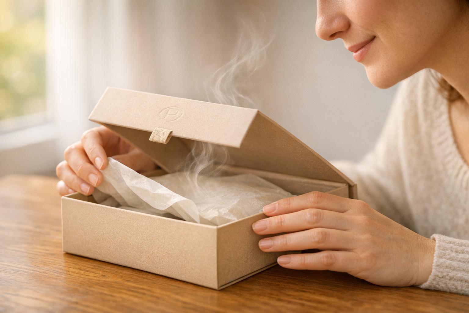
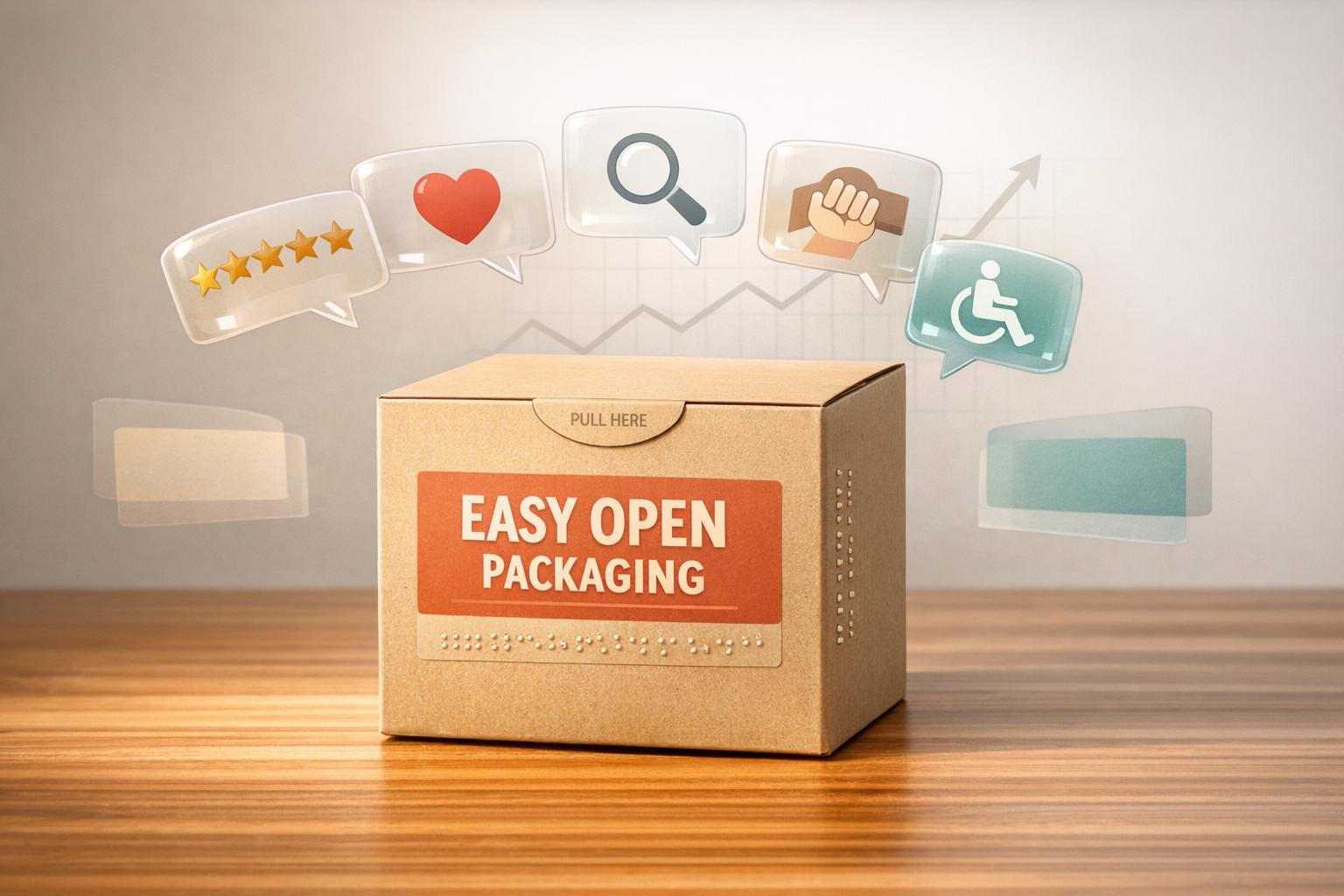
Metallic finishes like chrome and brushed steel, combined with textured surfaces, are setting a new standard for premium packaging. The "Pure Steel" trend uses mirror-like effects to convey precision and durability, making it a popular choice for tech products, cosmetics, and beverages. But this trend isn’t just about appearances - tactile elements also play a crucial role. Packaging that engages the sense of touch helps build trust, especially when 57% of consumers value packaging that’s easy to open.
"Leaning into heritage and science can help a brand feel dependable and trustworthy. This trend [Apothecary Aesthetic] helps position products to feel both premium and practical." – Mary Pho, Art Director, VistaPrint
A great example of this is Duzi Studio’s 2025 rebrand for Audrey's Chocolates, which used foil accents and luxury papers to maintain a sophisticated feel while incorporating approachable typography. The luxury packaging market, heavily influenced by metallic and textured designs, is valued at around $17–18 billion and growing by 4–6% annually. For smaller brands, the "Imprinted" style - featuring rubber stamps or textured papers - offers a cost-effective way to add a personal, handcrafted touch. These trends highlight how visual and tactile elements are shaping consumer choices in 2026, proving that packaging is more than just a container - it’s a key part of the brand experience.
sbb-itb-0c3a5ed
Balancing Trend Colors with Classic Palettes
In 2026, top brands are blending timeless color schemes with trendy accents using what’s called the "timeless core" and "controlled, reversible layers" method. Think of it this way: classic colors serve as the backbone of brand identity, building trust and recognition, while trend colors inject energy and grab attention in the short term.
This approach is often referred to as the "Anchor vs. Weapon" framework. Anchors - such as Deep Cocoa, Cream White, or Classic Tomato - provide stability and familiarity. On the other hand, trend colors - like Golden Saffron, Berry Punch, or Cool Matcha - act as tools to spark interest. A great example of this is Heinz’s recent outdoor campaign, where they removed their logo entirely, relying instead on their iconic red and 156-year-old typeface to maintain instant recognition. Similarly, Coca-Cola struck a balance by launching limited-edition Marvel cans featuring bold, modern designs, all while keeping their signature red-and-white branding intact. This balance allows brands to stay relevant while preserving their core identity, an essential strategy for navigating packaging trends in 2026.
Best Uses for Trend Colors
In line with the anchor and weapon framework, trend colors work best in specific scenarios. They shine when launching new products, running seasonal promotions, or testing limited-edition SKUs. High-contrast palettes, such as Neon Shock, are particularly effective for creating attention-grabbing "Double Take" moments, especially for challenger brands and products aimed at Gen Z consumers who value individuality and shareable aesthetics.
The trick is to use trend colors as accents rather than the main focus. Think metallic seals, hang tags, or secondary packaging that can be updated easily without driving up production costs. For example, Bournville (owned by Mondelēz International) revamped its packaging in late 2024 by bringing back an ornate 'B' from its original 1908 design and pairing it with modern color accents, preserving its heritage while adding a fresh twist. Additionally, platforms like TikTok Shop provide a low-risk environment to experiment with trend-heavy designs before rolling them out to larger retail markets.
Benefits of Classic Color Schemes
While trend colors are great for short-term impact, classic palettes offer lasting value. These timeless hues help brands maintain a consistent identity, which is especially important for long-standing products. In fact, 87% of affluent consumers prefer brands that project a sense of timelessness. Classic colors are also resilient - they hold up well against price fluctuations, market changes, and distribution challenges without needing frequent updates. This makes them ideal for core product lines in mass retail, where fleeting trends could easily fade into the background.
Moreover, 50% of consumers prioritize functional features like resealable packaging over purely aesthetic changes, showing that practicality often trumps trendiness. Classic colors also excel in ensuring readability across different materials and lighting conditions, which strengthens their role in building a cohesive, enduring brand narrative. Considering that 75% of consumers are more likely to buy from brands with strong storytelling in their packaging, it’s clear that classic palettes serve as the foundation of a brand’s identity. Trend colors, meanwhile, act as the finishing touches that keep the design fresh and relevant.
Color Strategies by Product Category
In 2026, color strategies across various product categories are being shaped by regulatory changes, consumer behavior, and the need for aesthetic appeal. Each category requires a tailored approach to meet these demands effectively.
Food and Beverage Colors
The food and beverage industry is bracing for a major shift as the FDA’s ban on Red No. 3 takes effect in January 2027. This change is pushing brands to adopt natural colorants, which often require packaging with enhanced barrier properties to maintain their quality and vibrancy.
To navigate this transition, brands can use the "Anchor vs. Weapon" framework, selecting signature hues that resonate with their product's identity. For example:
- Deep Cocoa for indulgent treats
- Classic Tomato for appetite appeal
- Cream White for a minimalist health-focused look
- Golden Saffron for a premium feel
- Cool Matcha for organic positioning
- Berry Punch for fruit-based offerings
With 64% of consumers actively seeking snacks that are "good for them", these colors need to clearly communicate health and functional benefits. The rise of GLP-1 medications - used by 23% of households as of September 2025 - has further driven the trend toward mindful eating, making "Better-For-You" palettes more relevant than ever. Additionally, brands must optimize for digital platforms like TikTok and Instagram, ensuring their colors grab attention and stand out in a scrolling feed.
Beauty and Personal Care Colors
In 2026, beauty packaging is evolving along three key themes: luxury, sustainability, and innovation. Each theme calls for distinct color strategies:
- Luxury: Colors like Midnight Black, Nude Beige, and gold or foil accents signal sophistication and timeless elegance.
- Sustainability: Nature-inspired hues such as seafoam greens, algae blues, and earthy tones like Mocha Mousse emphasize eco-consciousness and purity.
- Innovation: Futuristic tones like Liquid Steel, chrome finishes, and iridescent mauves convey precision and modernity.
Texture plays a significant role in enhancing the sensory experience. Matte finishes, soft-touch materials, and embossed logos elevate the packaging and reinforce perceptions of quality. As Rosalind Michaluk notes:
"Soft-touch materials, calming textures and tactility will create memorable ritual experiences that differentiate and elevate".
For brands targeting Gen Z, Dopaminergic Design - featuring bold, mood-enhancing colors like lavender and chartreuse - creates an emotional impact and boosts shareability on social media. The trend toward Refillable Prestige, combining durable outer cases with compostable inserts, is also influencing color strategies. This approach blends luxury with sustainability, appealing to the 75% of consumers who prefer brands with strong storytelling through packaging.
General CPG Colors
In the general consumer packaged goods (CPG) sector, 2026 is all about "color maxxing" - using bold, full-color systems to stand out on crowded shelves. As Kevin Keating, President of PKG Brand Design, explains:
"In 2026, packaging is expected to become more dynamic, engaging, and culturally resonant.".
While some brands embrace vibrant, multi-colored designs aimed at younger audiences, others stick to Ultra-Clean Industrial aesthetics, featuring muted tones like beige and gray paired with geometric patterns to signal reliability. Challenger brands often use bold colors to disrupt their categories, while established brands lean on timeless palettes to maintain trust.
Take Graza, for example. By launching olive oil in a squeeze can with high-contrast colors and playful illustrations, the brand redefined consumer expectations. Similarly, Bournville revitalized its identity in 2025 by blending heritage elements like its original 1908 flourished 'B' with modern color accents.
To counter "AI fatigue", many CPG brands are leaning into analog aesthetics - hand-drawn designs, rough textures, and imperfect, human-like visual elements. This approach resonates particularly well in the natural and "better-for-you" categories, where overly polished designs can feel inauthentic. Before finalizing any color choice for 2026, brands should conduct a "Material Test" to ensure the color performs consistently across different packaging materials like plastic, aluminum, and recycled paper.
Implementation Guidelines for 2026 Color Trends
Bringing 2026's color trends to life requires a careful mix of testing, regional customization, and staying true to your brand's identity.
Testing Colors on Different Materials
Colors can look and behave differently depending on the material they're applied to. For trends like "Mermaidcore" and "Liquid Steel", which feature metallic, iridescent, and chrome finishes, thorough testing is crucial. These finishes must retain their "fluid" or "engineered" look across materials like plastic, glass, and paper. For instance, a vibrant hue on a 14 pt. gloss cover might lose its impact on an 18 pt. ultra-premium matte substrate.
Additionally, with regulatory changes on the horizon, testing becomes even more critical. Natural pigments, while appealing, are more prone to fading than synthetic dyes. Testing for light exposure and barrier properties can help prevent degradation. Tools like 3D design software offer designers the chance to preview how gradients will appear on curved surfaces before moving to production.
Once colors perform as desired, the next step is tailoring them to regional markets.
Adapting Colors for Regional Markets
When entering regional markets, balancing local preferences with global consistency is key. Limited editions and personalized designs allow brands to add regional flair without overhauling their identity. Collaborating with local artists, for example, can create culturally resonant designs while keeping core brand elements like logos and fonts intact. As Justin Hamra, Creative Director at VistaPrint, puts it:
"Local brands and local artists go hand in hand, both driven to be unique and bring something exciting and beautiful into the world".
Regulations also play a big role in regional adaptation. California's SB 343, which takes effect on October 4, 2026, will impact how brands use green-themed palettes and recyclability claims. With 50% of consumers likely to scan QR codes for more product information, brands can use these digital tools to share localized sustainability certifications or stories while keeping packaging colors consistent. Testing small-batch runs with low minimum orders can help brands experiment with regional palettes without overcommitting to large inventories.
Once regional adjustments are made, the focus shifts to ensuring these trends enhance the brand's identity.
Maintaining Brand Identity with New Trends
The industry is embracing bold yet authentic packaging, but brands should adopt trends thoughtfully. A metallic strip, textured seal, or accent color can make a statement without requiring a full redesign. Seasonal products and limited-time offers are excellent opportunities to test out new palettes before making permanent changes. As GotPrint advises:
"It's all about making the trends work for your brand, instead of making your brand match the trends".
Neutral tones, like Pantone's "Cloud Dancer" white or "Universal Khaki", can serve as subtle backdrops that highlight logos and text. For more daring moves, such as "Double Take" packaging or "Neon Shock" accents, remember that 66% of consumers are skeptical of sustainability claims. Authenticity is more important than chasing every trend. Mary Pho, Art Director at VistaPrint, reinforces this:
"Leaning into heritage and science can help a brand feel dependable and trustworthy. This trend helps position products to feel both premium and practical".
Conclusion
The packaging trends for 2026 - ranging from soft pastels to bold metallics - present exciting opportunities for brands to connect with consumers. However, the key lies in selective adoption. A touch of metallic foil, a well-placed seal, or a neutral backdrop can elevate your brand's presence while staying true to its identity.
With 66% of consumers expressing uncertainty about the authenticity of sustainability claims, your packaging choices must do more than simply look appealing - they need to communicate trust. Drawing from your brand's heritage, using unbleached materials to showcase eco-consciousness, or incorporating hand-drawn elements can help convey authenticity in a meaningful way.
"careful blending of trends allows brands to innovate while honoring their roots." Kevin Keating, President of PKG Brand Design
Testing these trends through limited editions can be a smart way to gauge consumer reactions before making permanent changes. As Gillian Garside-Wight, points out:
"With data comes knowledge, and that knowledge enables companies to strive forward and drive meaningful change".
By combining bold accents with timeless core colors, brands can achieve both relevance and consistency. The brands that will excel in 2026 are those that find a balance between bold experimentation and staying true to their authentic story, using consumer insights to guide their decisions.
At PKG Brand Design (https://pkgbranding.com), we are dedicated to helping brands navigate these color trends with our Consumer First® approach, ensuring your unique story is preserved while embracing new opportunities.
FAQs
How can brands combine trendy colors with timeless designs in packaging?
To mix trendy colors with timeless designs effectively, brands should combine bold, attention-grabbing shades with neutral, classic tones. Vibrant colors can spark emotion and draw the eye, while neutral hues like beige, gray, or off-white offer balance and a sense of durability. This pairing ensures the packaging feels fresh yet enduring.
This strategy allows brands to stay aligned with current trends without sacrificing long-term relevance. Carefully blending these elements creates packaging that connects emotionally, appeals to a wide range of audiences, and maintains its visual appeal over time.
How will the FDA's ban on Red No. 3 affect packaging color trends?
The FDA’s planned ban on Red No. 3 is set to push packaging design toward natural and plant-based color options. With the 2027 compliance deadline on the horizon, manufacturers are actively reworking their products to meet the new standards. At the same time, brands are leaning into these alternatives to match growing consumer demand for cleaner labels and healthier ingredient choices.
This shift goes beyond just meeting regulations. It mirrors a larger movement within the industry - one that values openness and environmentally conscious practices. For today’s shoppers, who care deeply about health and sustainability, these changes strike the right chord.
How do metallic finishes and textured surfaces make packaging more appealing and trustworthy to consumers?
Metallic finishes and textured surfaces can elevate the appeal of packaging by signaling quality and a sense of exclusivity. Elements like foil accents or raised metallic details bring a sleek, high-end look that instantly draws attention. These reflective finishes not only make the packaging pop but also suggest durability and a carefully crafted product.
Textured surfaces, such as embossed patterns or soft-touch coatings, take things a step further by engaging the sense of touch. This tactile aspect adds depth, reinforcing the idea of careful craftsmanship and attention to detail. When consumers can physically feel the effort that went into the design, it creates a stronger connection to the product. Together, metallic and textured elements don’t just make packaging visually appealing - they create an emotional bond that builds trust and encourages buyers to choose the product.