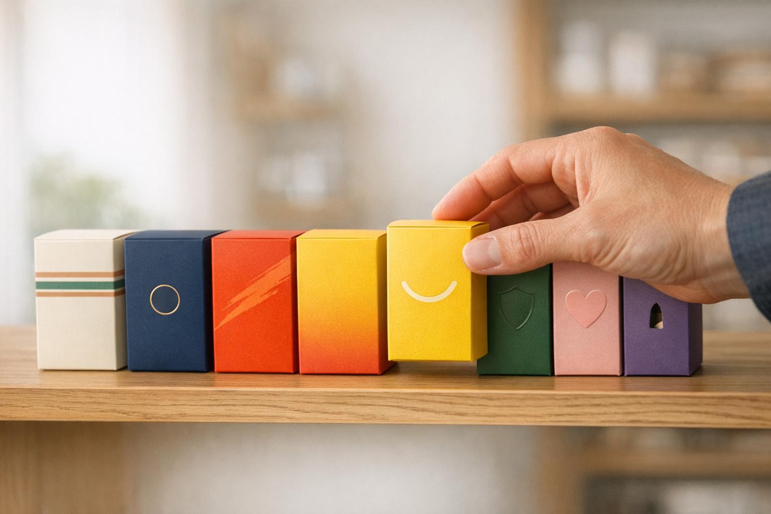
Typography on small packaging can make or break your product's appeal. With limited space, every design choice matters. Here's what you need to know to create packaging that's clear, legible, and visually appealing:
- Font Size: Stick to 8–10 points for general text. For critical details like ingredients, avoid going below 6 points.
- Contrast: Use high-contrast combinations like black on white or white on black for readability.
- Font Choices: Use sans-serif fonts for smaller text and curved surfaces. Limit to 2–3 typefaces to avoid clutter.
- Spacing: Adjust tracking (letter spacing) and leading (line spacing) for clarity, especially for text below 10 points.
- Testing: Always print physical proofs at 100% scale to ensure designs look good on actual materials.
- Material Impact: Textured or flexible surfaces may distort text; test designs to ensure legibility.
Typography isn't just about aesthetics - it ensures your message is clear and accessible, even on the tiniest packaging. Read on for detailed tips and techniques to perfect your designs.
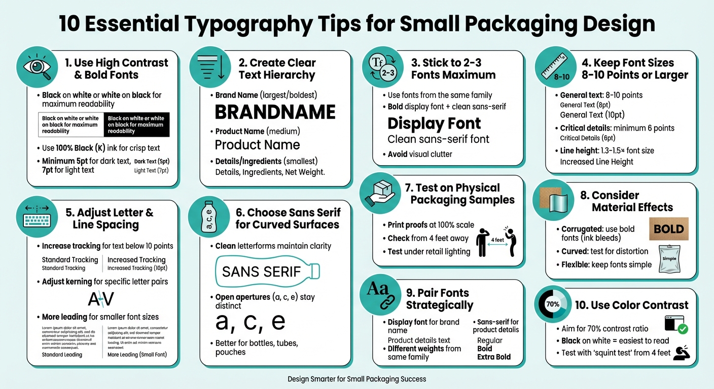
10 Essential Typography Tips for Small Packaging Design
1. Use High Contrast and Bold Fonts for Better Readability
Readability on Small Surfaces
When text shrinks below 10 points on small packaging, contrast becomes your strongest tool to maintain legibility. Without clear contrast between text and background, letters can blur together, making them hard to read. For maximum clarity, stick to black text on white backgrounds - or reverse it with white text on black. These combinations help consumers quickly scan packaging on crowded shelves.
To ensure consistent text clarity, use 100% black ink (K only) for dark text. Unlike color builds, which can appear blurry or pixelated due to misaligned ink dots during printing, black ink keeps strokes sharp and clean. For text on light backgrounds, a minimum font size of 5 points is recommended. For reversed text (light on dark), size up to at least 7 points for better readability.
Font Size and Spacing Optimization
Bold fonts are great for drawing attention, but overly heavy fonts can cause issues. For example, the counters (the open spaces inside letters like 'e' or 'a') can fill in with ink, making the text harder to read. Modern font families, such as Helvetica Now, offer special "Micro" weights designed for small text sizes (4-8 points). These fonts feature wider spacing and adjusted letter shapes to ensure clarity even at tiny sizes.
"The Micro weight is all kinds of trickery and tomfoolery, widely opening up the spacing and dramatically changing the shape of the letters... to make sure light gets in and letters don't become crowded black blobs." - Charles Nix, Type Director, Monotype
For text below 10 points, manually increase tracking (letter spacing) to prevent characters from touching. This adjustment ensures each letter remains distinct, even in small formats. These tweaks are essential for overcoming the challenges of small-scale printing.
Material and Surface Adaptability
The material of your packaging can significantly impact how ink behaves and how text appears under different lighting conditions. To avoid surprises, always print physical proofs at full scale on the actual packaging material. Relying on a computer screen for legibility checks can give you a false sense of clarity. Use vector-based file formats like .ai, .pdf, or .eps to ensure sharp, clean text across all surfaces.
High-contrast typography also helps your text withstand wear and tear. Even if the packaging gets scuffed during shipping or handling, bold text with strong contrast remains readable, ensuring key details are still accessible to consumers.
sbb-itb-0c3a5ed
2. Create Clear Text Hierarchy for Key Information
Readability on Small Surfaces
A clear text hierarchy is essential for helping customers quickly identify key information, especially on small packaging. Think of text hierarchy as a visual guide - it directs a shopper's eyes to the most critical details first. When browsing shelves, people often spend just seconds scanning a product, so it's crucial to highlight elements like the brand name, product type, and essential details in a way that's easy to spot.
"Typography helps to establish something called the hierarchy of information on packaging... Brands can actually direct the eyes of customers to specific places on packaging by using different font sizes and styles." - Mid-Atlantic Packaging
Effective hierarchy typically breaks down into three levels: Brand Name (the most prominent), Product Name (medium-sized), and Product Description/Ingredients (smaller text). This setup ensures customers can quickly grasp the essential information, which is a major advantage when time is limited. A well-structured hierarchy also makes it easier to tweak designs later without losing clarity.
Font Size and Spacing Optimization
For general readability, font sizes between 8 and 12 points work best. However, for smaller details like ingredient lists, avoid going below 6 points for dark text on light backgrounds or 7–8 points for light text on dark backgrounds.
Another key factor is spacing. When text sizes shrink, letters that are too tightly spaced can blur into an unreadable mess. To counter this, use "Micro" typefaces designed with wider apertures and spacing, which are better suited for text under 10 points.
Material and Surface Adaptability
The packaging material itself can influence how your text hierarchy appears. For example, light text on dark backgrounds often looks larger, while dark text on light backgrounds can feel more confined. Flexible materials like pouches add another layer of complexity, as text must remain legible even when the surface curves or shifts.
Always test your design on actual packaging materials to ensure the hierarchy holds up under real-world conditions. Factors like matte or glossy finishes can impact how bold or clear the text appears, so adjust font weights accordingly.
3. Stick to Two or Three Fonts Maximum
Readability on Small Surfaces
Keeping your font choices to just two or three can make a world of difference when it comes to readability on small packaging. Overloading your design with too many typefaces creates visual clutter, making it harder for shoppers to quickly grasp your brand's message during those brief moments of scanning.
"Too many font styles can lead to a busy message. One way to avoid this is to try and stick with a few fonts from the same font family." - Blue Label Packaging
A simple approach works best: choose a bold display font for your brand name and pair it with a clean sans-serif for details like ingredients and product descriptions. Alternatively, stick to a single font family and use different weights to distinguish between primary, secondary, and tertiary information.
Material and Surface Adaptability
Limiting fonts isn’t just about aesthetics - it’s also about practical printing considerations. Each additional font can introduce complications, especially when it involves mixing multiple color builds during printing. For small text, using more than three CMYK colors can lead to mis-registration issues, where colors don’t align properly. This misalignment can make text look blurry or shadowed, which is the last thing you want on your packaging.
To prevent this, small black text should always be set to 100% Black (K) rather than a CMYK build. This ensures clean, crisp strokes instead of pixelated or uneven ones. And before committing to your design, always test your font combinations on physical samples at full scale to catch any potential issues early.
4. Keep Font Sizes at 8-10 Points or Larger
Readability on Small Surfaces
Choosing the right font size is just as important as pairing fonts effectively. For small surfaces, aim for type sizes between 8 and 10 points, with 12 points being a good option for added clarity in some cases. Fonts smaller than this can blur together, making them harder to read and reducing detail. Sticking to this range ensures better readability and maintains proper letter spacing.
"Designers today are going for an aesthetic where things are of light contrast, with a lot of white space and very small type sizes. They don't consider the fact that more than 60% of people over 20, at least in America, either have or need vision correction." – Steve Matteson, Creative Type Director, Monotype
Font Size and Spacing Optimization
For small text, spacing is just as critical as size. When working with 8–10 point fonts, set the line height to 1.3–1.5× the font size and adjust tracking to ensure characters don’t crowd each other. Always use vector-based tools like Adobe Illustrator for designing small text. Unlike raster images, vector files keep your font sharp and clear, avoiding pixelation that can ruin the look of your design.
Material and Surface Considerations
The material and background color can heavily influence how readable your text is. For instance, when using light text on dark backgrounds, keep the font size at 7 points or larger to avoid the letters "bleeding" into the background. To achieve crisp results, use 100% Black (K) for small text. Lastly, don’t rely on how fonts look on your computer screen - always print a proof at 100% scale and check it from the distance your audience will view it. This ensures your design works in the real world, not just on your monitor.
5. Adjust Letter and Line Spacing for Easy Reading
Fine-tuning letter and line spacing can make a big difference in how readable text is, especially on small packaging. This step builds on earlier adjustments to font size and contrast.
Readability on Small Surfaces
When text is reduced to sizes below 10 points, the spacing between letters naturally tightens. This can cause letters to blur together, making them harder to read. To combat this, increase tracking (the overall spacing between letters) and adjust kerning (spacing between specific letter pairs, like "AV" or "Te") to keep each letter clear and distinct.
Font Size and Spacing Optimization
Line spacing - or leading - is just as important as letter spacing. Smaller font sizes need more leading to keep lines from feeling cramped, but it’s a balancing act. Too much space can make the text feel disconnected. Fonts with tall x-heights or condensed letterforms benefit from increased leading to avoid crowding.
"The smaller the type size, the greater the line spacing needed, proportionally speaking, to offset the reduced readability of small settings." – Ilene Strizver, Typographic Consultant
These adjustments should be fine-tuned based on the specific needs of your packaging design.
Material and Surface Adaptability
Just like font size and style, spacing needs to work with the material of the packaging. On textured or absorbent surfaces, ink can spread, making tight spacing blurrier and harder to read. For these materials, increase both the font size (aim for at least 10 points) and the spacing to ensure clarity.
When using reverse type - light text on a dark background - add extra spacing to counteract the way light colors can bleed into darker ones. Always test these adjustments on physical proofs to confirm the text remains legible in the final product.
6. Choose Sans Serif Fonts for Curved Surfaces
When designing for curved packaging, font choice becomes even more crucial. Unlike flat layouts, curved surfaces demand specific typographic adjustments to maintain readability and visual appeal.
Readability on Small Surfaces
Sans serif fonts are a better fit for curved packaging because they avoid the intricate details of serif fonts, which can lose clarity on rounded surfaces. Their clean and simple letterforms hold up well when printed on bottles, tubes, or pouches, ensuring the text remains legible even as the surface curves or flexes.
Studies indicate that sans serif fonts with low stroke contrast perform particularly well at small sizes, making them ideal for the quick glances shoppers use to scan shelves. Fonts with open apertures - like the letters a, c, and e - maintain their distinct shapes, even when distorted by curvature.
Font Size and Spacing Optimization
For text smaller than 10 points on curved surfaces, adjusting tracking (letter spacing) is essential. Curvature naturally compresses letters on the inner side of a bend and stretches them on the outer side, so starting with slightly looser tracking than you’d use on flat surfaces can help. Micro weight typefaces, specifically designed for small text (4–8 points), feature wider spacing and modified letterforms to counteract these distortions.
Another helpful trick is using light text on dark backgrounds, which creates an optical illusion that makes the text appear larger. This can improve the visibility of small text on curved packaging. These adjustments, combined with careful spacing, ensure that your typography remains clear and readable, even on challenging surfaces.
Material and Surface Adaptability
Sans serif fonts perform well across various packaging materials without compromising their clarity. On flexible materials like pouches and sachets, which may wrinkle or shift, these fonts stay legible regardless of orientation. As discussed earlier, always test your typography on physical proofs of the actual packaging material. Curved surfaces can reveal readability issues that might not be apparent on a computer screen.
7. Test Typography on Physical Packaging Samples
Once you've fine-tuned your typography digitally, the next step is testing it on actual packaging. Why? Because what looks flawless on a crisp, high-resolution screen doesn't always translate well to the physical world. On-screen designs can hide legibility issues that only become apparent when printed. The best way to ensure your typography works is by printing proofs at 100% scale and evaluating them under real-world conditions.
"Testing physical samples lets you confirm that your design choices hold up in the environments where they’ll actually be seen." - Kevin Keating, President, PKG Brand Design
Below, we’ll explore how to check readability, adjust font sizing and spacing, and ensure your typography fits the material and finish of your packaging.
Readability on Small Surfaces
Digital mockups often don’t reveal how typography performs in real life. By printing your design at full size, you can test legibility from different distances - just like a shopper would see it on a shelf. Stand about four feet away and see if the text remains sharp and readable. If it appears blurry or hard to read, consider increasing the font size or improving the contrast between the text and background. This step is crucial for making your packaging accessible and easy to understand.
Font Size and Spacing Optimization
Physical testing also ensures your font sizes and spacing are appropriate for real-world readability. For dark text on light backgrounds, the smallest readable font size is 5 points. For light text on dark backgrounds, you’ll need at least 7 points to maintain clarity. Key details like ingredient lists or safety warnings should be no smaller than 6 points. Testing these elements in print helps you catch any spacing or size issues before production.
Material and Surface Adaptability
Different packaging materials and finishes can affect how typography looks and feels. For example, using a CMYK color build for black text can create a pixelated or fuzzy appearance due to the way printers layer ink dots. To avoid this, set black fonts to 100% K (Key) instead of using a "rich black" CMYK mix. Additionally, test your typography on the actual packaging material to identify any problems caused by textures or coatings. Don’t forget to check under typical retail lighting conditions to ensure the text maintains its contrast and readability.
8. Consider How Packaging Materials Affect Typography
When designing typography for packaging, the material you’re working with plays a big role in how readable and effective the text will be. Smooth materials like glass often allow for sharp, clear text, but porous or textured surfaces - like corrugated cardboard - can lead to ink bleeding and other distortions.
Let’s break it down:
Corrugated Cardboard is one of the trickiest materials for small or intricate typography. Its porous nature absorbs ink unevenly, causing the text to blur or spread.
"On corrugated cardboard boxes, it would be difficult to print intricate or otherwise small fonts without the ink bleeding or expanding" - Box Genie
To counteract this, opt for larger, bold sans-serif fonts that are more resilient to ink bleeding. These fonts maintain clarity even when some spreading occurs.
Curved Surfaces, such as glass bottles or plastic jars, bring their own set of challenges. Typography that looks flawless on a flat design can become distorted when applied to a cylindrical surface. Letters may stretch or compress, so always test your design directly on the curved material to ensure it holds up.
Flexible Packaging, like pouches, adds another layer of complexity. These materials can shift or deform, which can make overly elaborate fonts hard to read. Simplicity is key here - stick to clean, straightforward fonts for the best results.
"A label should be treated as a unique ecosystem that requires teams to go back to the drawing board to design for the specific proportions of a label" - Mid-Atlantic Packaging
Each material demands specific adjustments to typography. For instance, textured surfaces often require fonts of at least 6 points for legibility. High-contrast text is also a must to ensure accessibility and clarity across all packaging types.
9. Pair Fonts to Separate Brand Name from Product Details
Strategic font pairing plays a key role in guiding a consumer’s eye from the brand name to essential product details. A smart approach? Use a bold, decorative display font for your brand name and pair it with a clean sans-serif font for the finer details. This creates a clear visual hierarchy, making it easier for consumers to navigate the limited space on small packaging.
Your brand name should stand out with the largest and boldest typeface, capturing attention immediately. In contrast, product details - like ingredients, instructions, or nutritional facts - should be set in a highly legible sans-serif font at a smaller size. This separation not only improves readability but also ensures that each element serves its purpose effectively.
"Hierarchy is the invisible guide that directs the consumer's eye when they read labels."
– Shruti Ramanujam, Artwork Flow
For a cohesive look, consider using different weights within the same font family. For example, use Bold for the brand name and Regular for the product details. This approach distinguishes text roles while maintaining a unified design. Be cautious, though - fonts that are too similar can clash, disrupting the overall harmony of the design.
Sans-serif fonts are ideal for body text and product details because they stay clear and readable at smaller sizes - something that’s crucial when working with limited space. Decorative or script fonts should be reserved for the brand name or headlines, never for critical information like ingredient lists or instructions, where clarity is non-negotiable.
This thoughtful pairing of fonts ties back to earlier principles of contrast and spacing, ensuring clarity and balance, even on the smallest packaging designs.
10. Use Color Contrast to Stand Out on Shelves
Color contrast plays a key role in grabbing attention and ensuring readability. Shoppers spend an average of just 4 seconds scanning product labels, so high-contrast designs can make the difference between catching someone's eye or blending into the background.
Readability on Small Surfaces
For small packaging, sharp contrast between text and background is a must. Black text on a white background is one of the easiest combinations to read, especially for important details like ingredients or instructions. On the flip side, white text on a dark background can create the illusion of larger lettering, which is a clever way to maximize readability in tight spaces.
Steer clear of combinations like dark-on-dark or light-on-light, as well as overly harsh pairings that strain the eyes. To ensure your design is both accessible and visually effective, aim for at least a 70% contrast ratio between text and background colors.
"Type is a visual voice. Without reading, it imparts its message."
– Laura Worthington, Type Designer
A quick way to test your design is using the "squint test." Stand about 4 feet away or squint at the packaging. If the text becomes hard to read, adjust the contrast or font size until it’s clear. Remember, on small packaging, every detail - from font size to color contrast - affects how well your design connects with consumers.
Material and Surface Adaptability
Beyond color contrast, think about how the packaging material impacts your design. Different materials interact with ink and light in unique ways, which can affect how your typography looks. For instance, textured papers or eco-friendly materials might absorb ink unevenly, reducing contrast and clarity. Similarly, glossy or matte finishes can alter how colors appear under various lighting conditions.
Testing your design on the actual packaging material is crucial. This helps identify potential issues like blurry text or color shifts, especially for very small print where precise color registration matters. As mentioned in section 7, physical samples are your best friend when it comes to catching these problems before mass production.
Wrap Up
Let's revisit some key points for mastering small packaging typography - focusing on readability, smart font choices, and thorough testing.
Start by prioritizing readability. Use sans-serif fonts for critical details and stick to a maximum of two or three font styles. Keep font sizes practical: aim for at least 8–10 points for general text and a minimum of 6 points for regulatory information. High contrast between text and background can make your design stand out while ensuring legibility.
Testing is equally important. Always print 100% scale vector proofs (like .ai or .pdf files) and review them under typical store lighting and realistic viewing distances. This step helps identify potential issues early. As Blue Label Packaging highlights, "What you see on screen can be misleading... text can be more legible on a computer screen than on a physical print".
Accessibility matters, too. Clear typography isn't just good design - it ensures your packaging connects with a visually diverse audience. Enhance clarity by adjusting letter spacing and using 100% Black (K) ink for small text to avoid blurring. Also, consider how your packaging material affects ink absorption and color accuracy.
At PKG Brand Design, we take a Consumer First® approach, integrating consumer insights and research into every project. Tools like eye tracking tests and package research studies ensure that typography choices not only look good but also perform well at retail. From concept to final artwork, we craft small packaging that combines aesthetic appeal with functional readability - because clear, effective typography can directly influence sales.
Whether you're designing for cosmetics, snacks, or travel-sized products, these principles will help you create packaging that communicates your brand’s story while driving results.
FAQs
How do I choose the best font for tiny labels?
To make sure text is easy to read on small labels, stick to fonts designed specifically for clarity at smaller sizes, such as Minuscule. You can also rely on clean, simple fonts like Helvetica, Georgia, or Verdana, which maintain legibility when scaled down. Stay away from fonts that are overly decorative or intricate - they tend to lose clarity in smaller formats. Always test various font sizes and styles to ensure everything remains readable before settling on your final design.
What’s the safest smallest type size for ingredients?
The smallest readable type size for listing ingredients on packaging is approximately 1.6 mm, measured by the height of a lowercase or uppercase 'o.' Fonts below 7 points can be difficult to read, making readability a top priority. Additionally, it's essential to review and follow regulatory guidelines to ensure your labels meet compliance standards.
How can I proof typography before mass printing?
Before mass printing, it's smart to print sample labels to evaluate key details like readability, font clarity, spacing, and color accuracy. Look closely for typos or grammatical errors that might not be obvious on a screen. Double-check that the printed colors align with your digital design and confirm that the font size and spacing work well for smaller packaging. This process helps identify and fix potential issues early, ensuring the final product looks polished and professional.