Brand guidelines ensure your packaging consistently reflects your brand identity - crucial since 72% of consumers say packaging design influences their buying decisions. Inconsistent packaging can confuse customers and hurt sales, while consistency across platforms can boost revenue by 10-20%.
Here’s how to apply brand guidelines effectively:
- Audit current packaging: Identify inconsistencies in logos, colors, fonts, and materials. Use tools like spectrophotometers and create a physical "Golden Sample" for reference.
- Define visual identity: Specify logo placement, color codes (Pantone/CMYK), typography rules, and imagery styles to maintain uniformity.
- Craft messaging: Align tone, taglines, and copy style with your brand voice. Include pre-approved text frameworks for different package sizes.
- Prototype and test: Use 3D renders and physical samples to spot design flaws. Test durability and consumer reactions to ensure appeal and functionality.
- Prepare for manufacturing: Follow technical guidelines like CMYK color mode, 300 DPI resolution, and accurate bleeds/margins to avoid costly production errors.
"Consistency in packaging builds trust, strengthens your brand, and drives sales." – Kevin Keating, President, PKG Brand Design
By following these steps, you can ensure your packaging stands out while maintaining brand integrity.
What Brand Guidelines Mean for Packaging Design
Consistent packaging is more than just a design choice - it's a reflection of your brand's identity. At the heart of this consistency are brand guidelines, which lay out the technical standards for every element of your packaging. These guidelines act as a roadmap for designers, printers, and manufacturers, ensuring your brand is represented accurately across all materials.
But these aren't just about aesthetics. They protect your brand's reputation. Something as small as a misaligned logo or an incorrect color can make customers question the quality of your product.
"Packaging is frequently the first tangible manifestation of a brand that a customer interacts with; because of this, branding and packaging go hand in hand." – Michael Dillon, Chief Revenue Officer
Brand guidelines translate your identity into practical, real-world rules for manufacturing. They address everything from how ink behaves on different surfaces to how colors appear under various lighting conditions. These details minimize design errors and keep production running smoothly. Essentially, they ensure every visual element works together seamlessly.
Visual Identity Elements
Visual identity elements are the building blocks of recognizable packaging. The guidelines should define each component with exact measurements and specifications to maintain consistency.
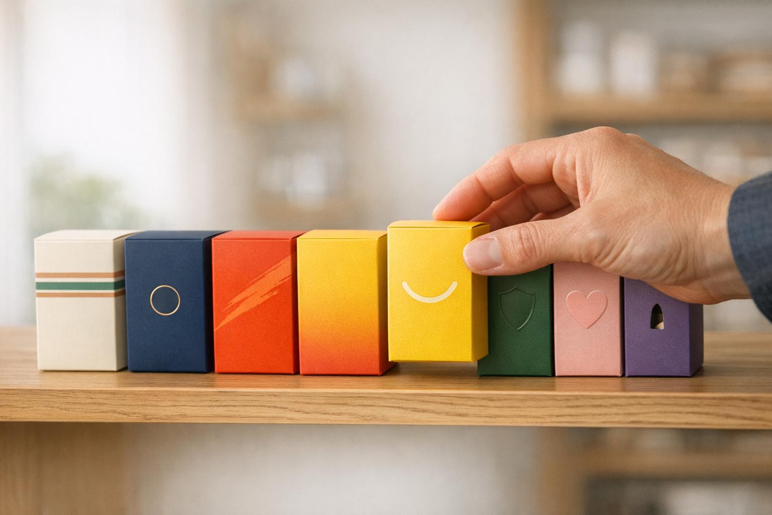
- Logo specifications: These outline where the logo should be placed, its size, and how much space it needs to avoid looking crowded. For example, a box might feature a primary logo on the front, while a smaller symbol appears on bottle caps or side panels.
- Color palette standards: Colors can vary depending on the medium, so guidelines must include exact Pantone and CMYK values for physical packaging. Since color heavily influences consumer perception, many brands also create a physical "Golden Sample" to ensure accuracy during production.
- Typography hierarchy: Fonts play a big role in how your brand is perceived. Guidelines should specify fonts for headlines, product names, and body text, along with their sizes and weights. For instance, a traditional brand might use serif fonts to convey trust, while a modern product could lean on clean, sans-serif fonts for a fresh look.
- Imagery and iconography: Whether you use photos or illustrations, your guidelines should define the style. Should product photos have white backgrounds or lifestyle settings? Should icons have rounded or sharp edges? These choices shape your brand's story and emotional connection with customers. Guidelines may also cover material and finish details, like paper texture or surface treatments (matte, gloss, or soft-touch) to ensure a consistent tactile experience.
While these visual elements grab attention, the brand voice ensures the message behind them resonates.
Brand Voice and Messaging
Your brand voice is the personality expressed through your packaging copy, while tone adjusts that voice to fit different products or audiences. Guidelines should define core voice traits - whether it's confident, playful, or trustworthy - and ensure those traits come through in every message.
This includes approved taglines, key messages, and proof points that highlight your brand's value. For example, a modern and approachable brand might use conversational language and active verbs, steering clear of overly formal or technical jargon. The visual and verbal elements should complement each other; a modern voice pairs naturally with clean, simple typography rather than ornate scripts.
"A brand is the set of expectations, memories, stories and relationships that, taken together, account for a consumer's decision to choose one product or service over another." – Seth Godin
Consistency in grammar and mechanics is just as important. Whether it's using the Oxford comma, formatting numbers a certain way, or capitalizing product names consistently, every detail contributes to your brand's image. Research shows that about 95% of purchasing decisions happen subconsciously, so even small inconsistencies can leave a negative impression.
To make things easier, include messaging frameworks in your guidelines. These should provide pre-approved copy in different lengths - like 50, 100, or 200 words - so designers can adapt the message to fit various package sizes without straying from your brand's core values. This planning avoids rushed, off-brand copywriting that could weaken your message.
sbb-itb-0c3a5ed
How to Apply Brand Guidelines to Packaging
5-Step Process for Implementing Brand Guidelines in Packaging Design
To ensure your packaging reflects your brand identity consistently, you need careful planning, precision, and thorough testing. Here's how you can make that happen.
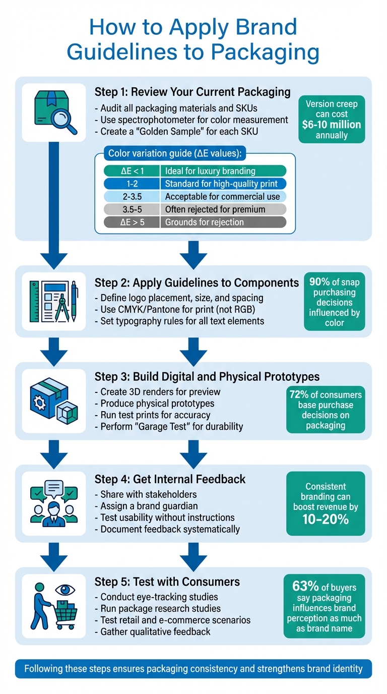
Step 1: Review Your Current Packaging
Start by auditing all your packaging, marketing materials, and digital assets. Collect every SKU to establish a baseline. Kevin Keating, President of PKG Brand Design, emphasizes:
"Evaluating brand alignment across all marketing assets, digital environments, and physical packaging should be the central focus of your branding audit."
Look for issues like "version creep", where small, unauthorized changes to artwork or specs build up over time. These inconsistencies could cost you anywhere from $6 million to $10 million annually. Ask yourself: Are there multiple versions of your logo in use? Are colors consistent across print and digital formats? Does your imagery match your brand’s tone? Also, check for discrepancies in materials, paper weights, or surface finishes that stray from your standards.
For color consistency, use tools like a spectrophotometer to measure color scientifically, avoiding subjective judgment. When reviewing physical samples, standardize lighting with D50 (ISO 3664) to simulate “warm daylight” and prevent metamerism - where colors appear to change under different light sources.
Create a "Golden Sample" for each SKU. This physical reference ensures all future production meets your standards. Use the table below to determine acceptable color variation levels:
| ΔE Value | Perception Level | Commercial Acceptability |
|---|---|---|
| ΔE < 1 | Nearly invisible | Ideal for luxury branding |
| 1 ≤ ΔE < 2 | Slight difference | Standard for high-quality print |
| 2 ≤ ΔE < 3.5 | Noticeable side-by-side | Acceptable for most commercial uses |
| 3.5 ≤ ΔE < 5 | Clear difference | Often rejected for premium products |
| ΔE > 5 | Fundamentally different | Grounds for rejection |
Step 2: Apply Guidelines to Packaging Components
Translate your brand guidelines into actionable design rules for your packaging. Specify logo placement, size, and spacing to ensure it stands out without being overwhelmed by other elements. For color, use print-specific standards like CMYK or Pantone (PMS) instead of digital formats like RGB or Hex, as these ensure consistency across various printing methods. This is especially important since 90% of snap purchasing decisions are influenced by packaging color.
Set typography rules for headlines, product names, and body text, including font sizes and weights. Follow your guidelines for imagery and iconography, and define tactile elements like matte, gloss, or soft-touch coatings to create a uniform physical experience.
Print dielines at full scale, fold them, and verify that critical elements avoid cuts, creases, or glue areas. Automated verification tools can help detect discrepancies in text, fonts, and graphics between original and revised files.
Step 3: Build Digital and Physical Prototypes
Use 3D renders to preview how your design looks from various angles before moving to physical production. This step helps you identify placement and readability issues across different package sizes and shapes.
Next, create physical prototypes to evaluate the design’s real-world appearance and functionality. Since 72% of consumers base purchase decisions on packaging, this step is critical. Run test prints to confirm color accuracy, font readability, and proper placement of design elements. PKG Brand Design highlights the importance of this step:
"Bridge the gap between screen and reality: a test print prevents costly surprises and ensures your design translates perfectly into physical form."
Ensure background graphics extend 3–5 mm beyond the trim line (bleed) and keep logos 5–7 mm inside the trim (safe area) to account for printing shifts. Produce an ISO-certified hardcopy color proof to safeguard against color mismatches.
Test structural durability with a "Garage Test": drop the prototype from waist height three times on different edges and test its ability to withstand a 15–20 lb top-load for one minute.
Step 4: Get Internal Feedback
Share prototypes with stakeholders to gather input on brand alignment, shelf appeal, and functionality. Assign a brand guardian to oversee consistency across all packaging projects. This person acts as the go-to for interpreting brand guidelines and speeding up approvals.
Test usability by giving the prototype to someone without instructions. Andy Young from advises:
"The approved sample sets the standard your print run will match, so review it carefully to ensure color and finish accuracy".
Document feedback systematically and maintain a revision log to track changes. Consistent branding across all platforms can boost revenue by 10–20%.
Step 5: Test with Consumers
Consumer testing ensures your packaging resonates with your target audience. With 63% of buyers saying packaging influences brand perception as much as the brand name, this step is non-negotiable.
Use eye-tracking studies to see where consumers focus first and for how long. This data helps optimize logo placement, product names, and other key elements. Conduct package research studies to compare designs on simulated shelves. Research shows 73% of consumers believe packaging design reflects a product’s re-purchase potential.
Test both retail and e-commerce scenarios. Retail packaging should grab attention and handle frequent handling, while e-commerce packaging must endure shipping and deliver a memorable unboxing experience. Gather qualitative feedback through focus groups or interviews. Ask consumers to describe their impressions of the brand based solely on the packaging. This feedback allows you to fine-tune your design before full production.
Once consumer testing validates your design, you’re ready to move forward with manufacturing.
Preparing Packaging for Manufacturing
Once your design has passed rigorous validation, it’s time to finalize your files to meet manufacturing standards.
Meeting Print Production Requirements
Accurate preparation of production files is key to avoiding costly errors. Start by setting your files to CMYK mode with images at 300 DPI at their final size. This ensures colors are consistent and prevents pixelation.
For critical brand elements like logos, use Pantone (PMS) or spot colors to maintain precise color matching across materials and print runs. Add a 0.125-inch (3mm) bleed to all backgrounds to account for cutting shifts, and keep essential elements - logos, product names, etc. - within a safe margin of at least 0.25 inches (5-7mm) inside the trim line.
Vladimir Gendelman, CEO of CompanyFolders.com, highlights common pitfalls:
"The three errors that derail [packaging] most often are missing bleeds on secondary panels, text placed into the imprint area, and dielines left active in the final prepress PDF."
To avoid font-related issues, embed or convert all fonts to outlines in your final PDF. This prevents substitutions that could alter your design. For adhesive areas, like glue flaps, leave them free of varnish or laminate to ensure proper bonding. Additionally, barcodes should use high-contrast colors - ideally black on white - for reliable scanning.
| Requirement | Specification | Purpose |
|---|---|---|
| Image Resolution | 300 DPI at 100% size | Prevents blurry or pixelated printing |
| Standard Bleed | 0.125 inch (3mm) | Avoids white edges after trimming |
| Safe Margin | 0.25 inch (5-7mm) | Protects critical content from being cut |
| Color Mode | CMYK or Pantone | Ensures accurate color reproduction |
By following these specifications, you’ll maintain a consistent and professional brand image across all packaging.
Working with Packaging Design Professionals
To turn technical requirements into flawless packaging, it’s wise to collaborate with design professionals. These experts bridge the gap between digital designs and the physical production process. They convert RGB files (optimized for screens) into CMYK files (optimized for print) using ICC profiles, ensuring the final product matches your approved design. They also handle bleed areas, safe zones, and trapping to prevent issues like white borders or registration misalignments.
PKG Brand Design is a notable example of a packaging design firm that ensures consistency in manufacturing. Their Consumer First® approach incorporates consumer insights into every stage, from brand strategy and identity to structural design and final production artwork. This ensures your packaging aligns with brand standards and resonates with your audience. They also oversee vendor handoffs, providing a seamless transition.
Design professionals often attend the first press check to verify print quality and establish production benchmarks. Many also use automated inspection software to detect discrepancies between the original artwork and printer proofs, catching errors that might slip past manual reviews. This level of detail is essential, especially since 90% of snap purchasing decisions are driven by color.
Experienced designers help avoid "feature creep", where excessive elements clutter the design and dilute your brand message. They refine structural elements and ensure compliance with regulatory standards, including text legibility and ingredient placement. To streamline feedback and maintain consistency, a centralized collaboration platform can align input from marketing, legal, and regulatory teams.
Common Problems and How to Fix Them
When working on packaging projects, staying consistent with your brand while ensuring functionality can be challenging. These common issues and their solutions can help you avoid unnecessary costs and delays.
Maintaining Brand Consistency
Version creep is a subtle but significant problem. It happens when small, unauthorized tweaks - like shifting logos, changing colors, or adjusting spacing - add up over time, weakening your brand's identity. This can have a serious financial impact. In fact, over 50% of senior managers in mid- to large-sized companies estimate that brand dilution costs their businesses between $6 million and $10 million annually. On the other hand, presenting your brand consistently can boost revenue by 10–20%.
To tackle version creep, create a "Golden Sample" - a physical reference that serves as the standard for all packaging. Share this sample with all suppliers and appoint a brand manager or central team to oversee packaging updates. This ensures accountability and prevents unauthorized changes from slipping through.
Another frequent issue is material variation. For example, your signature blue might look bold on a white coated board but appear muted on Kraft paper. To avoid surprises, require ink drawdowns (lab samples) on the actual production material before committing to a full run. Additionally, use standardized D50 lighting (ISO 3664) in light booths to avoid metamerism - where colors look different under various lighting conditions.
For precise color matching, rely on the Delta E (ΔE) matrix to set numerical thresholds for acceptable color variation. A ΔE value under 2 is ideal for professional-quality prints, while anything over 5 is usually considered unacceptable.
By staying consistent, you not only strengthen your brand but also simplify your designs, ensuring your message remains clear.
Keeping Designs Simple
An overloaded design can confuse consumers and dilute your brand message. When you cram in product benefits, instructions, promotional messages, and decorative elements, the result is visual chaos.
This problem, known as feature creep, often arises when stakeholders keep adding elements during the design process. While each addition might seem important, the overall design can become cluttered. To prevent this, establish a hierarchy of information that prioritizes key details in this order: Product Name → Main Benefit → Variant/Size → Key Instructions. This approach ensures the most critical information is prominent. Also, define clear space around your logo to give it breathing room and prevent it from being overshadowed by other elements.
Once your design is clean and focused, the next step is ensuring production accuracy to avoid costly errors.
Reducing Production Mistakes
Production errors can be expensive and time-consuming. Common issues include missing bleeds, placing important text too close to trim lines, and using low-resolution images (below 300 DPI). These problems are often made worse by departmental silos, which can lead to versioning mistakes, such as printing from the wrong file.
To avoid these pitfalls, follow these production best practices:
- Extend backgrounds beyond trim lines.
- Keep critical text within safe margins.
- Use CMYK color settings with images at 300 DPI resolution.
Centralizing your proofing process can also make a big difference. Use a single platform where all stakeholders - marketing, legal, and regulatory - can review and approve the same version of the file. This reduces the risk of outdated files being sent to print and can speed up approvals by 25–40%.
For extra peace of mind, consider automated inspection software. These tools can compare artwork pixel-by-pixel and verify text at speeds of up to 1,000 characters per second, catching errors that might escape human reviewers. Additionally, choose suppliers with G7 Master Qualification or Graphic Measures International (GMI) certification to ensure consistent color reproduction across different printing methods.
Wrap-Up
Using brand guidelines in packaging is a powerful way to create instant recognition and drive better business outcomes. By auditing, prototyping, refining, and testing your packaging systematically, you can design materials that grab shoppers' attention - even in crowded retail spaces.
Consistent branding isn't just about appearance; it directly impacts your bottom line. Studies show that maintaining a uniform brand presentation can increase revenue by 10–20%. On the flip side, inconsistencies could cost businesses anywhere from $6 to $10 million or more annually. That’s why implementing rigorous standards, like a "Golden Sample" and precise technical parameters, is so essential.
This financial reality highlights the value of working with experts who can handle both the creative and technical sides of packaging. PKG Brand Design offers a blend of creative vision and technical precision to ensure your packaging delivers on brand consistency. Their Consumer First® approach integrates real consumer insights into the design process, ensuring that your packaging not only adheres to brand guidelines but also connects with your audience. From brand strategy and identity to final production details, they guide you through key elements like color calibration, material selection, and supplier management to ensure trust-building consistency.
FAQs
What’s the fastest way to stop “version creep” in packaging?
The fastest way to put an end to "version creep" is by implementing a structured packaging artwork approval process. This means setting up clear workflows, encouraging collaboration among stakeholders, and maintaining strong version control. When approvals are streamlined, teams can ensure they're always working with the most up-to-date files, reducing the risk of outdated versions causing confusion.
On top of that, promoting transparency between internal and external teams and leveraging digital tools for real-time updates can help cut down on errors and unnecessary revisions. This approach keeps version creep in check and ensures smoother project management.
How do I set an acceptable color tolerance (ΔE) for print vendors?
To determine an acceptable color tolerance (ΔE), you need to set a specific ΔE value that represents the maximum color difference you’re willing to allow. For most branding and printing needs, a ΔE of 2 is a common benchmark, as it ensures colors remain visually consistent to the human eye.
When setting tolerances, take into account factors like the printing method, the material being printed on, and the color standards you're working with. Industry standards such as ISO 12647 can serve as a helpful reference to define tolerances that align with your project's specific requirements.
What should I include in a packaging “Golden Sample” kit?
A packaging "Golden Sample" kit serves as the benchmark for quality and appearance during production. It includes the final, approved sample that has been signed, dated, and sealed. Typically, you'll want to have several copies: one for your own records, one for the manufacturer, and additional ones for inspection purposes. These samples play a critical role in maintaining consistency and ensuring your packaging aligns with your brand's standards throughout mass production.